Freshly Made Sketches
Challenge #596
Good day, fellow crafters. I'm excited to share my entry for a challenge blog that is new to me, Freshly Made Sketches (FMS). This challenge blog runs weekly sketch challenges submitted by their readers. This week’s sketch can be found below my entry and if you are interested in participating then follow the link below their page banner above. Whether or not my work inspires you to participate, I sincerely hope you enjoy it.
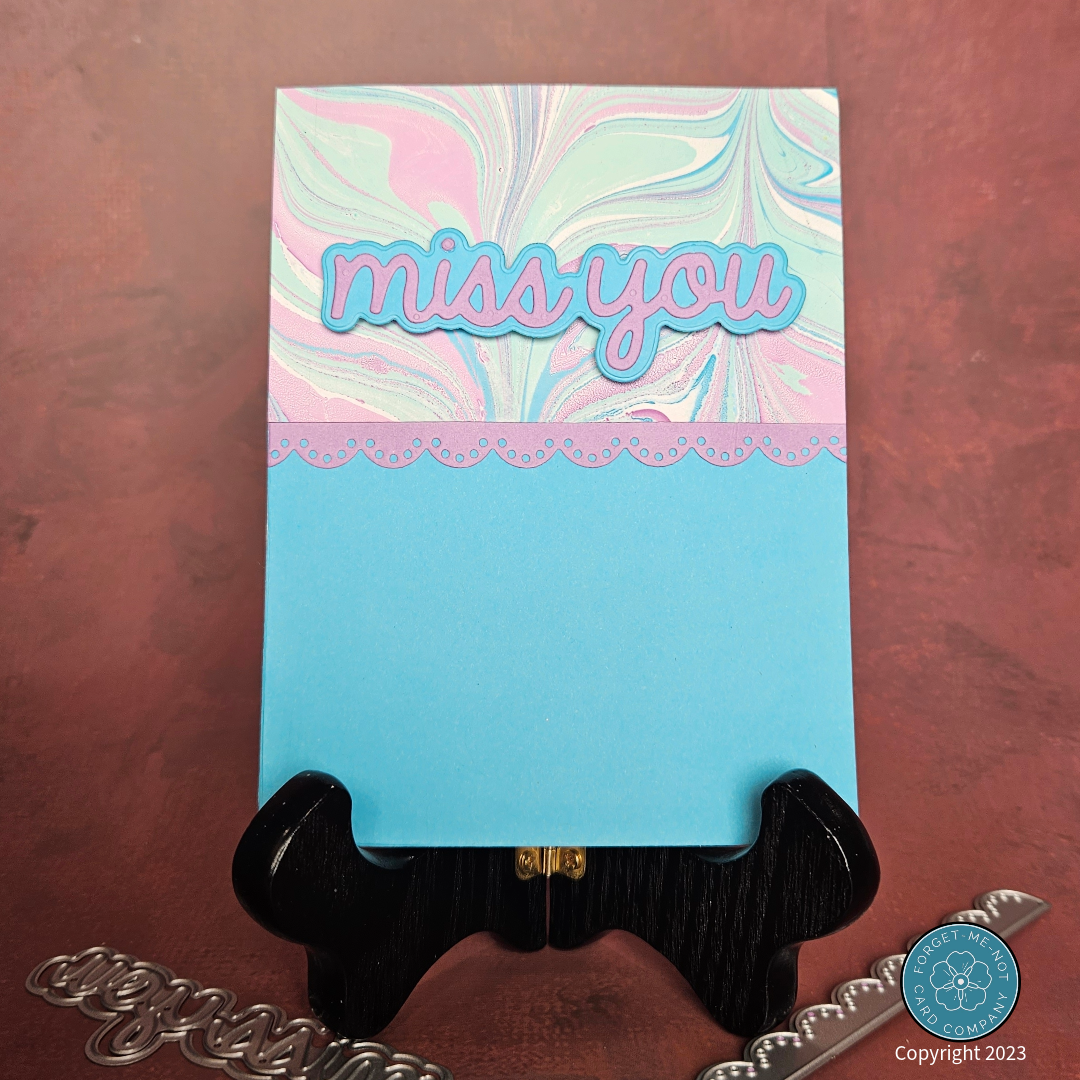
Taking inspiration from a design sketch by a reader of the FMS blog, this card features a clean and simple layout. The unique arrangement, displayed on the left, ventures beyond my usual comfort zone of filling up the entire page.
To craft this card, I aimed to maximize impact within the limited space while maintaining an elegant design. I found the perfect solution by allowing the paper itself to shine. Recently, I created a collection of stunning hand-made marbled papers, and I've been eager to incorporate them into various projects. Among these pieces, a beautiful pink, blue, and green creation stood out, and I've been saving it for just the right occasion. This sketch presented the perfect opportunity to showcase this exquisite paper, so I decided to use it here.
To begin, I prepared the A2-sized card by trimming, scoring, and folding a pale blue cardstock that beautifully complemented the marbled paper. With the base ready, I then trimmed the marbled paper to its final dimensions and set it aside.
Although I intended to let the marbled paper take center stage, I also recognized the need for a visual aid to guide the viewer's eyes amidst the swirling colors. To address this, I employed the Eyelet Lace Border die (SSDIE-184) along with a complementary pink cardstock, skillfully crafting a delightful accent. I adhered it to the marbled paper and then adhered the marbled paper to the card base.
The last step was to create the sentiment. To accomplish this I used the Heffy Doodle Miss You text die (HFD-0292), the corresponding shadow die cut set, and the same pink and blue cardstock I used for the other components of the card. I then surface-mounted the sentiment and called the card complete.
At first glance, this sketch appeared deceptively simple, yet it proved to be a challenging endeavor, not in terms of my design skills, but in terms of resisting my inherent urge to fill every inch of the page with elements. As a passionate creator, I've always found joy in crafting elaborate and detailed designs, immersing myself in a sea of creativity. The sketch however helped to remind me that sometimes, less truly is more.


