
AECP Level One Final Assessment

Good day, fellow crafters. Today's blog post is something special and will be somewhat different from my usual content, but be patient it will be worth it as this blog post is packed with information about my final project for the Altenew Educators Certification Program (AECP) Level One assessment. This program has been a challenging but rewarding journey, and I'm excited to share my work with you and I hope that it serves as inspiration for you to explore your creative side. So thank you for taking the time to read about my experience. If you are new to crafting or have never heard of the AECP, you can learn more about the program by clicking here
I am currently participating in the level one accreditation program out of the three levels offered. Each level has its own set of requirements and projects that must be completed and submitted for review by a team of experienced Altenew instructors, if you are following my blog you will have seen the cards I submitted featured there. I choose to participate in the program for several reasons, first, certified educators are able to teach Altenew classes, workshops, and events geared toward paper crafting and secondly, the program provides an opportunity for crafters to expand their skills and knowledge, connect with a community of like-minded individuals (like all of you), and share their creativity with others. I have made many new friends along this journey already and am looking forward to making many more.
Now similar to our school days when we had projects and final exams to complete our coursework, this program follows a similar structure. I have successfully finished all the assigned projects, and now it's time for my final assessment and to do that the following ground rules have been provided for me to adhere to during this evaluation:
Create two sets of cards: a “His” and a “Hers” plus a DIY coordinating gift packaging
The cards need to be a cohesive set for various occasions and packaged together as a group
Utilize at least 3 components from the classes in AECP Level 1 Course
Use at least one recycled element (in either the cards or the packaging)
The classes in Level 1 cover a range of topics, including stamp layering techniques, stenciling, ink blending, and creating dimensional projects but to meet these requirements, I have chosen to showcase the techniques that I learned specifically from the Clean and Simple Boutique Cards, Celebration Stenciling Techniques, and Easy Ink Blending modules of the course. I wanted something that would create a challenge and take me out of my comfort zone and I feel that these three modules were the most challenging of the modules that were offered. They introduced me to topics and techniques that I had not seen in the past or if I had seen them, they were used by other creators but not been explained well in the demonstrations I had observed and so I wanted to expand on what I learned for this assessment.
My Thoughts on Design
Designing a collection of greeting cards requires careful thought regarding colors, techniques, and design elements. The choice of suitable colors sets the tone, evokes emotion, and ensures a unified and pleasing look. Experimenting with different techniques, such as hand-drawn illustrations, watercolor paintings, or digital art, adds a touch of uniqueness to the designs. Paying attention to the overall design, including layout and sentiment, captures the viewer's attention and effectively conveys meaningful messages. So by considering these aspects with care, you can create a visually captivating set of greeting cards that will be cherished keepsakes for any occasion.
Drawing from my personal experience, I've learned some valuable tips that greatly enhance the creative process when making greeting cards. Firstly, I firmly believe that there is no such thing as a wrong card. If you feel dissatisfied with the outcome, remember that it's just paper, and you have the freedom to try again. Most importantly, prioritize having fun throughout the process, as it is only then that your creativity truly flourishes.
Additionally, maintaining a clean and organized workspace is crucial. Clutter can disrupt your thoughts and hinder your creative flow. Make it a habit to tidy up your materials and create an organized environment that encourages clear thinking and innovative ideas. This also helps when designing sets of cards so that all the pieces of your work are kept together and organized. There is nothing like losing that one element of your card that brought the whole piece together and having to recreate it.
Lastly, embrace the excitement of trying something new. Stepping out of your comfort zone often leads to remarkable discoveries of techniques and approaches that you wouldn't have explored otherwise. It is through these moments of experimentation that some of the most unique and captivating designs are born. By incorporating these practical tips into your creative journey, you'll elevate your greeting card creations and experience the joy of expressing your creativity in a personal and meaningful way.
The Cards
“Hers” - Feminine Set
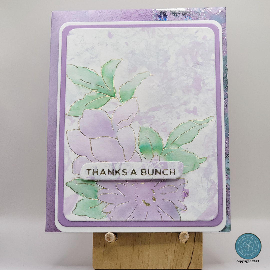
The gallery below showcases my collection of cards known as the "Hers" set. It features a delightful array of feminine colors and intricate floral designs. The attention to detail extends not only to the cards themselves but also to the envelopes and the final packaging, all adorned with matching elements. For this particular set, I decided to center the theme around gratitude, hence the selection of "Thank You" cards. It is my belief that every woman should possess a set of thank you cards that seamlessly blend style and practicality, always at the ready when the occasion arises.


“His” - Masculine Set
The gallery below showcases my collection of cards known as the "His" set. This set incorporates masculine colors, along with geometric patterns and nature-inspired imagery. The driving force behind the theme of this collection is motivation, recognizing the universal need for uplifting and encouraging messages that can touch the hearts of men. It is a profound belief that inspiration should transcend gender boundaries, as everyone can benefit from empowering words and expressions of support. These cards, carefully crafted to inspire and invigorate, serve as a powerful reminder to men that they possess an unlimited potential and the ability to conquer any challenge they face.

Construction of the Cards
Easy Ink Blending Cards

What I fell in love with from the Easy Ink Blending module is that it demonstrated the ability for the creation of vibrant and smooth colors, the seamless blending of different hues to achieve stunning gradients, and provided a solid foundation for adding other elements to complete the card design. Moreover, the process of ink blending is often relaxing and therapeutic, offering a soothing and enjoyable experience while crafting.
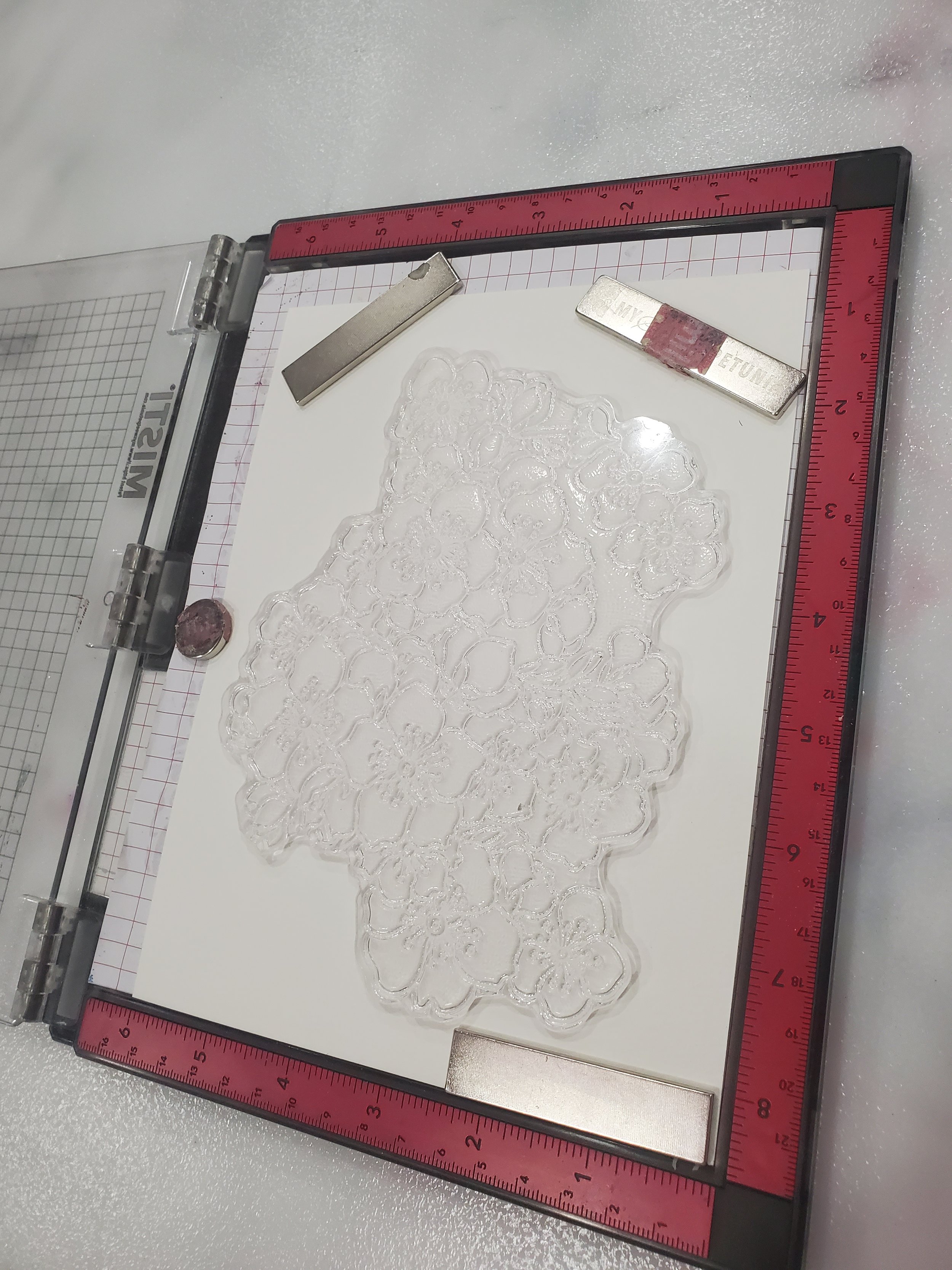
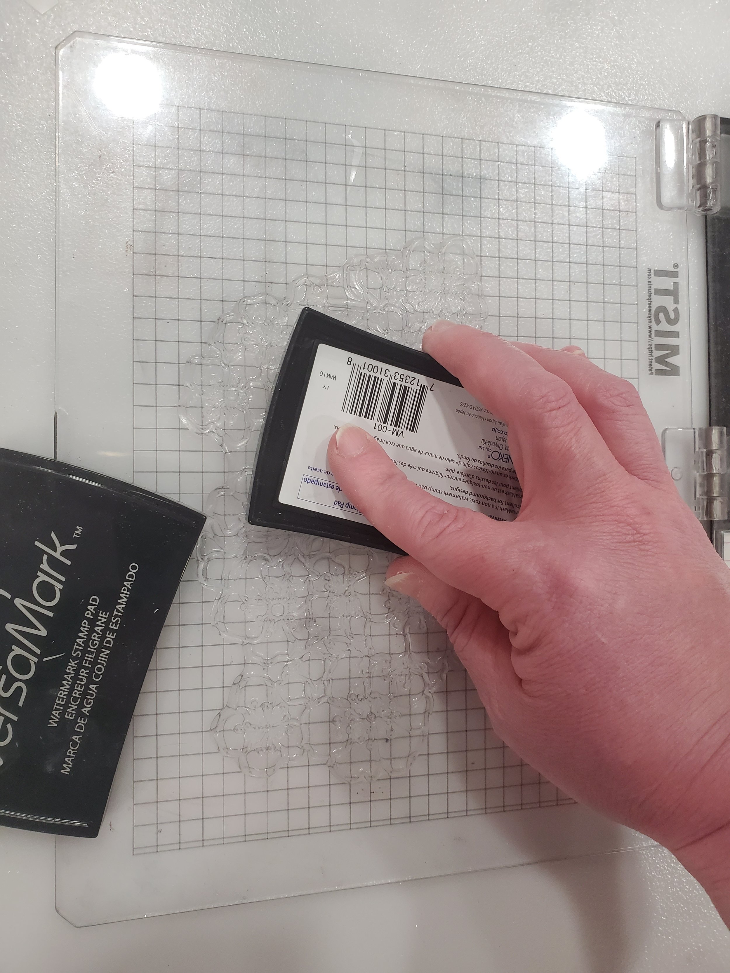
Initial Steps for All Ink-Blending Cards
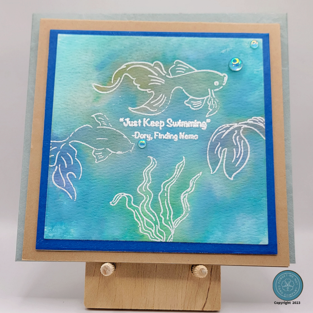
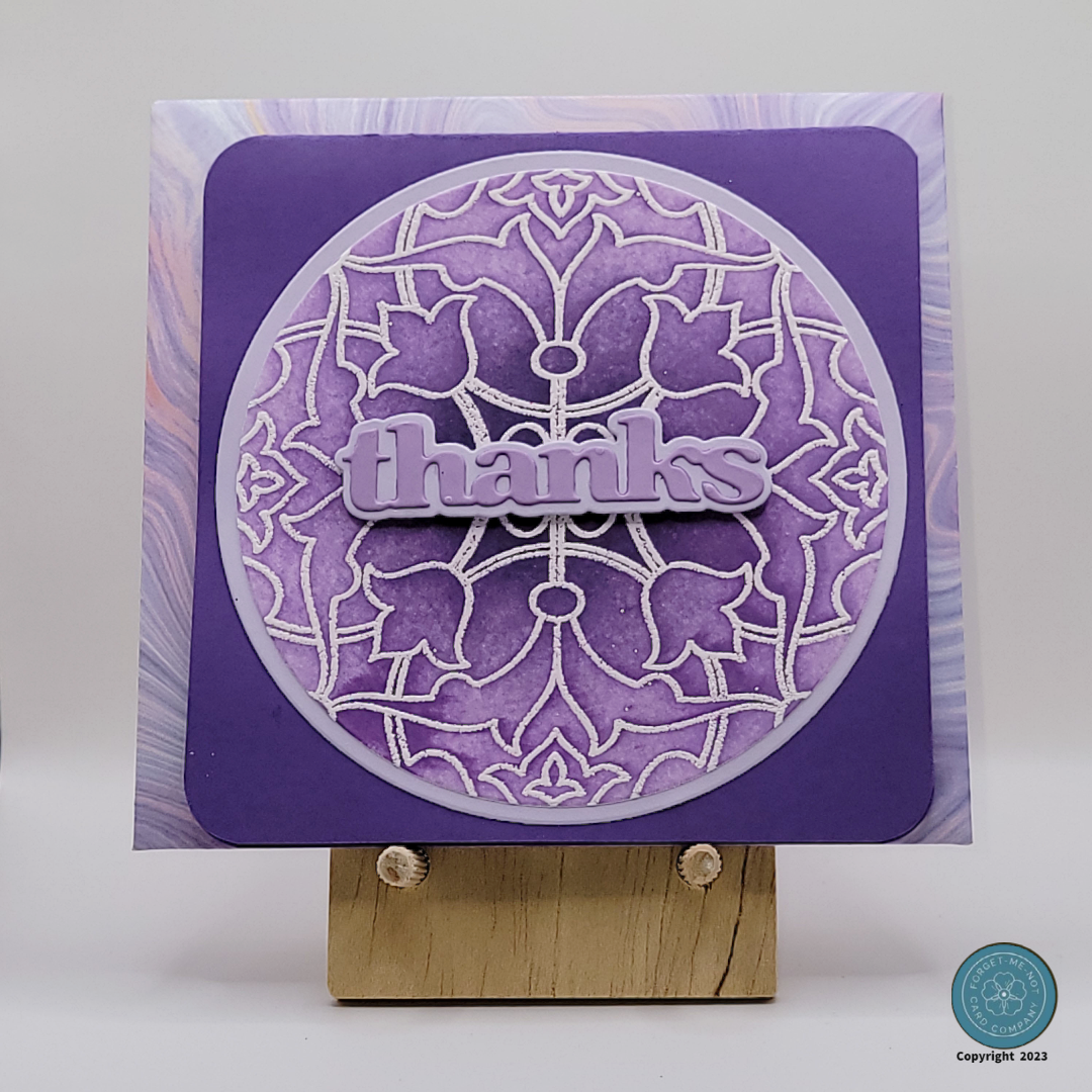
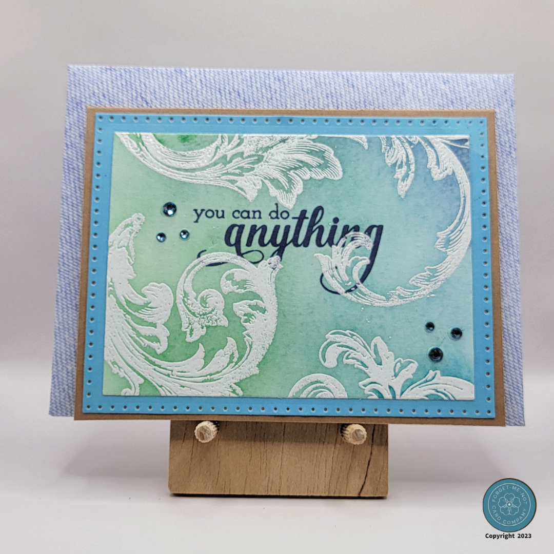
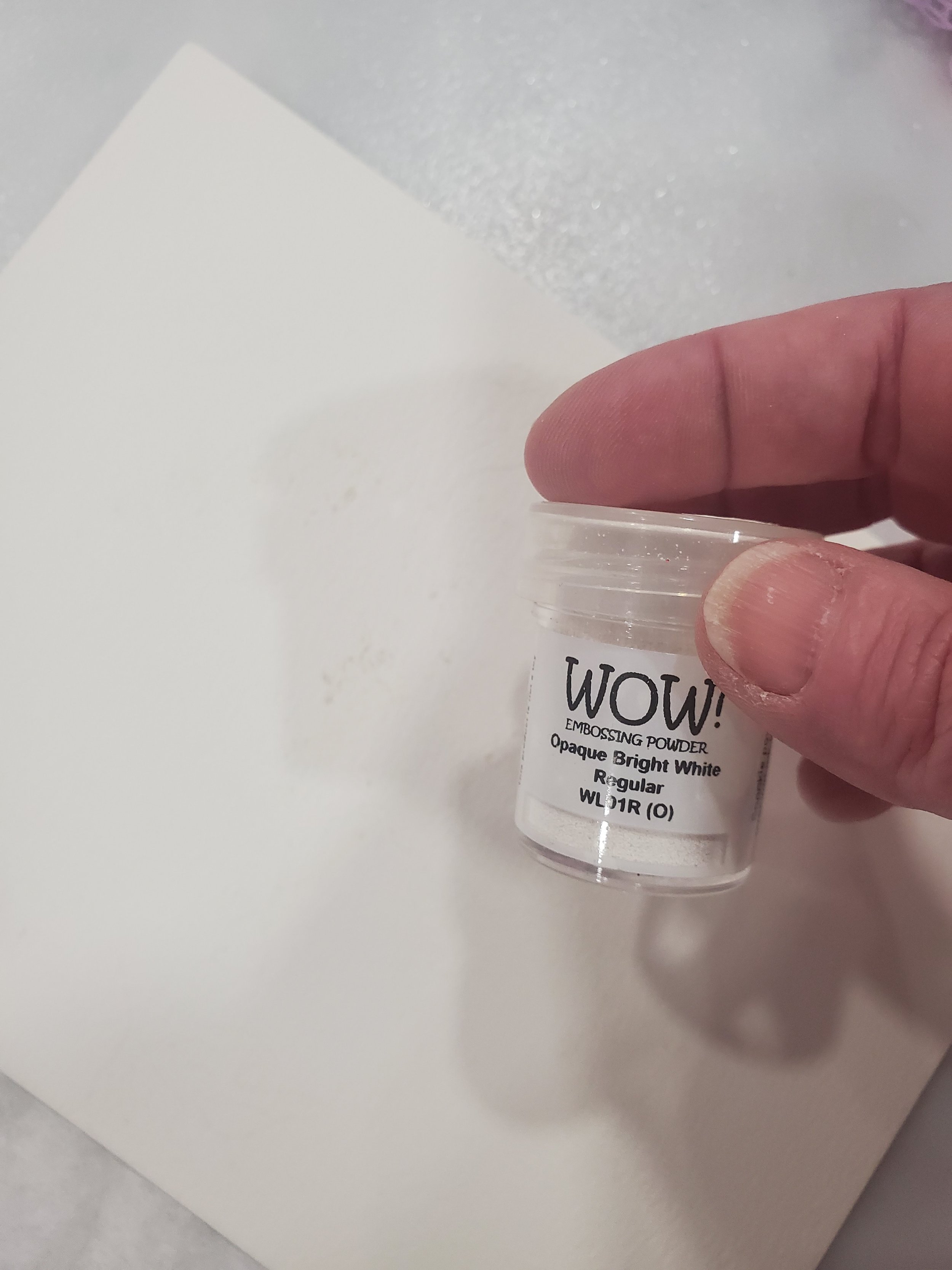
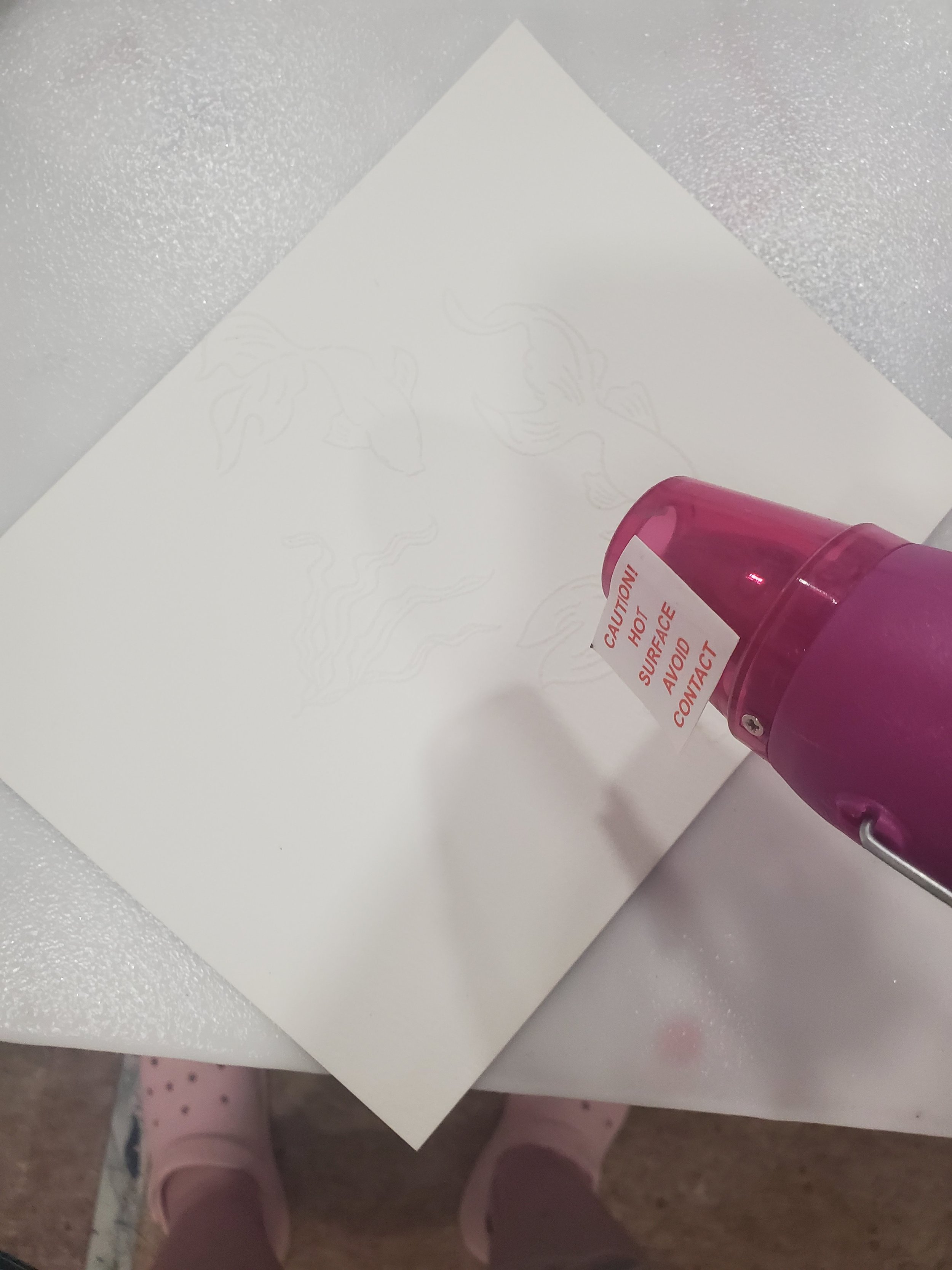
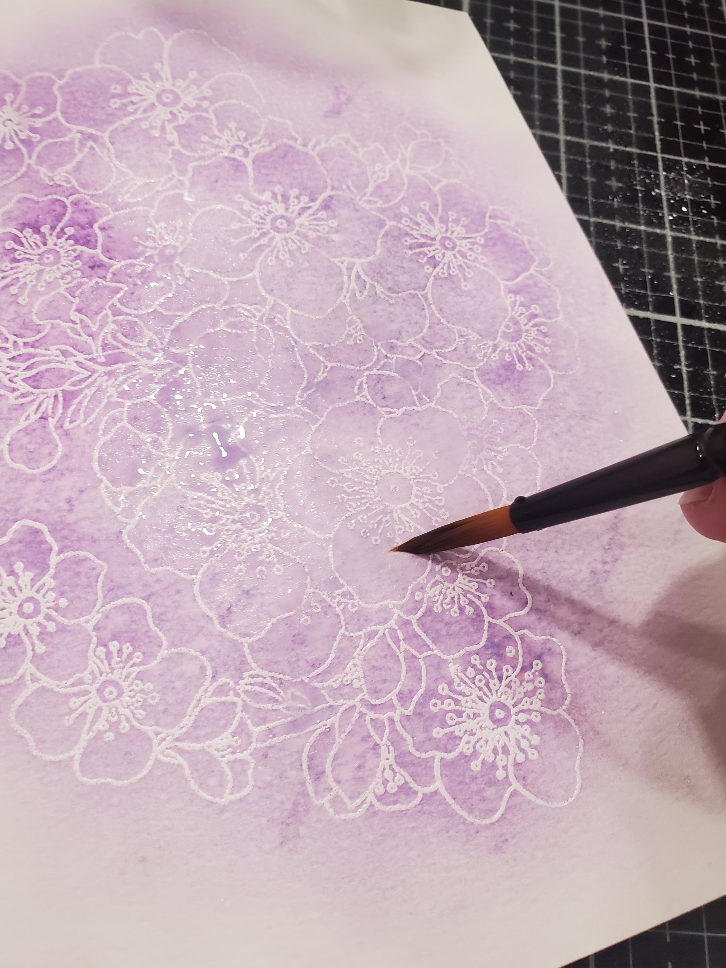
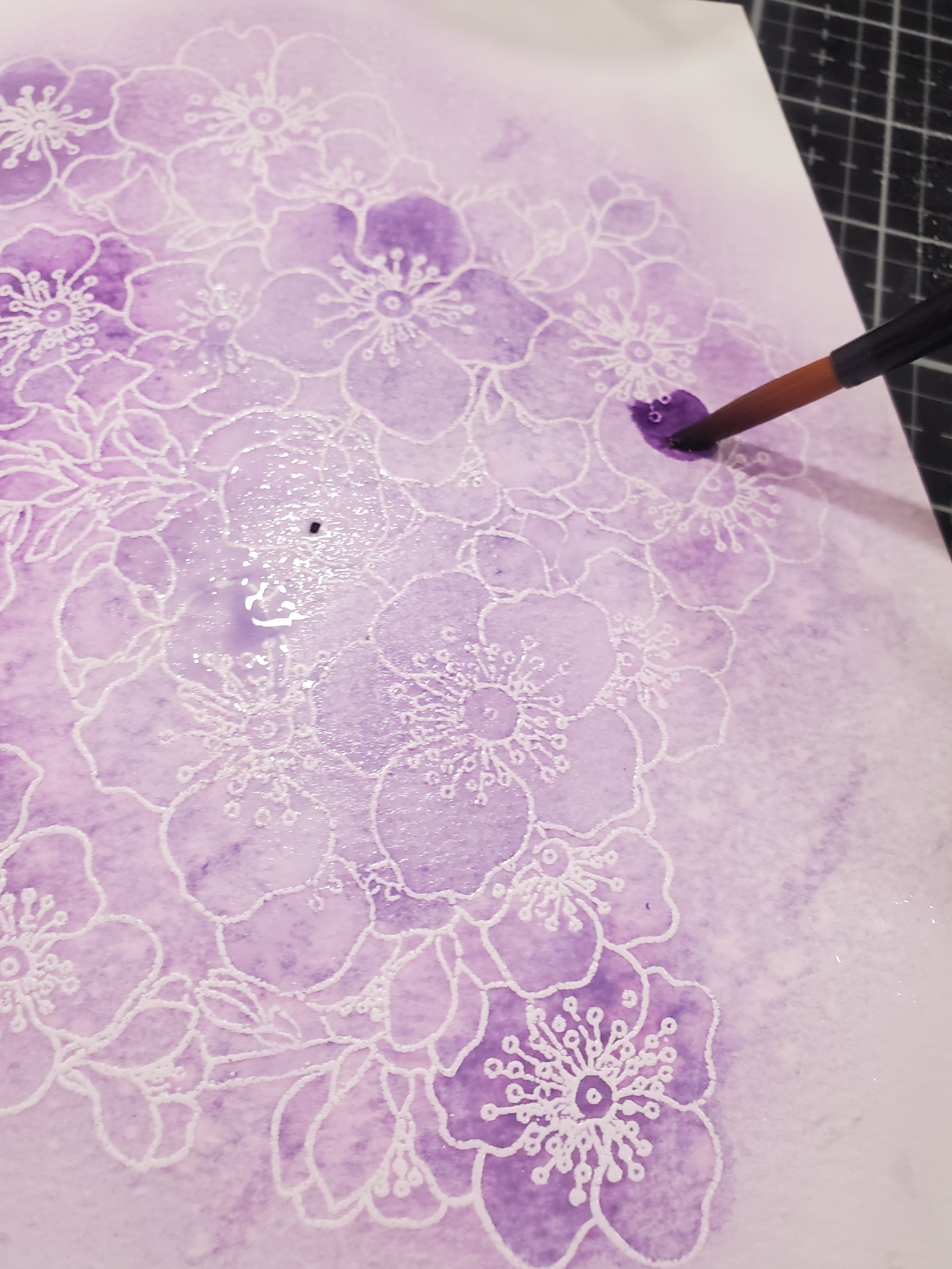
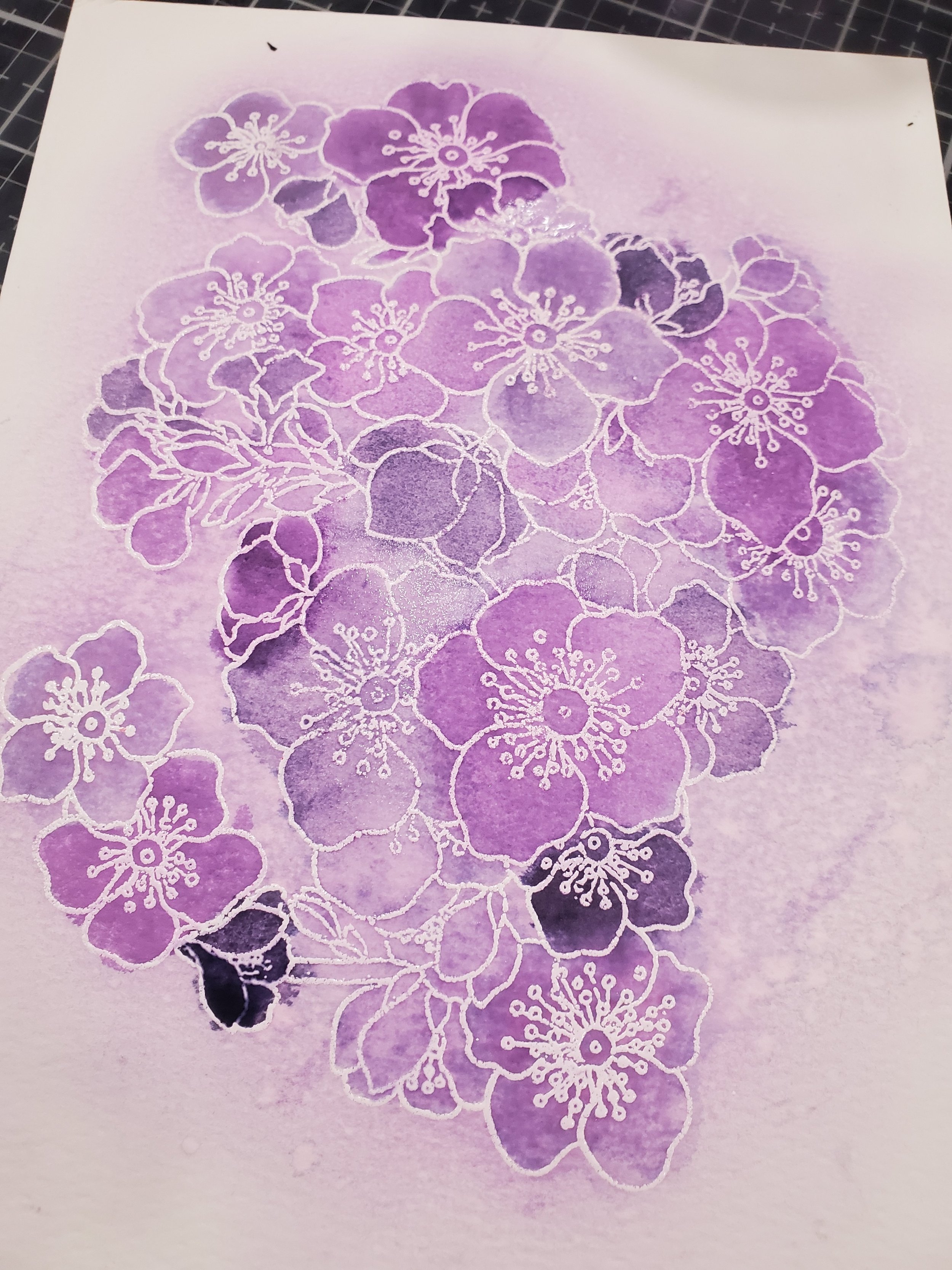
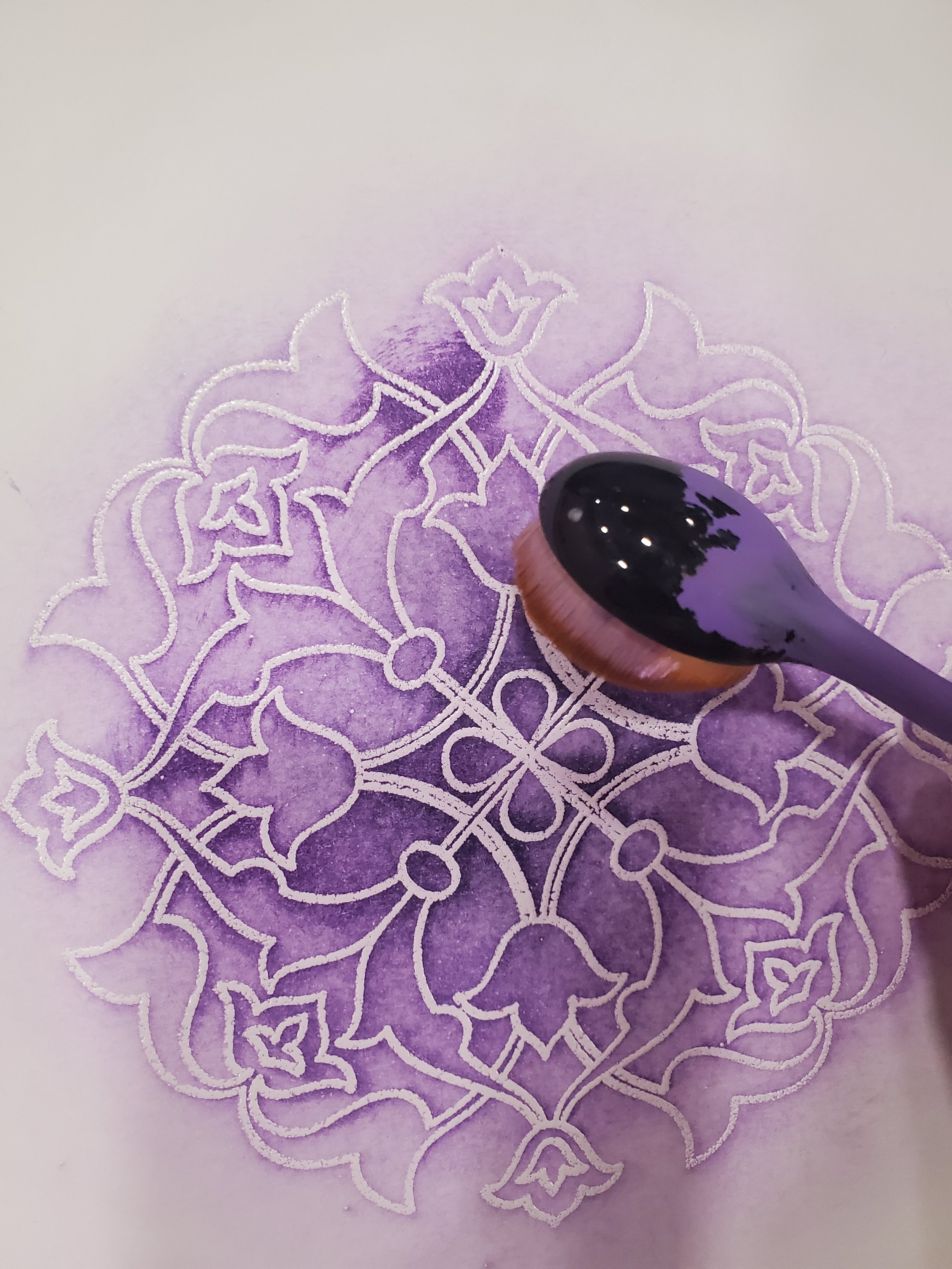
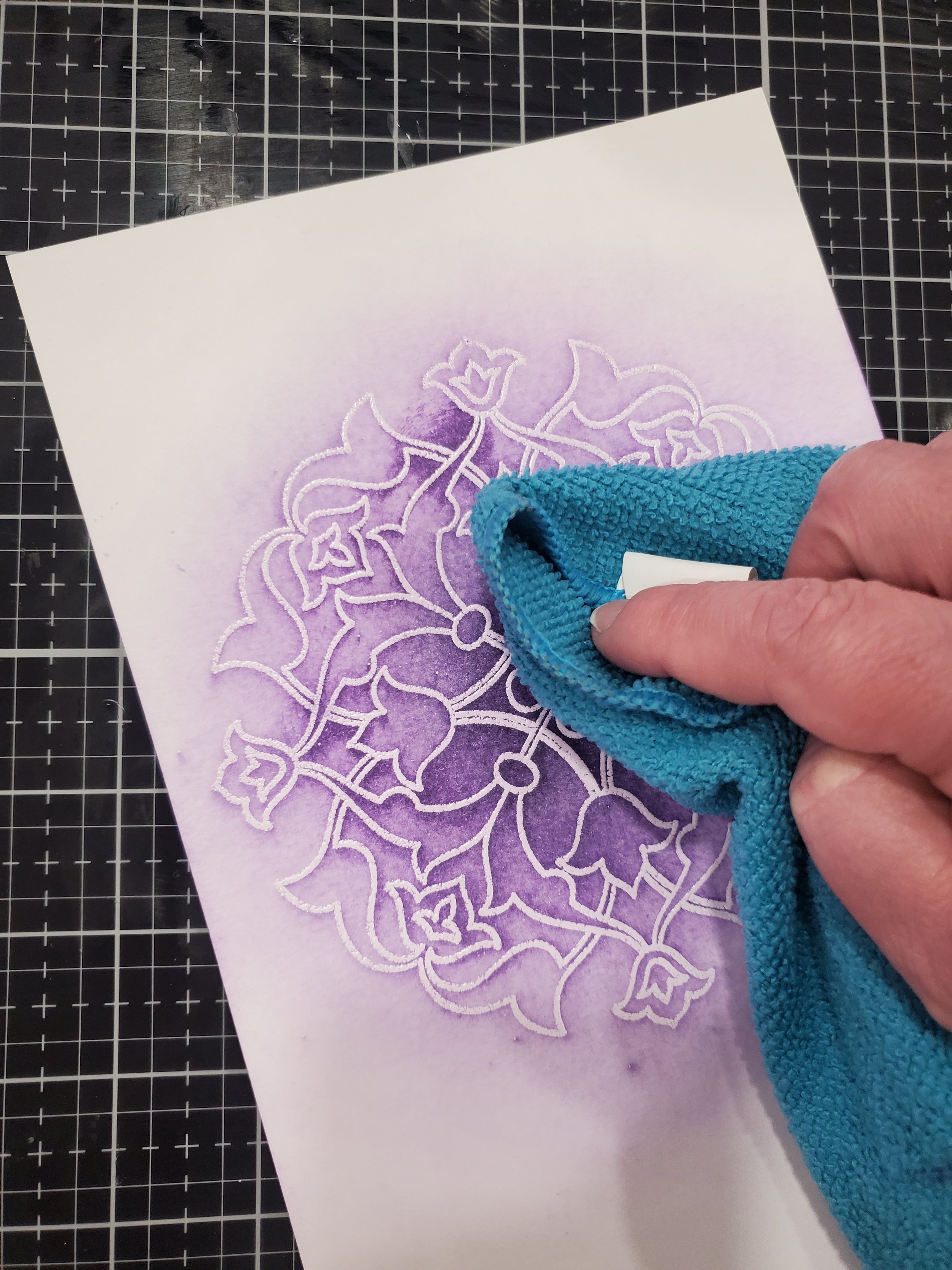
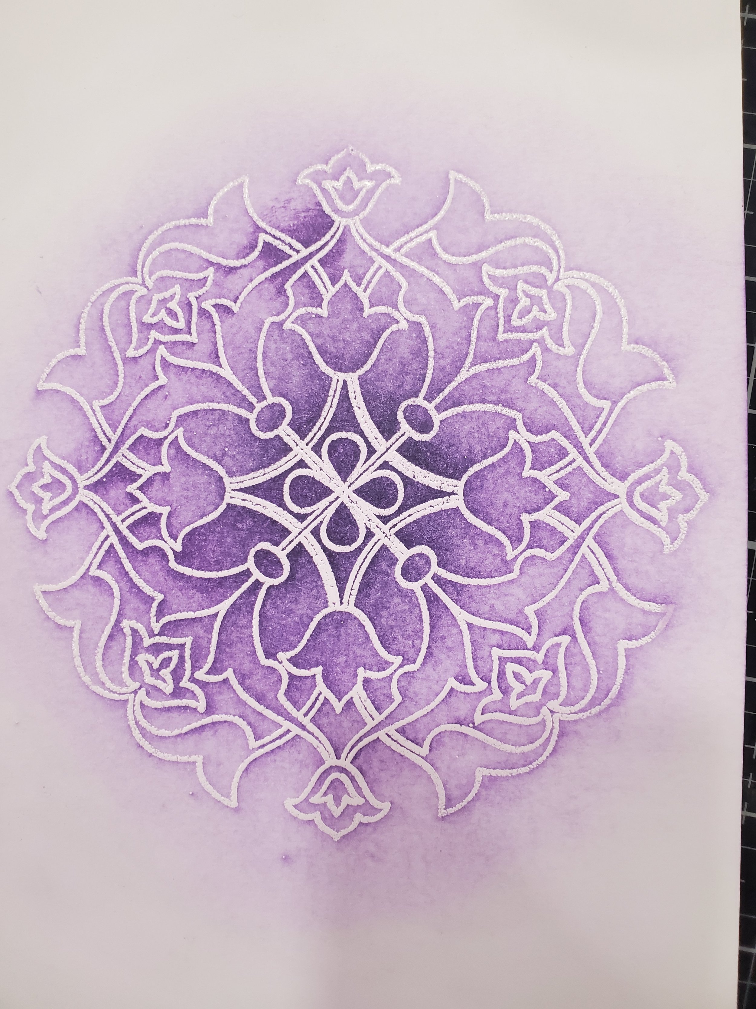
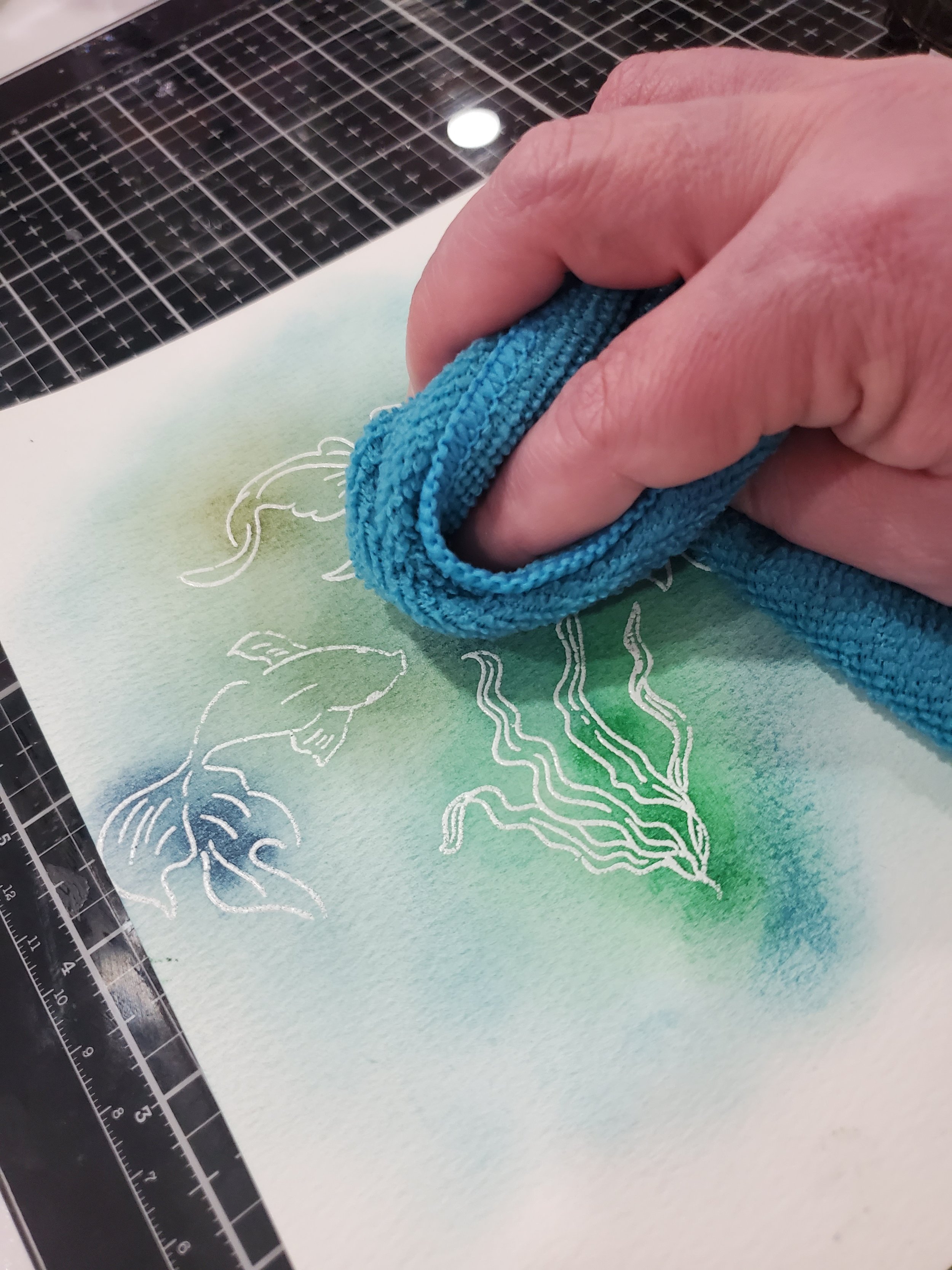
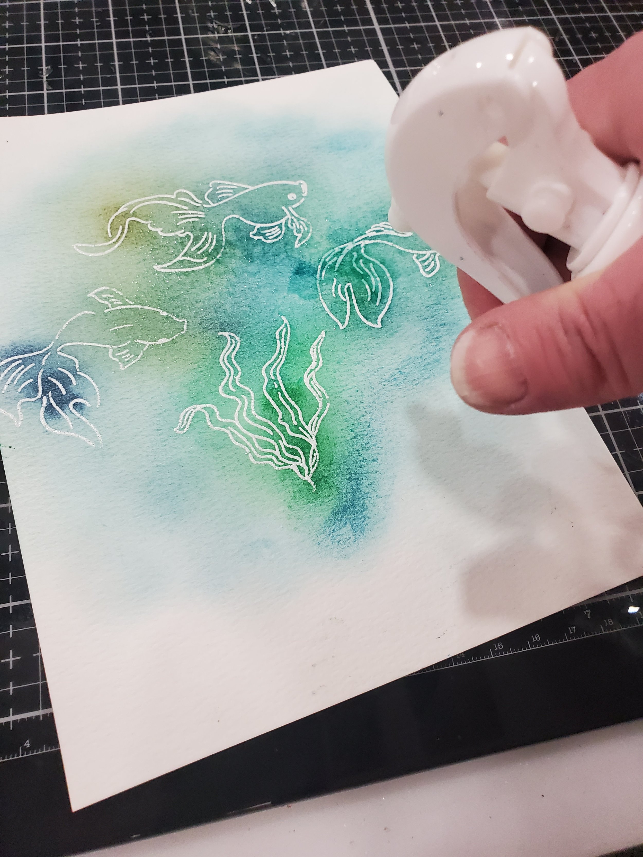
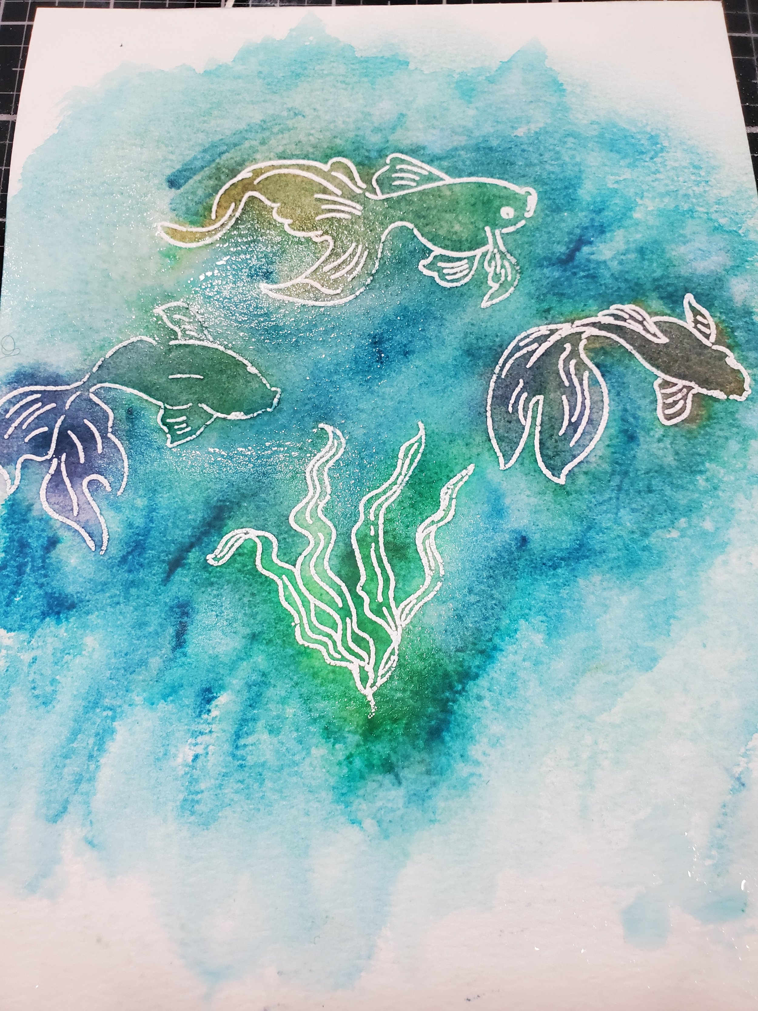
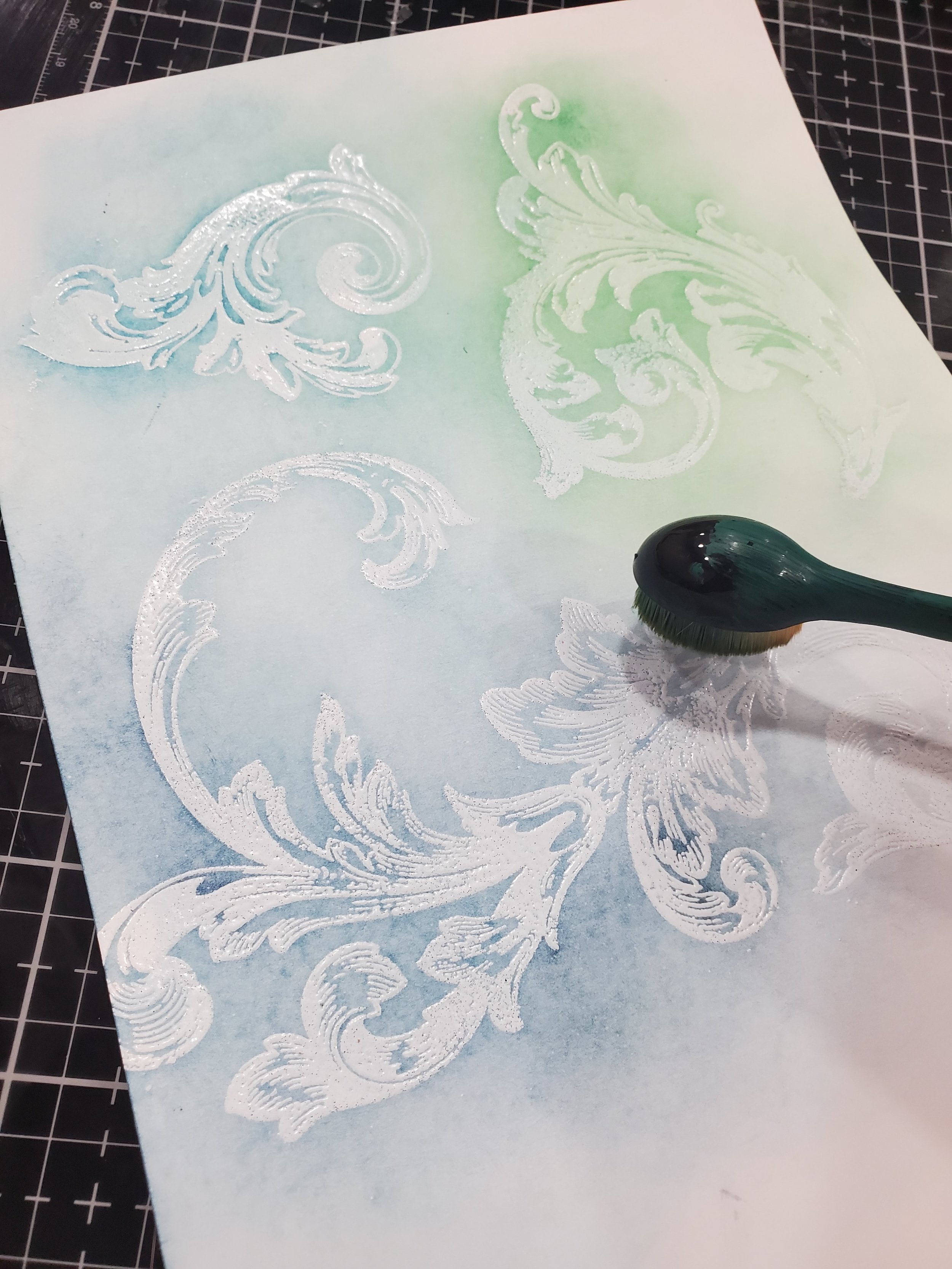
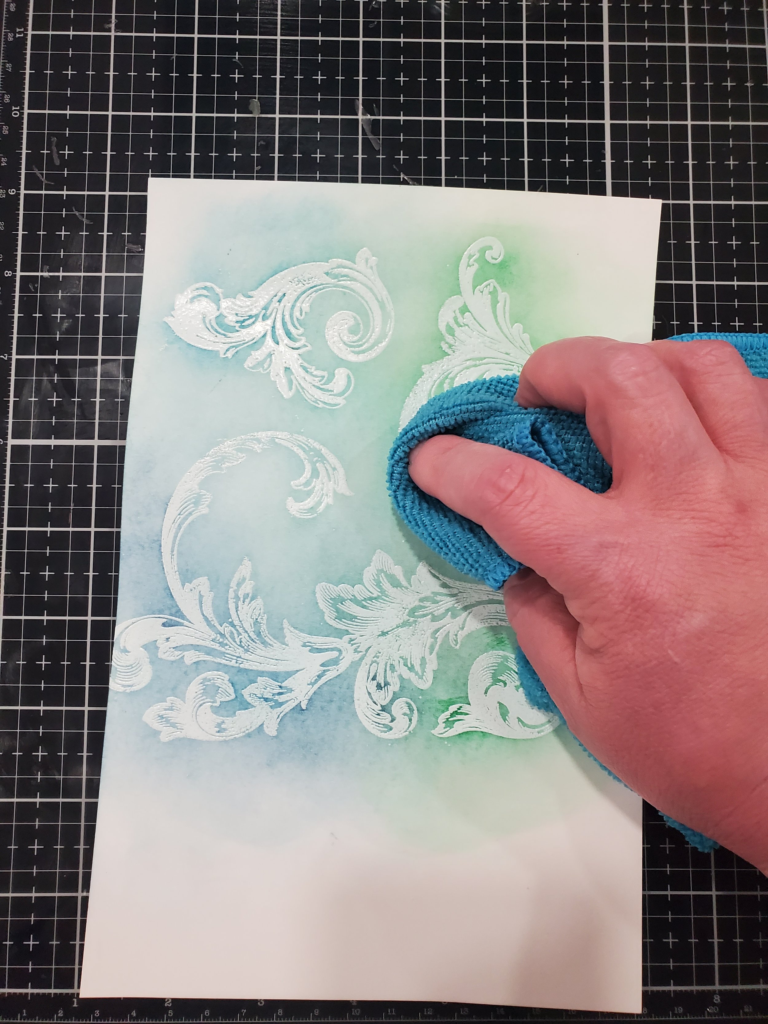
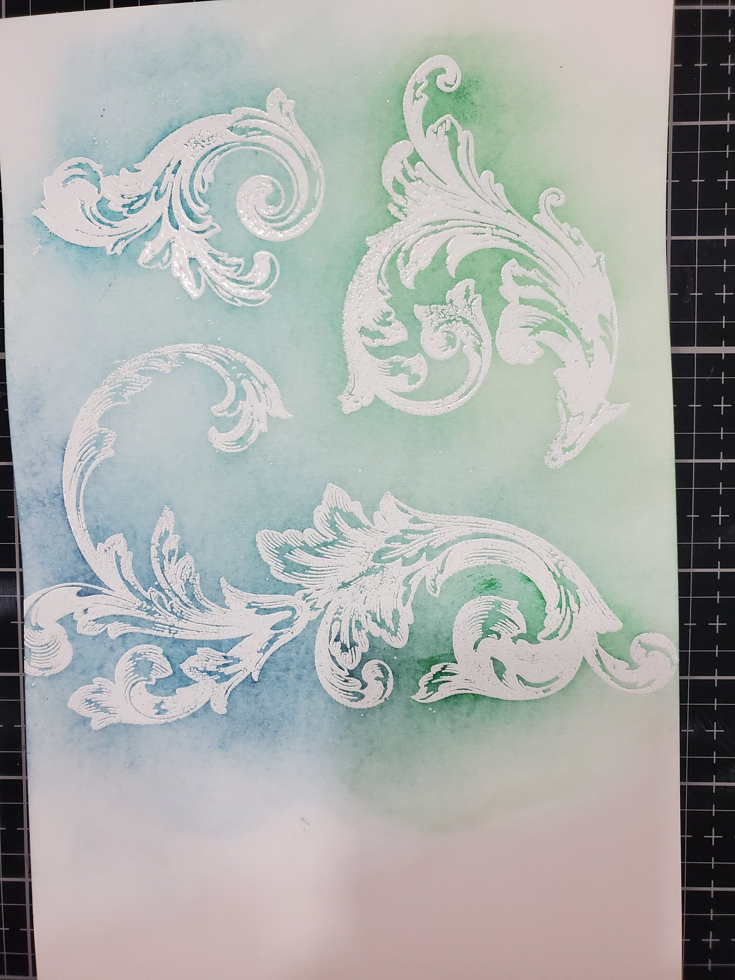
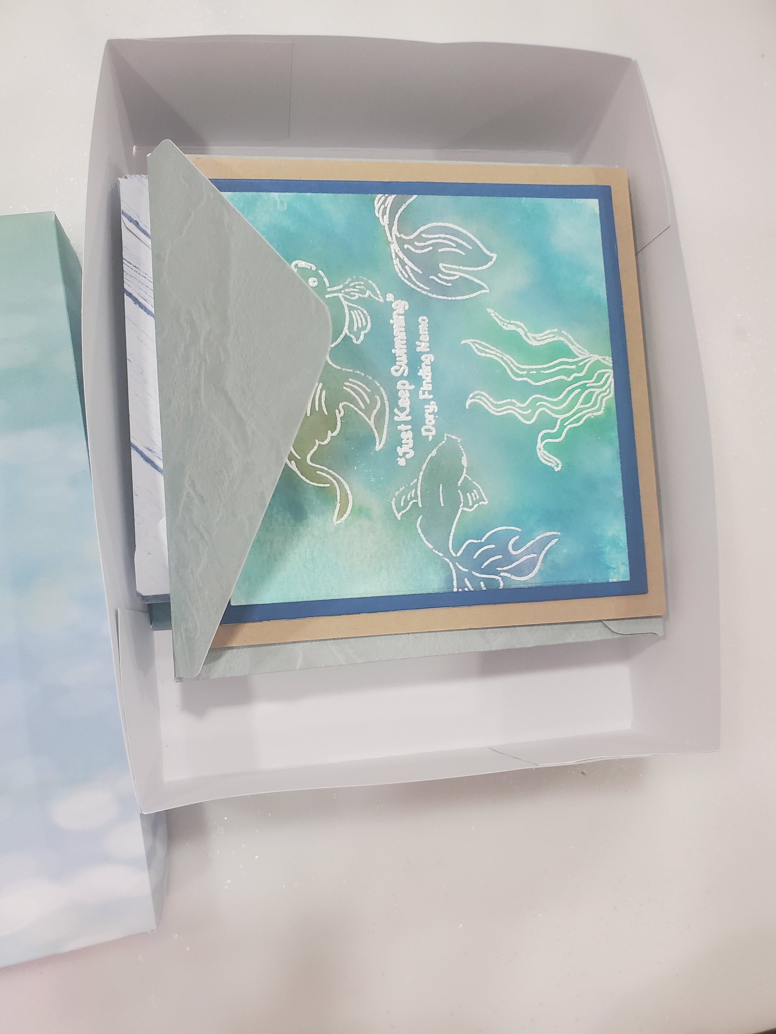
Displayed below is a collection of images showcasing the step-by-step process I employed to craft the captivating backgrounds for each of these cards. Although the finishing step for these backgrounds varied and I will talk about them next, the overall initial process remained consistent, differing only in the choice of stamp utilized. Image F1 features the Altenew Captivating Blooms stamp set, F2 displays the intricately detailed Altenew Arabesque Medallion stamp set, M3 the Atlenew Goldfish Pond stamp set, and M4 the Altenew Baroque Motifs stamp set.
Background Finishing Steps
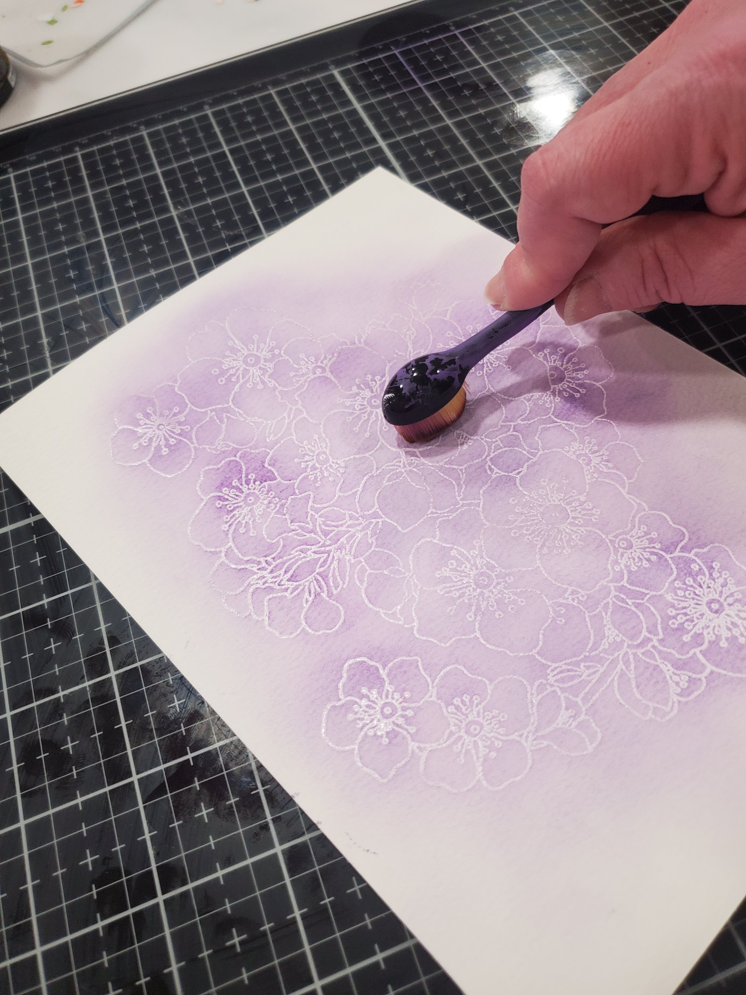
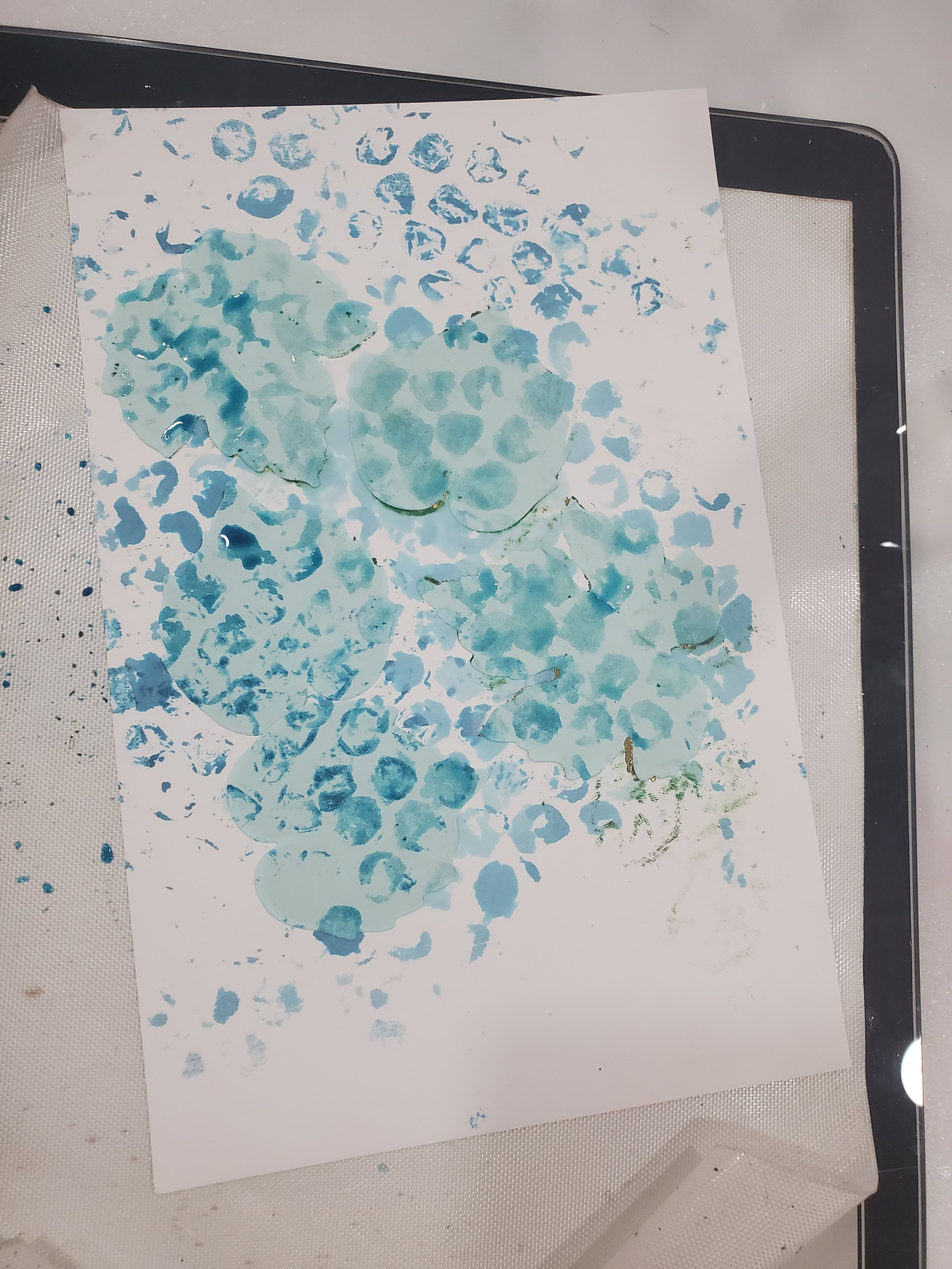
As mentioned earlier, I find enjoyment in the ability to craft my own custom hues by layering multiple ink blends on top of one another. This technique proved particularly effective in achieving the desired effects for cards F2 and M2, as showcased in the images. The beauty of this approach lies in the opportunity to bring to life colors that exist solely in my imagination, surpassing the limitations of my ink collection. It empowers me to build upon what I already possess, expanding the range of possibilities in my creations—a truly invaluable asset.
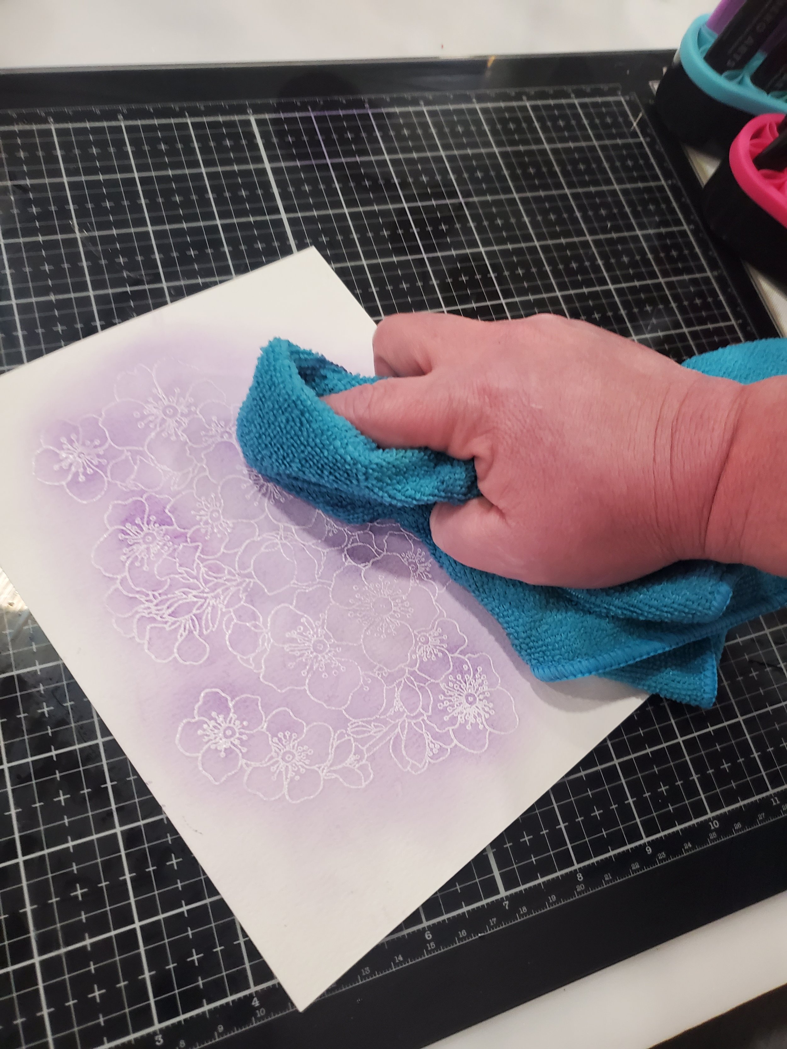
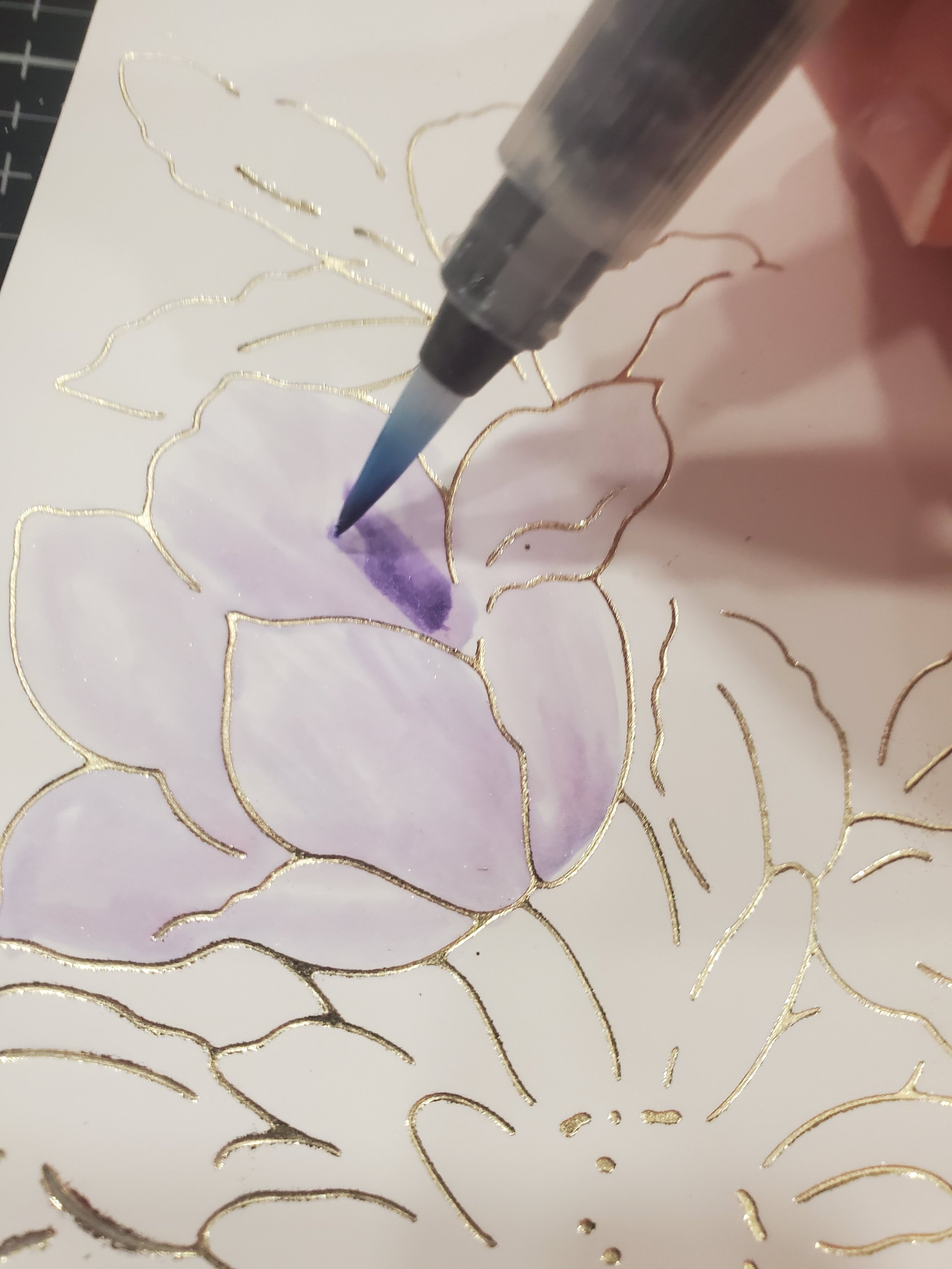
Additionally, there is another method I employed to enhance my creative capabilities, exemplified in the finishing touches applied to the backgrounds of cards F1 and M1. By smudging a touch of the same ink used in blending and gently misting it with water, I unlocked the potential to fashion my own watercolors. This technique holds a special place in my repertoire, particularly when working with floral designs. The resulting effect adds a distinct charm and versatility to my artwork, opening up a world of artistic expression.
The next step involved trimming the backgrounds to their final dimensions, matting them, and adhering them to card bases. Staying true to the overarching theme, all the feminine cards feature shades of purple for both the mat and the card base, while the masculine cards showcase various tones of blue for the mat and a complementary kraft-colored card base. This color coordination enhances the visual cohesiveness and reinforces the intended aesthetic.
Furthermore, it is worth noting that these creations also align with the requirements of the AECP assessment guidelines. To ensure consistency and utilize top-quality materials, Altenew dies were exclusively employed to precisely cut the sentiments for each of the cards I created. This choice guarantees precision and a professional finish, while also showcasing the versatility and craftsmanship of Altenew's product line.
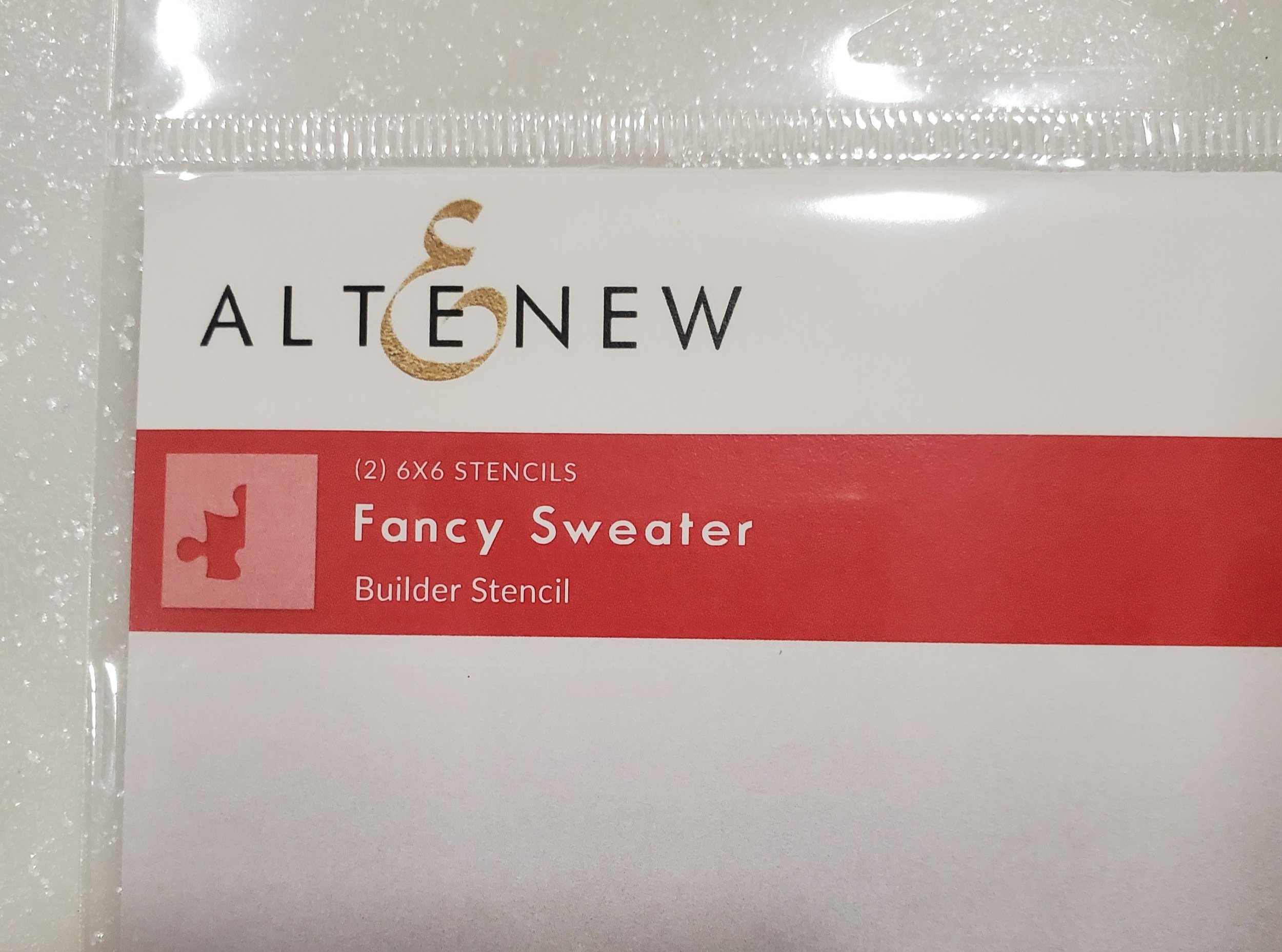
Clean and Simple Boutique Cards


The Clean and Simple Boutique Cards module had a profound impact on me, leaving a lasting impression that continues to inspire my cardmaking endeavors. I was immediately drawn to the module's emphasis on simplicity, its straightforward construction techniques, and the remarkable "wow" factor it brought to the world of cardmaking. As card makers, we strive to showcase the inherent beauty of the elements we choose, and this module perfectly encapsulated that essence. It doesn’t take lots of elements or extremely pricey things to provide a sense of elegance and beauty to a card and I can appreciate that which is why I chose to make cards representative of this module.
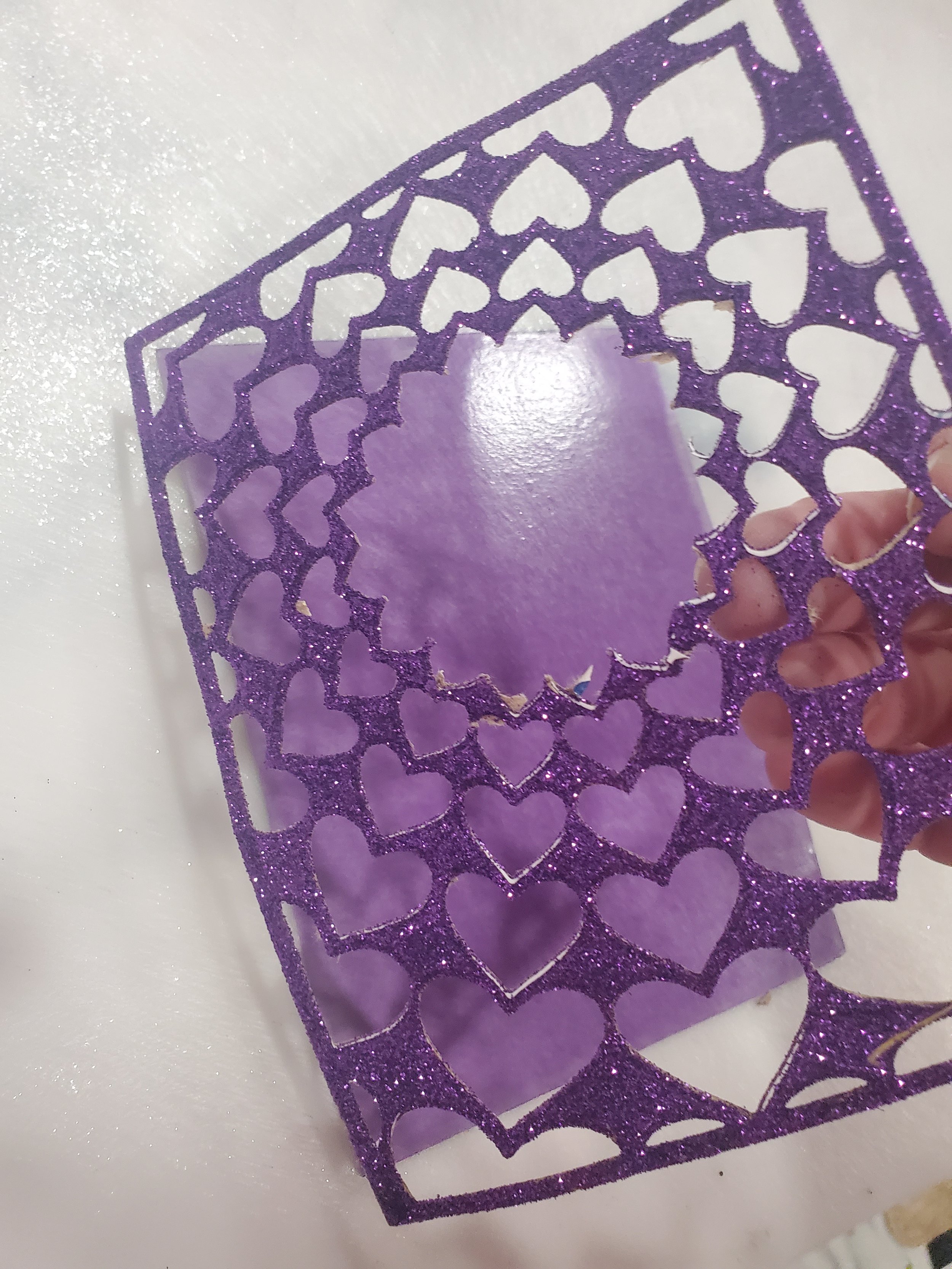
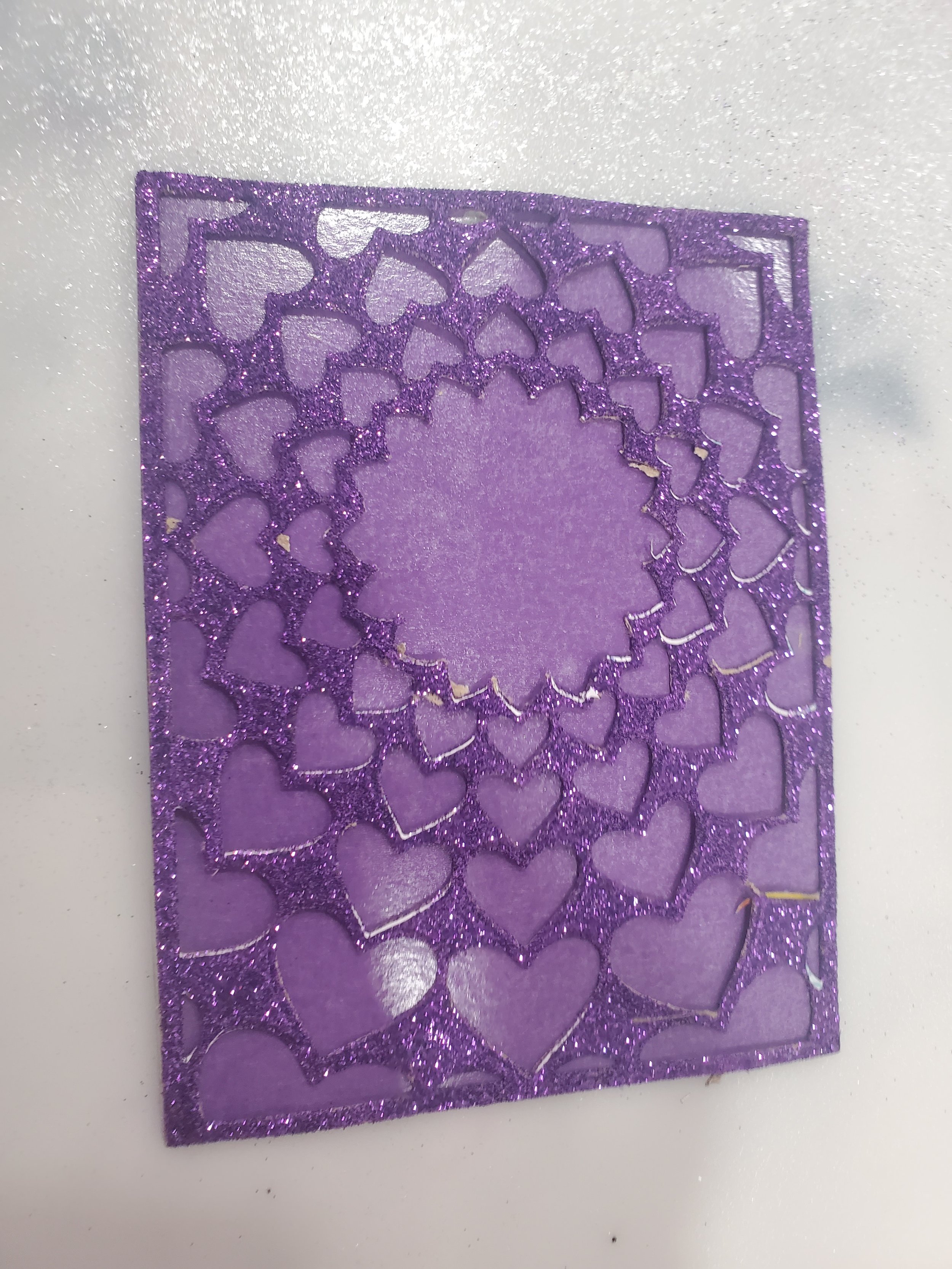
Initial steps for Clean and Simple Boutique F1 and M1 Cards
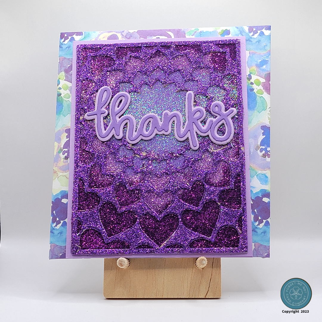
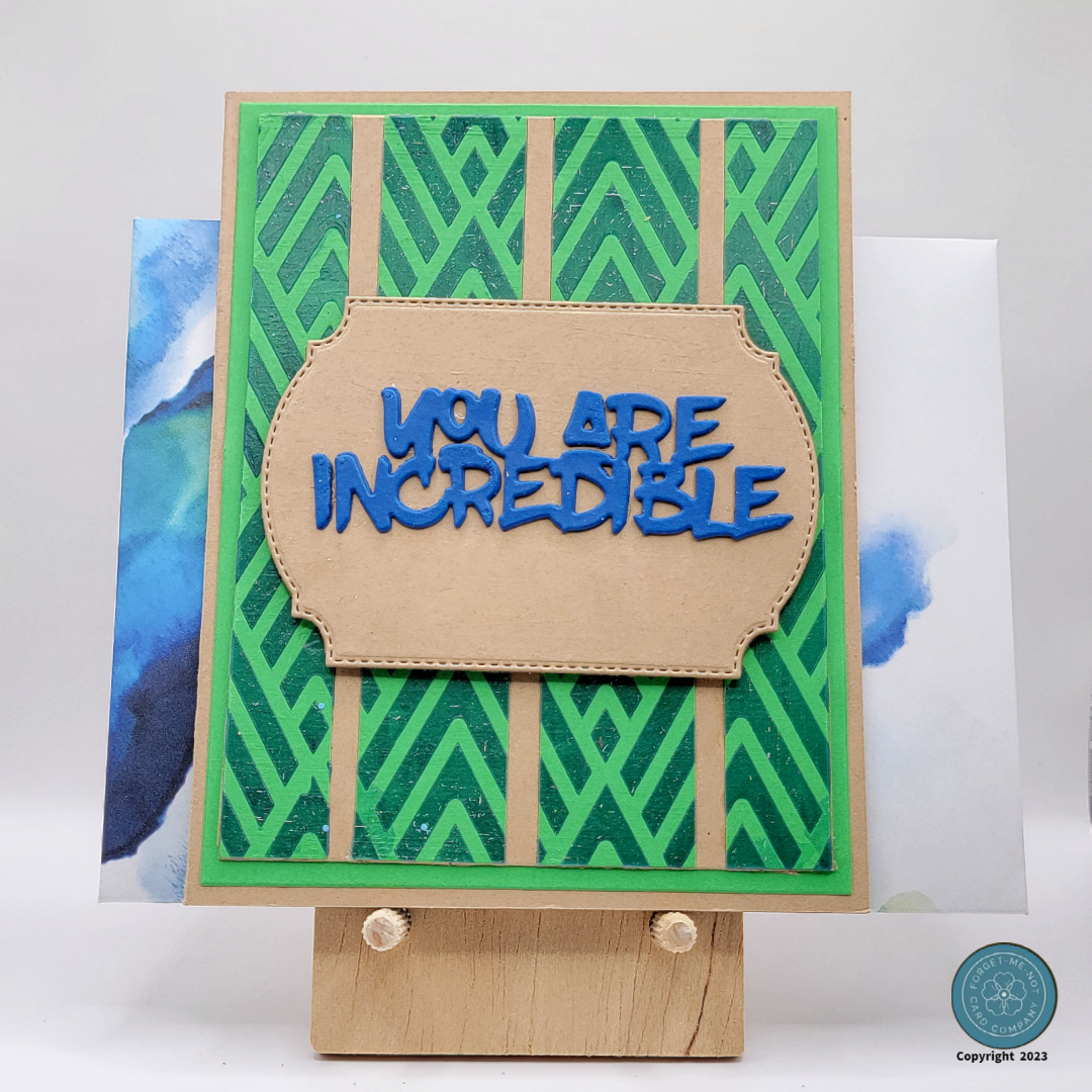
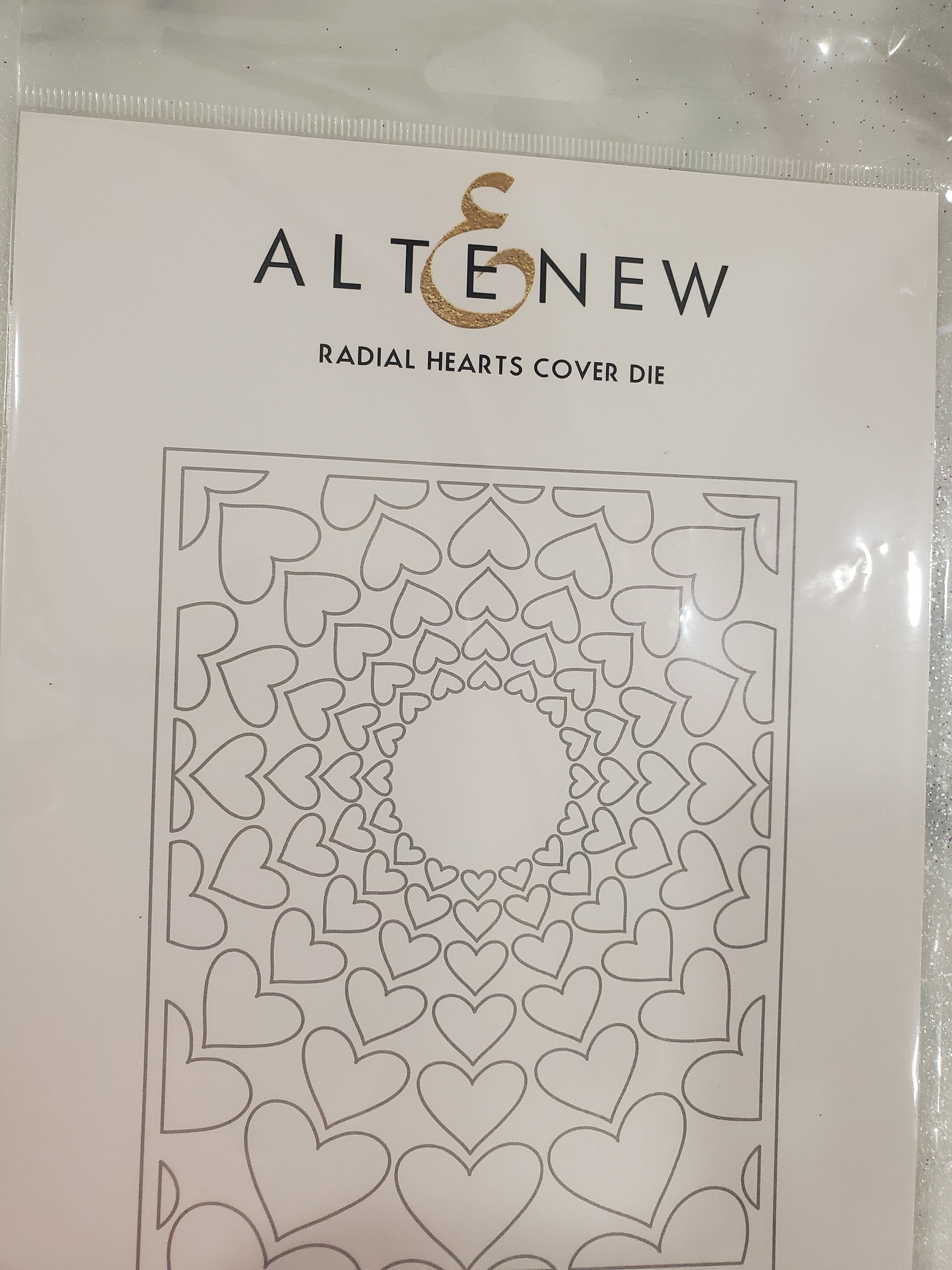
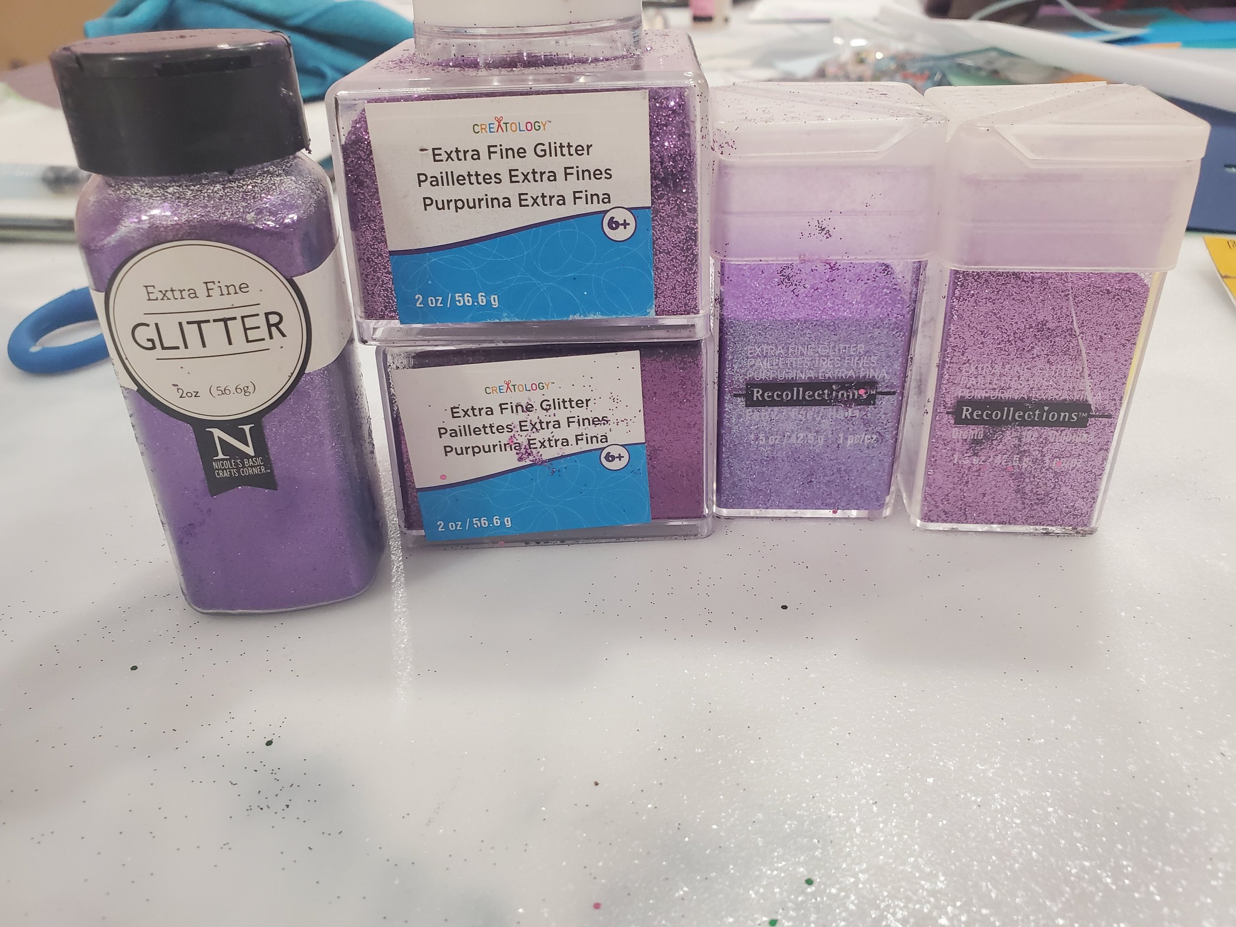
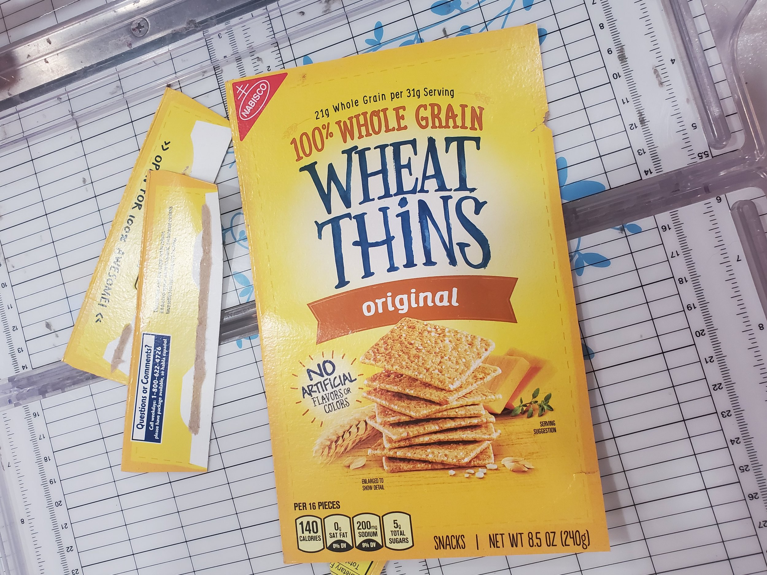
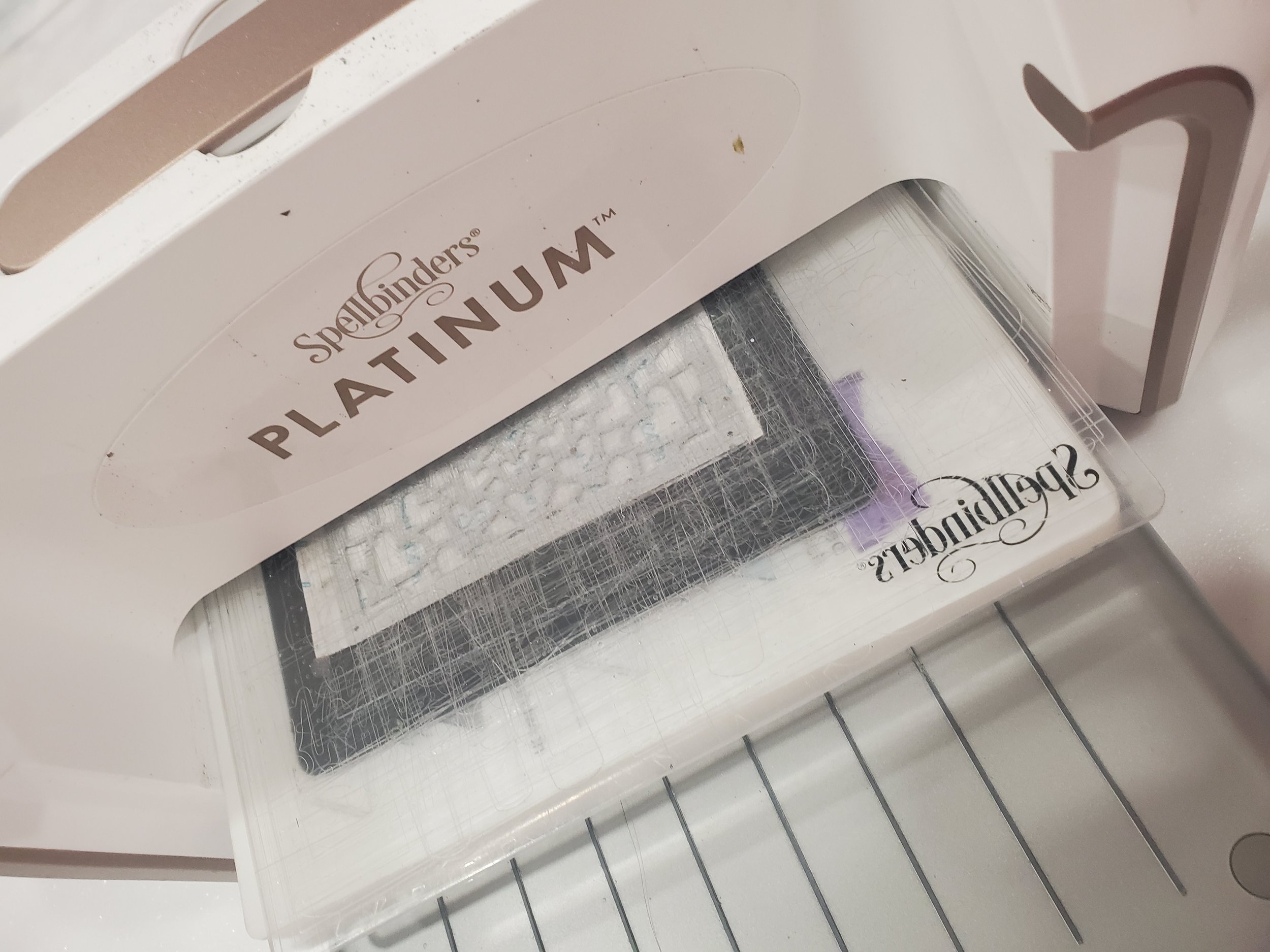
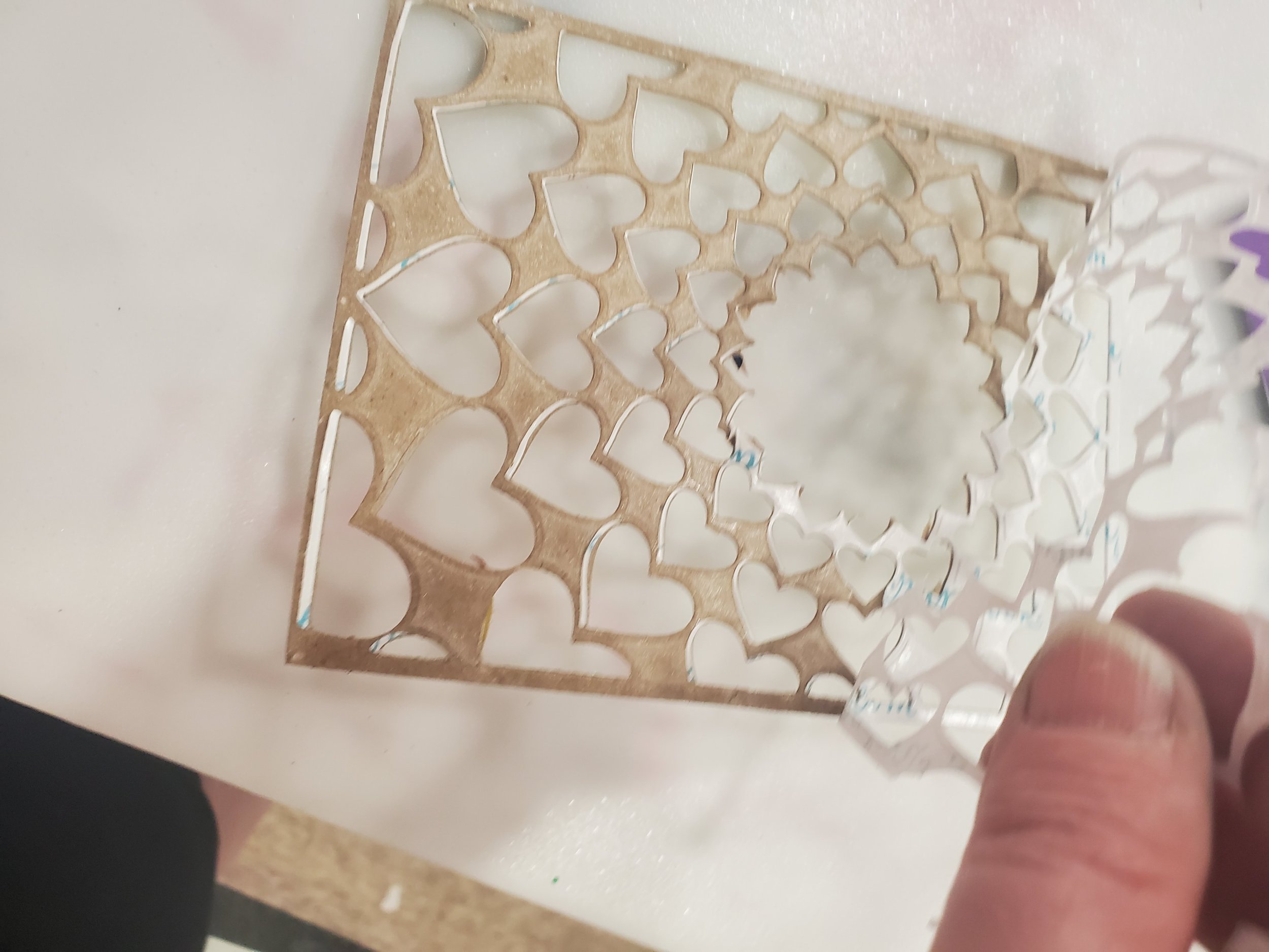
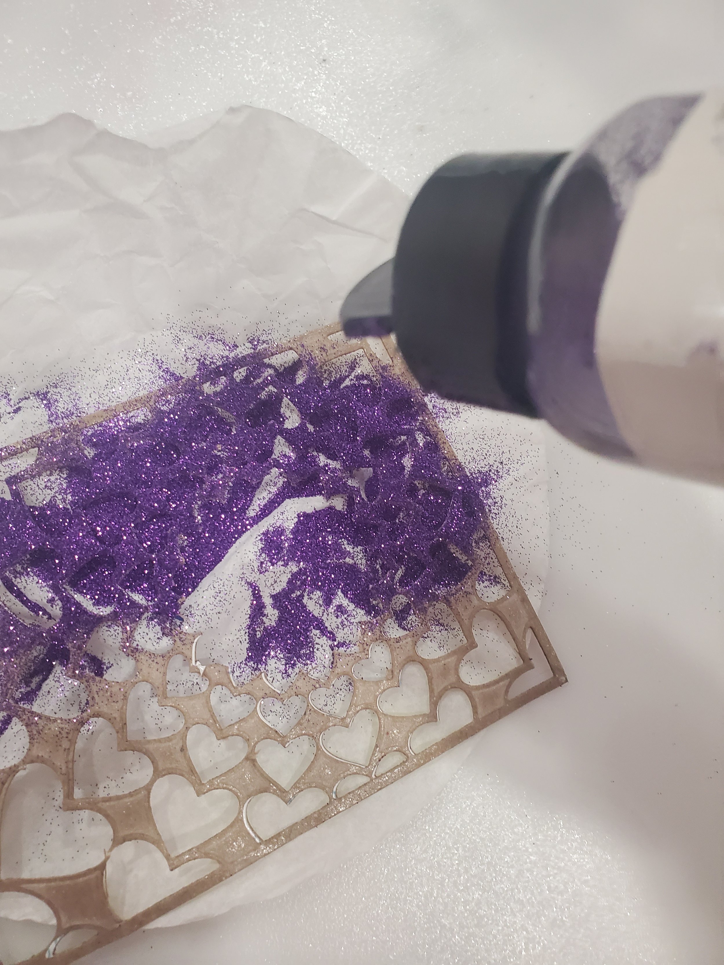
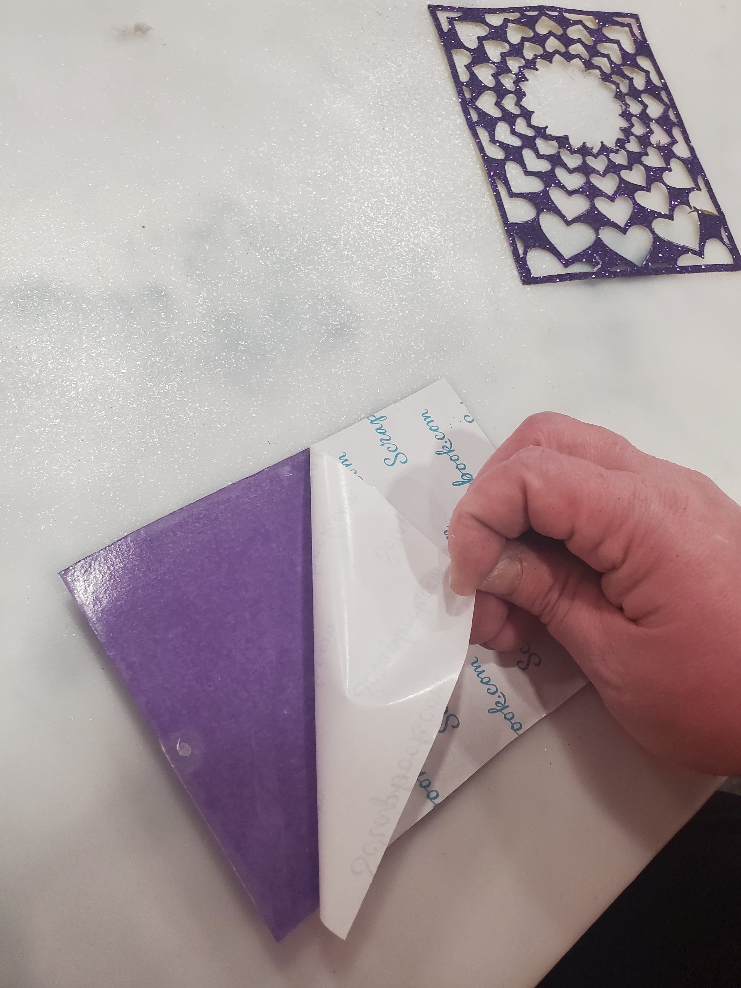
For both of these cards, I employed the same fundamental steps demonstrated in the gallery below, with a minor variation in the glitter colors and the choice of Altenew cover dies. In the M1 card, I utilized the Altenew Tangled Loops Cover die, while the F1 card featured the Altenew Radial Hearts Cover die. By customizing the glitter colors and selecting distinct cover dies, I was able to infuse each card with a unique character while adhering to the foundational steps outlined in the gallery. This allowed me to explore creative variations and cater to specific themes or preferences, resulting in two remarkable and individualized creations. Additionally, I took the opportunity to incorporate recycled elements into the card designs, in this case, the background of the cards which subsequently added structural strength to the project as well as adding a delightful touch of sustainability and creativity. The combination of recycled elements and the chosen techniques resulted in cards that were not only visually captivating but also carried a meaningful message of sustainability and creativity. I am a firm believer, as are most crafters I have met, that you never toss usable elements because you never know when inspiration will strike.
In the gallery below, you will find images of the essential materials needed for the card creation process, along with the technique I utilized. The key factors that make this crafting technique truly exceptional are the selection of the cover die and the artful application of glitter. By carefully choosing the cover die, you set the stage for a captivating design and determine the style, theme, and visual impact of the finished creation. Equally important is the way you spread the glitter. This step adds a touch of sparkle and elegance to the card. With a deliberate and thoughtful approach, you can achieve a mesmerizing effect that catches the light and captures attention. The artful distribution of glitter enhances the overall visual appeal, making your card truly stand out and say to the viewer that it is a one-of-a-kind creation.
Background Finishing Steps
The next step involved trimming the backgrounds to their final dimensions, matting them, and adhering them to card bases. As will all of the cards in this set we have to stay true to the overarching theme, so all the feminine cards feature continue to incorporate shades of purple for both the mat and the card base, while the masculine cards continue to showcase various tones of blue for the mat and a complementary kraft-colored card base.

M2 sentiment raised on pop dots
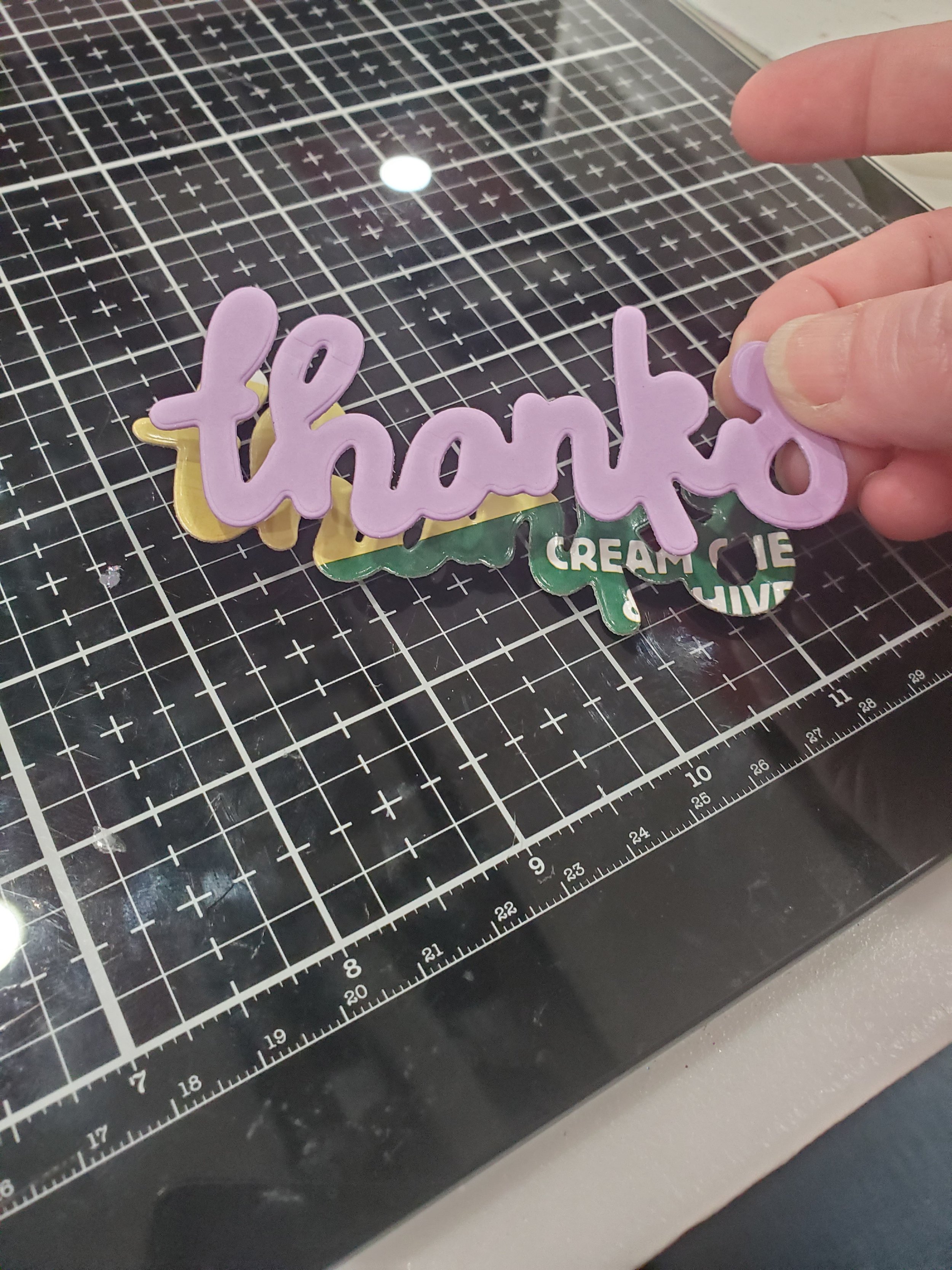
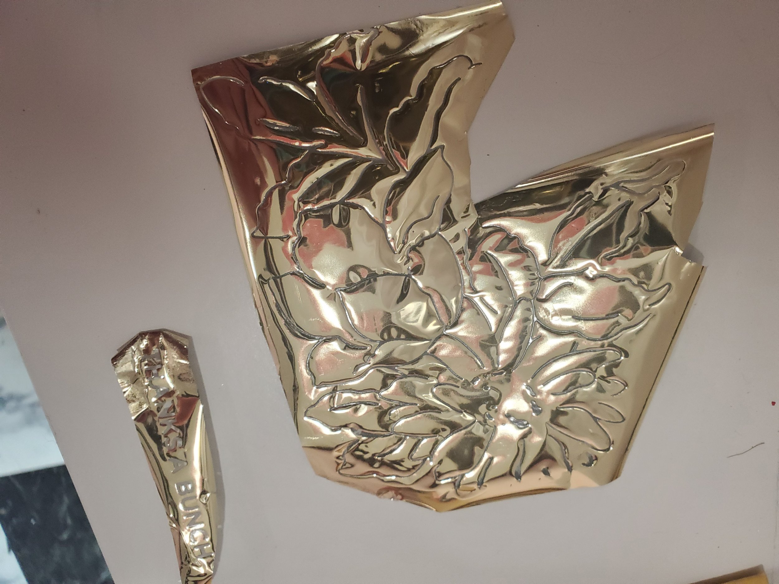
To complete both cards, I incorporated sentiments that were cut out from matching cardstock, reflecting the respective themes of the designs. Utilizing Altenew dies from my collection, I carefully crafted sentiments that perfectly complemented the overall aesthetics. For the F1 card, I opted to directly mount the sentiment onto the card background, allowing it to seamlessly blend with the design. This choice ensured a cohesive and unified look, emphasizing the card's intended theme. On the other hand, for the M1 card, I felt that extra touch was needed to enhance its visual impact. To achieve this, I used pop dots to mount the sentiment onto the background. This raised the sentiment slightly, creating a subtle dimension and adding a touch of depth to the overall composition. The pop dots provided a visually pleasing contrast and ensured that the sentiment stood out in an eye-catching manner.
Boutique F2 Card Construction
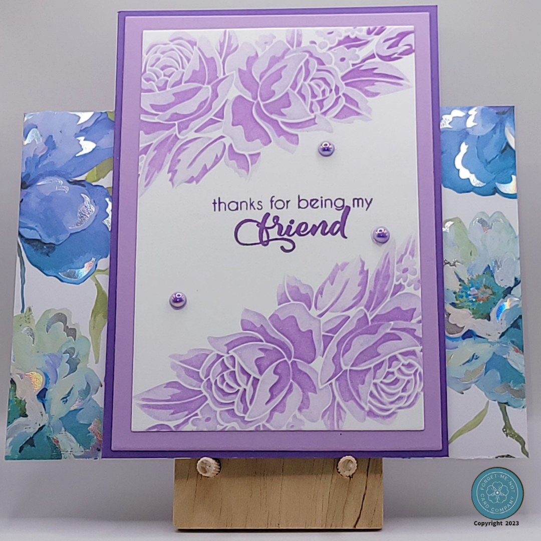
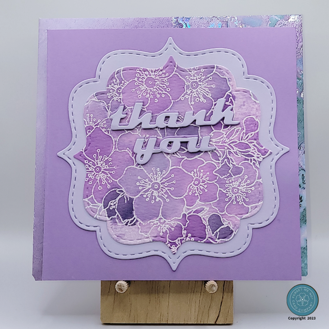
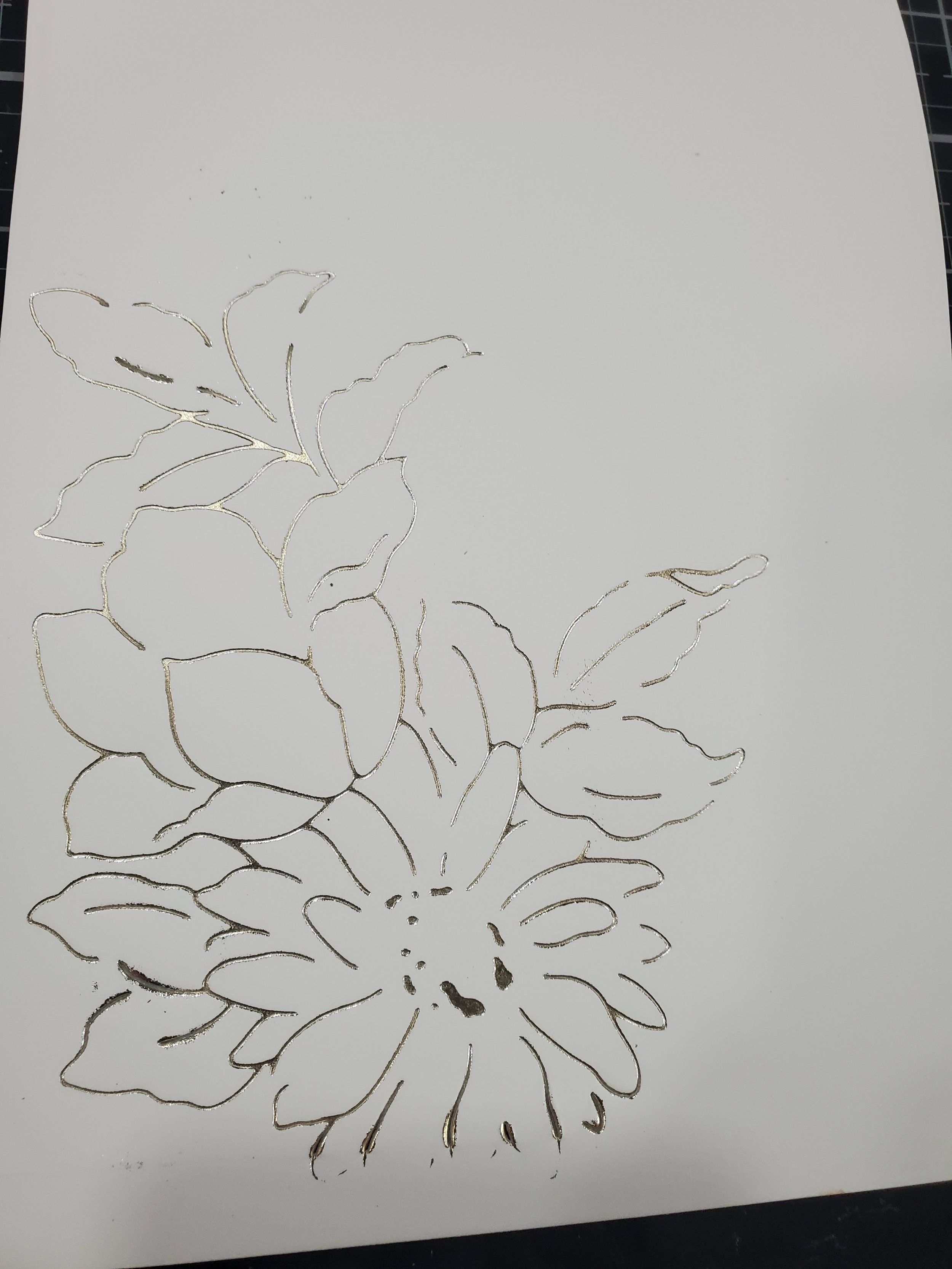
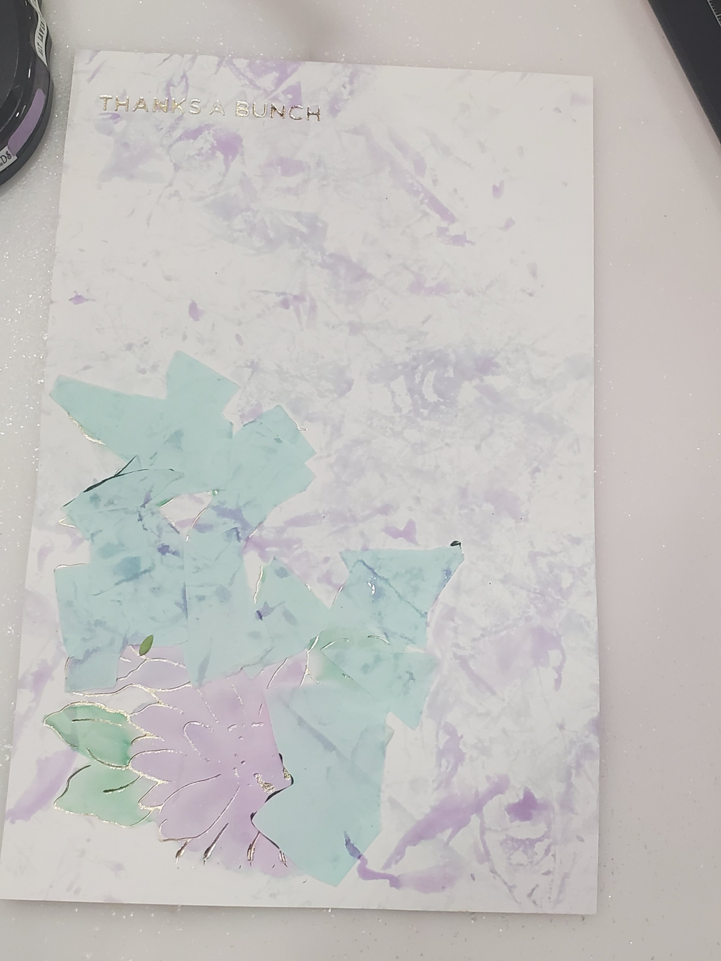
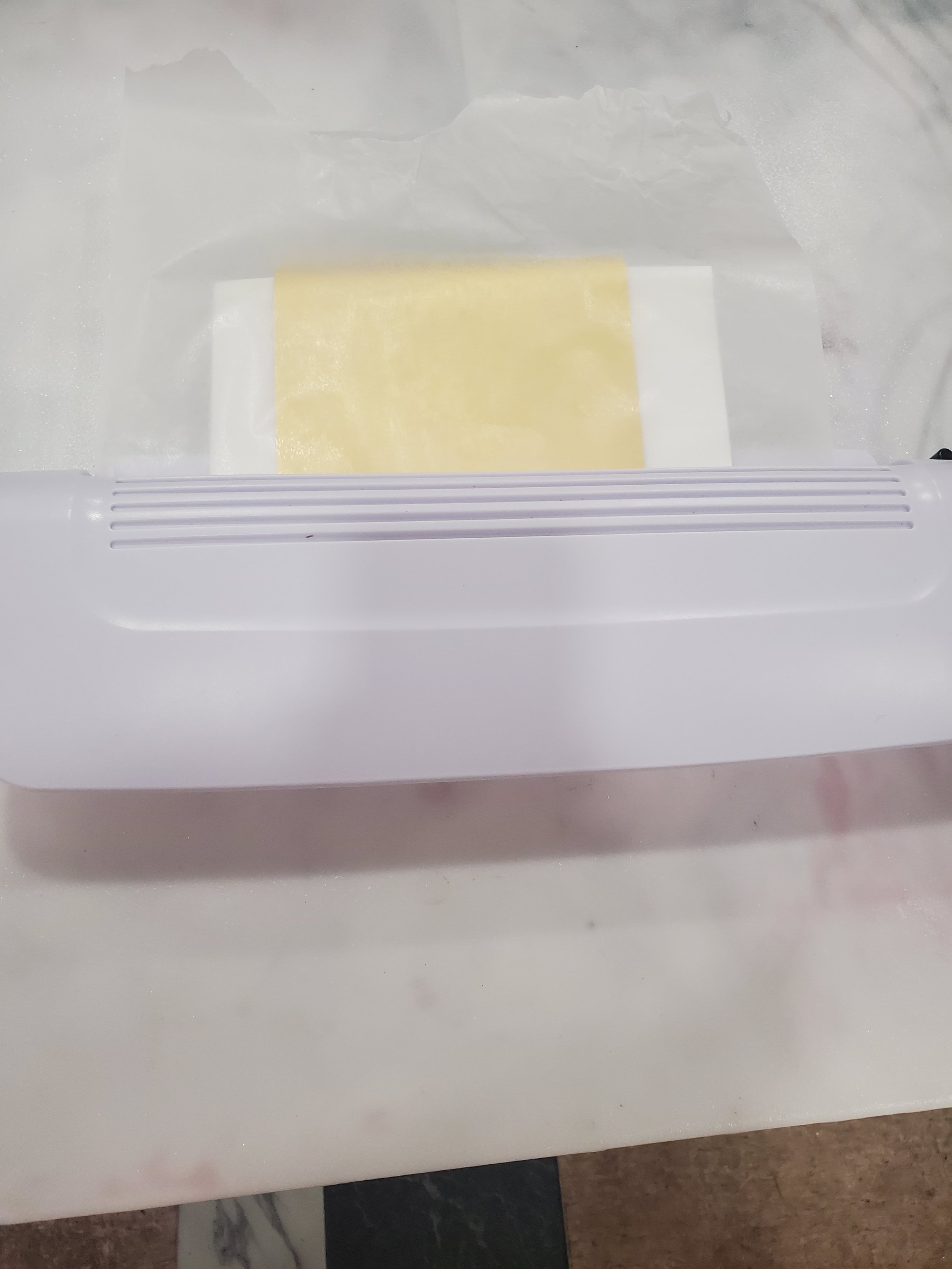
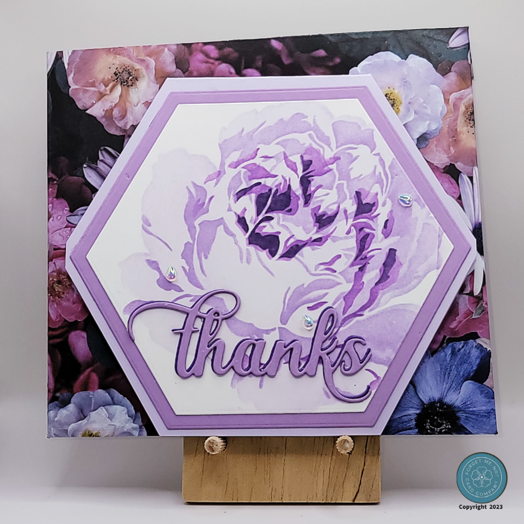
The gallery below presents the step-by-step process for creating the Boutique F2 card. In both the F2 and M2 cards, I incorporated gold foil, but with distinctly different application methods that yielded similar results. Specifically, for the F2 card, I opted for a Glimmer plate and utilized my Spellbinders Glimmer Hot Foil machine to achieve the outcome depicted in the second image. For this card, my intention was to achieve a super clean and sharp look, which proved highly attainable using the method described. I also aimed to have a delicate touch of color as well as maintaining a consistent color scheme, so I employed the technique depicted to simulate watercolors with the same inks as the rest of the "Hers" set. This approach allowed me to infuse subtle hues into the design while ensuring cohesiveness.
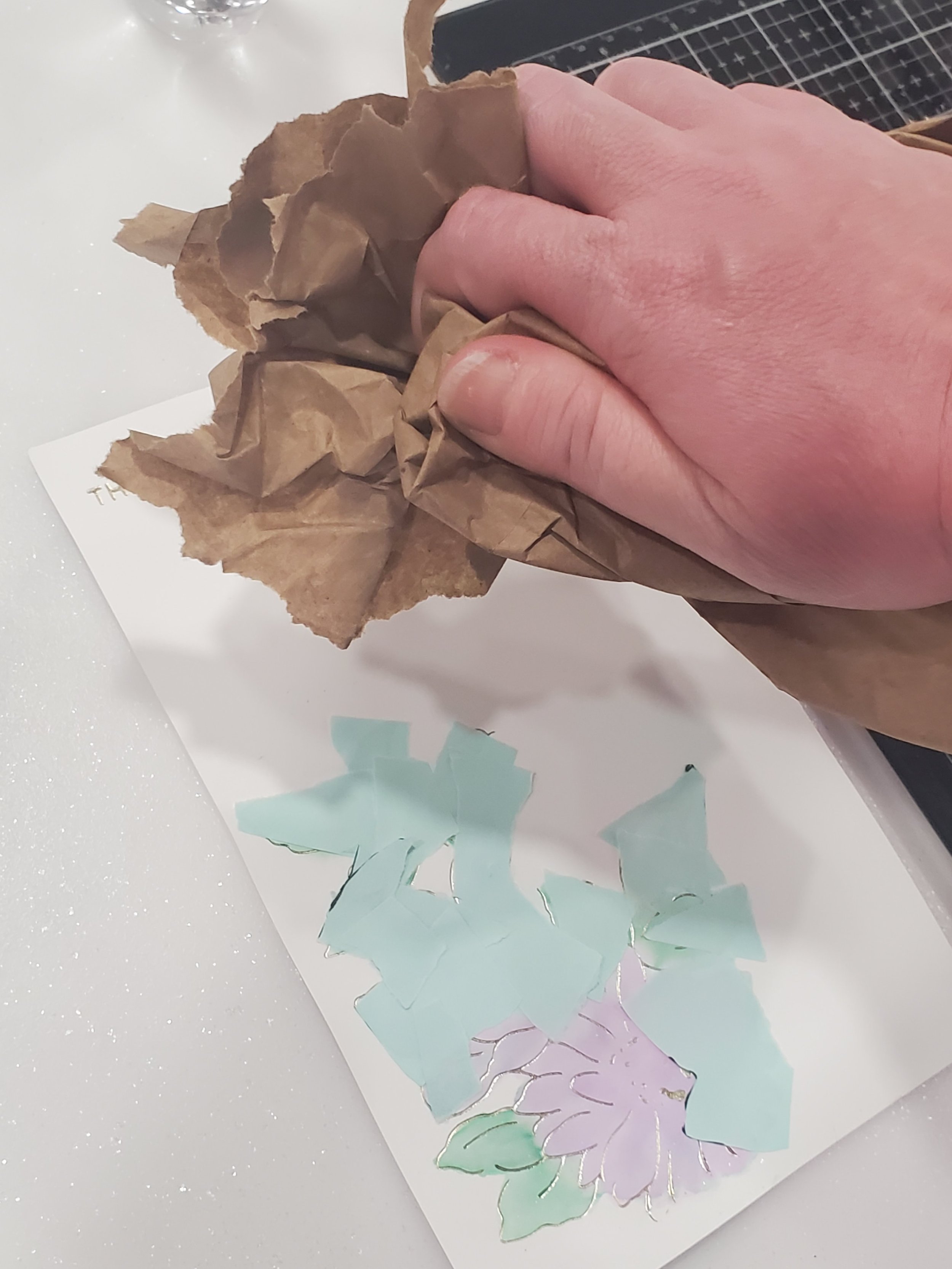
To enhance the background, I incorporated yet another recycled element by utilizing leftover brown packing paper from a recent crafting supply delivery. This ingenious repurposing added a textured backdrop that contributed to the card's overall uniqueness. What makes it even more intriguing is that even though I possess the same paper and ink, I can never recreate the exact same background design. This element of unpredictability and one-of-a-kind appeal is incredibly enticing and adds an extra layer of charm to the finished card.
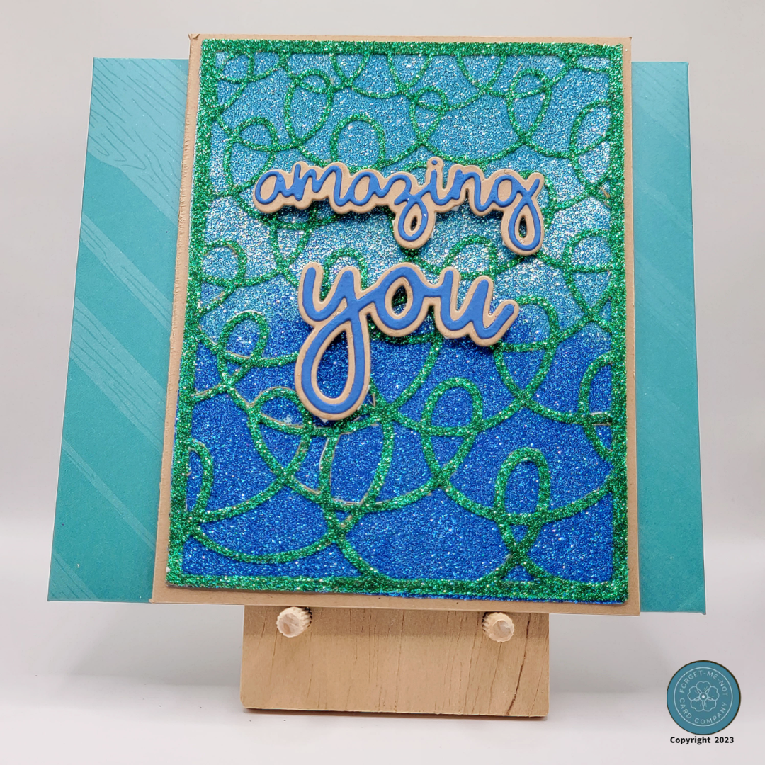
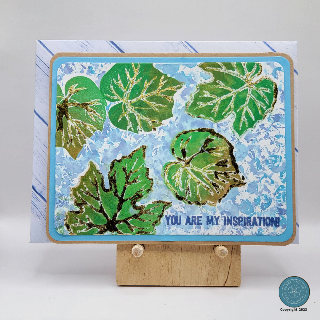
Boutique M2 Card Construction
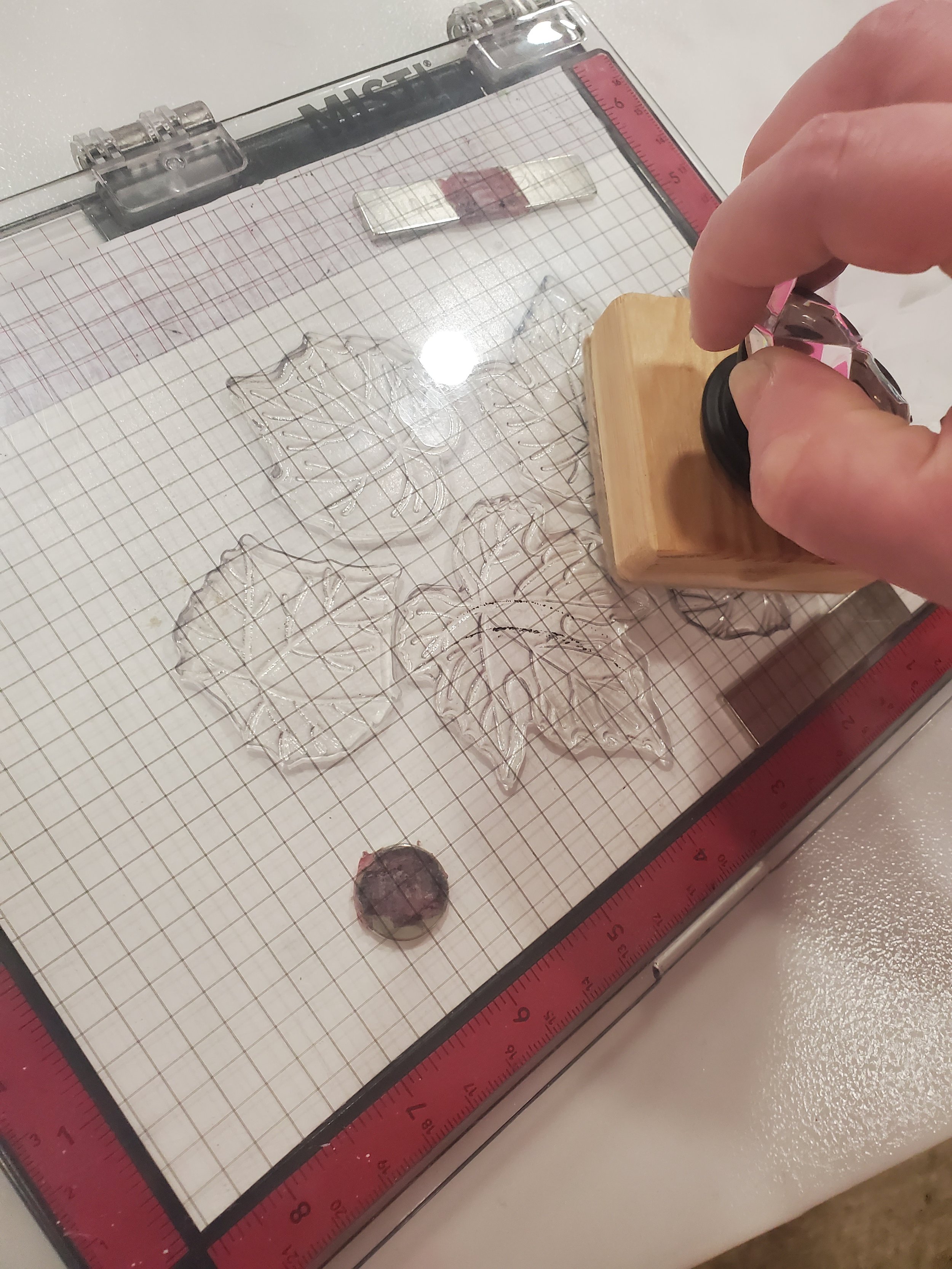
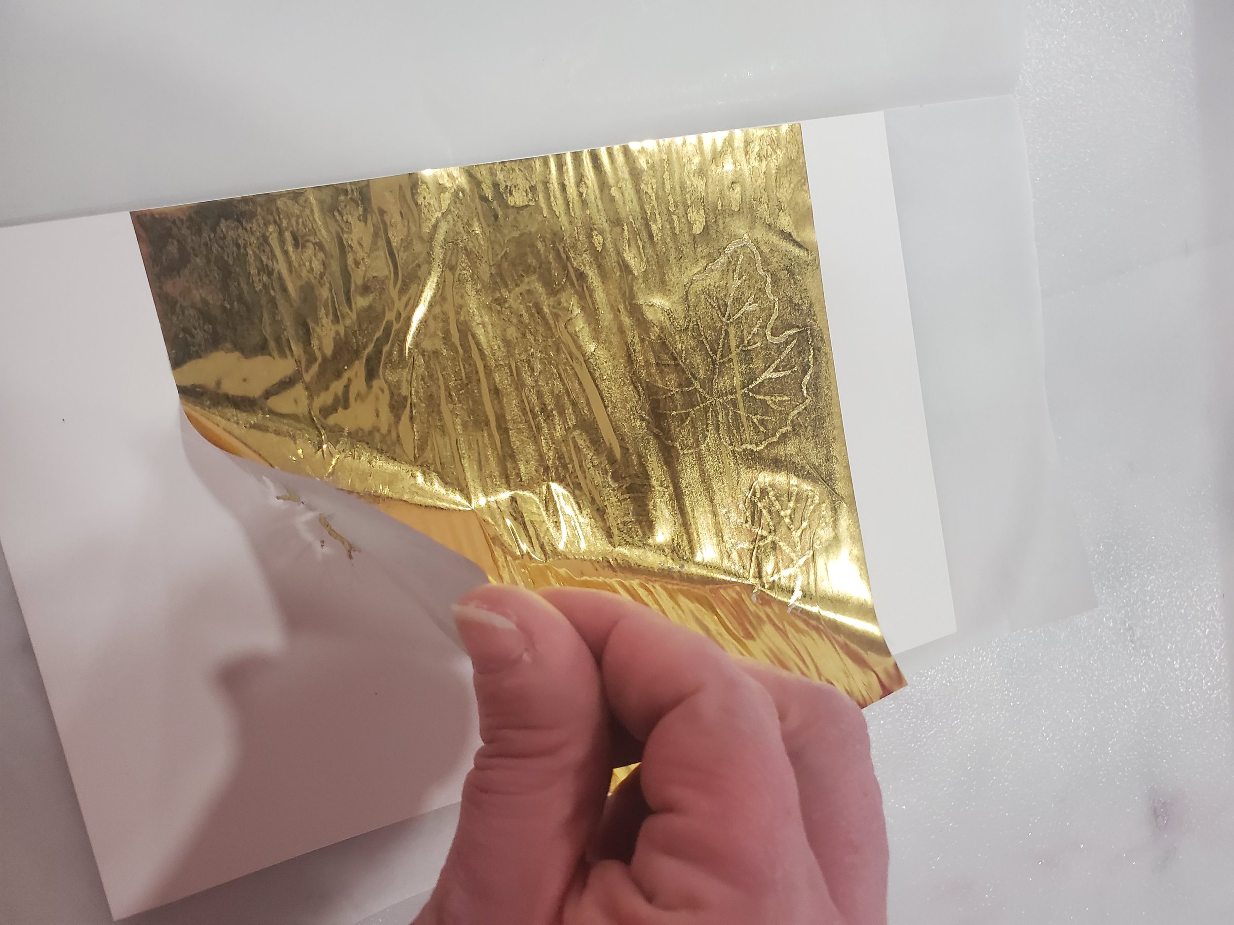
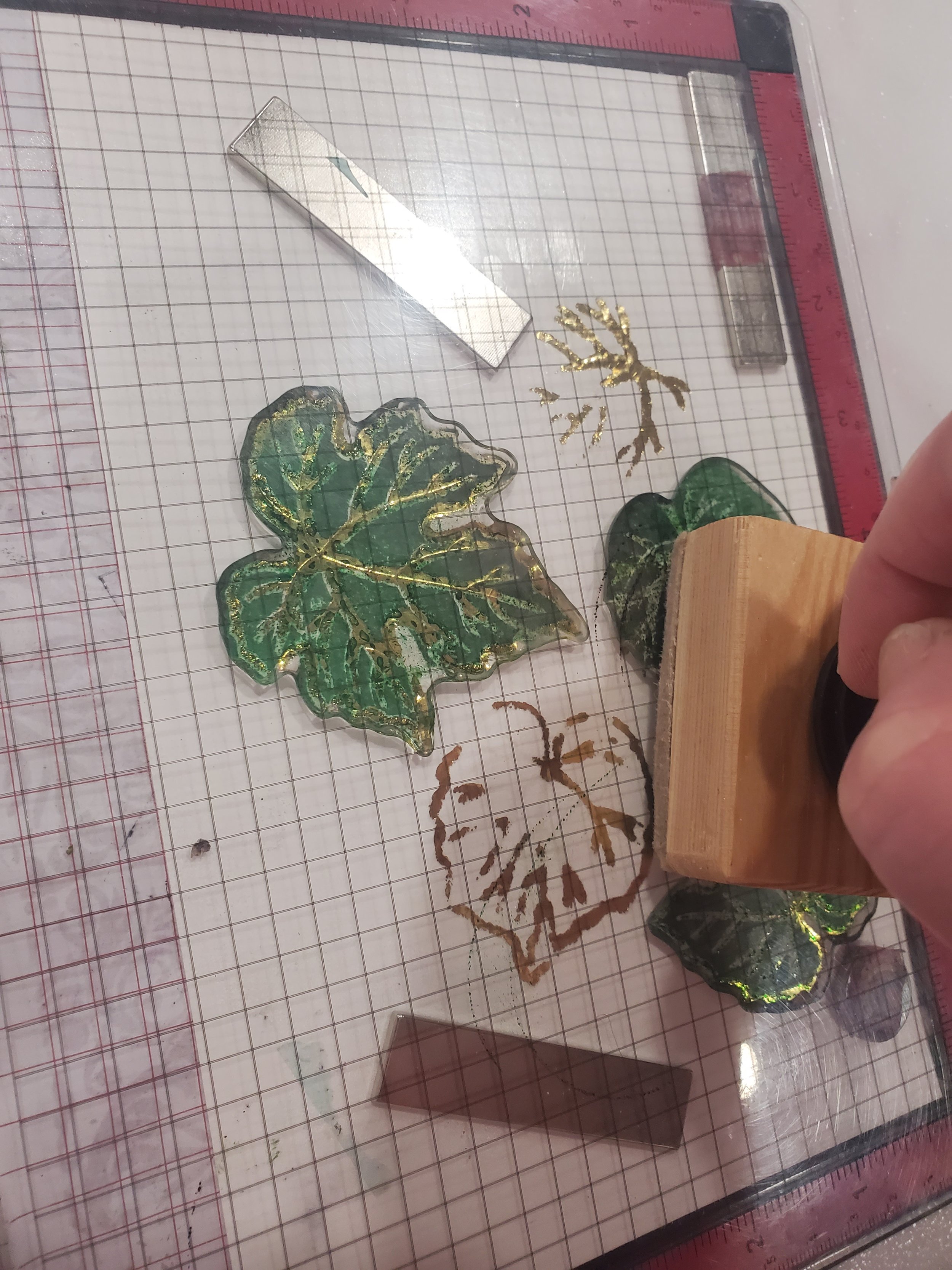
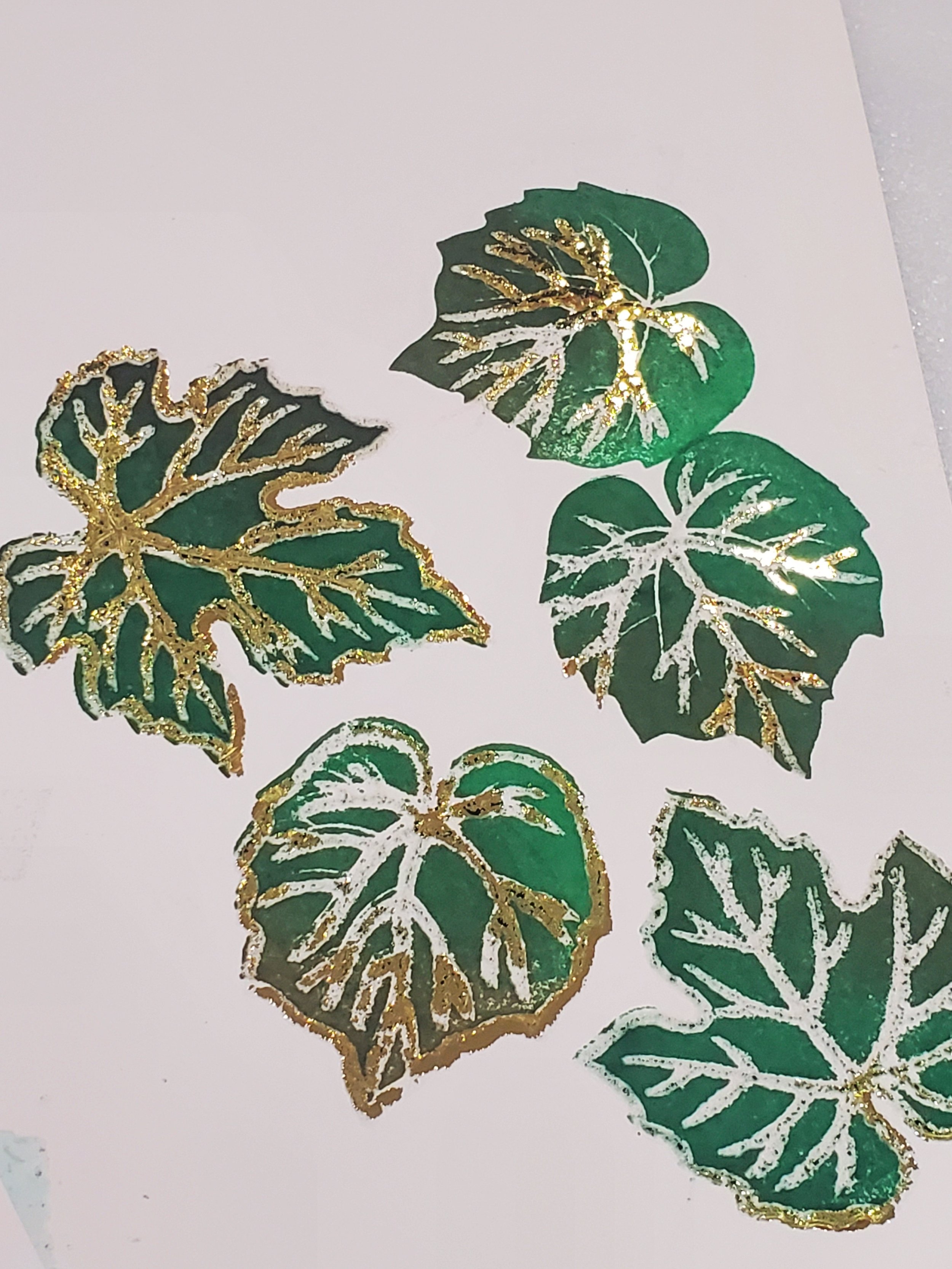
The gallery below presents the step-by-step process for creating the Boutique M2 card. Similar to the previous card, my intention was to incorporate gold foil, but this time I aimed for a different effect. Instead of crisp and refined detailing, I sought to create a blocky and rugged appearance, evoking a more masculine aesthetic. By placing the foil over the unmelted embossing and then running it through the laminator you can achieve this appearance. The application of green ink over the foil had a remarkable effect on the leaves as well, making them the most distinctive feature of the card. The combination of the stamped green ink and the foil created a contrast that emphasizes the details of the leaves making them stand out.
After carefully cutting out the leaves using the corresponding die set and positioning them against the background, the leaves seamlessly blended with the overall design, enhancing its visual appeal and adding a touch of natural beauty and definitely bringing to mind that it is definitely a masculine card.

Background Finishing Steps

The next step involved trimming the backgrounds to their final dimensions, matting them, and adhering them to card bases. As with all of the cards in this set we have to stay true to the overarching theme, so all the feminine cards feature continue to incorporate shades of purple for both the mat and the card base, while the masculine cards continue to showcase various tones of blue for the mat and a complementary kraft-colored card base.
For the sentiment for the F2, I wanted to carry forth both the elegance of the gold foil and the background coloring to pull the whole card together. To do this I simply stamped the sentiment in an area I knew was not in my finished card area but would still be covered with the brown paper and ink technique I used. That way all I needed to do was to use a sentiment die from collection to cut it out and mount it to the card using pop dots to provide dimension to the card.
The sentiment for the M2 card was intentionally designed to be simple. As I mentioned earlier the idea was to make the blocky gold foiled leaves be the show stopper so a simple stamped sentiment completed the look for this card.
Celebration Stencil Cards


Incorporating stencils into the crafting process offers numerous benefits. From ensuring consistency and saving time and costs to providing ease of use and precision, stencils are a valuable tool. Personally, I find great joy in using stencils alongside techniques like ink blending, embossing, and texture paste applications, as they add a beautiful finish to my designs.
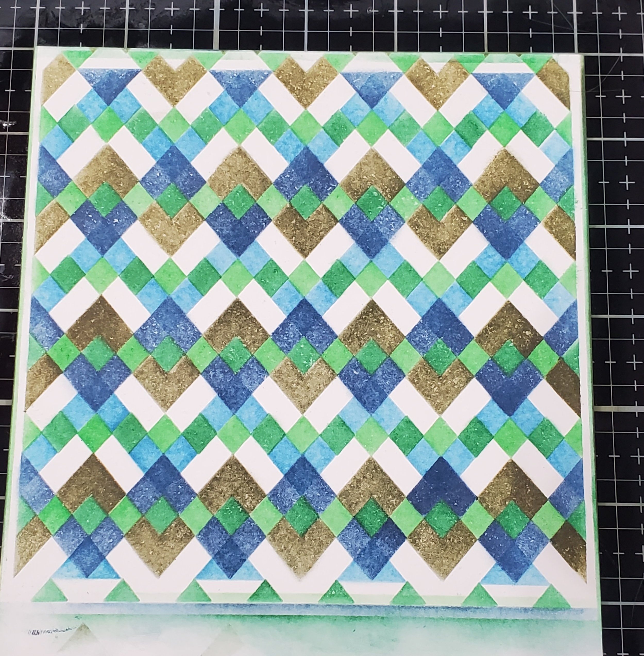
Creating the F1 and F2 Stencil Cards
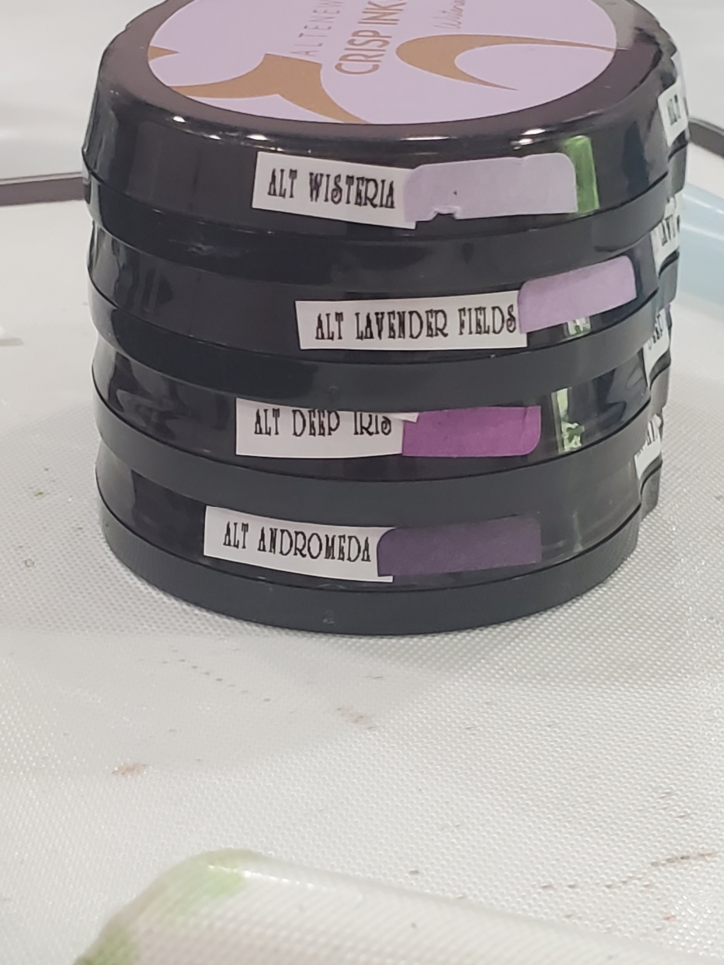
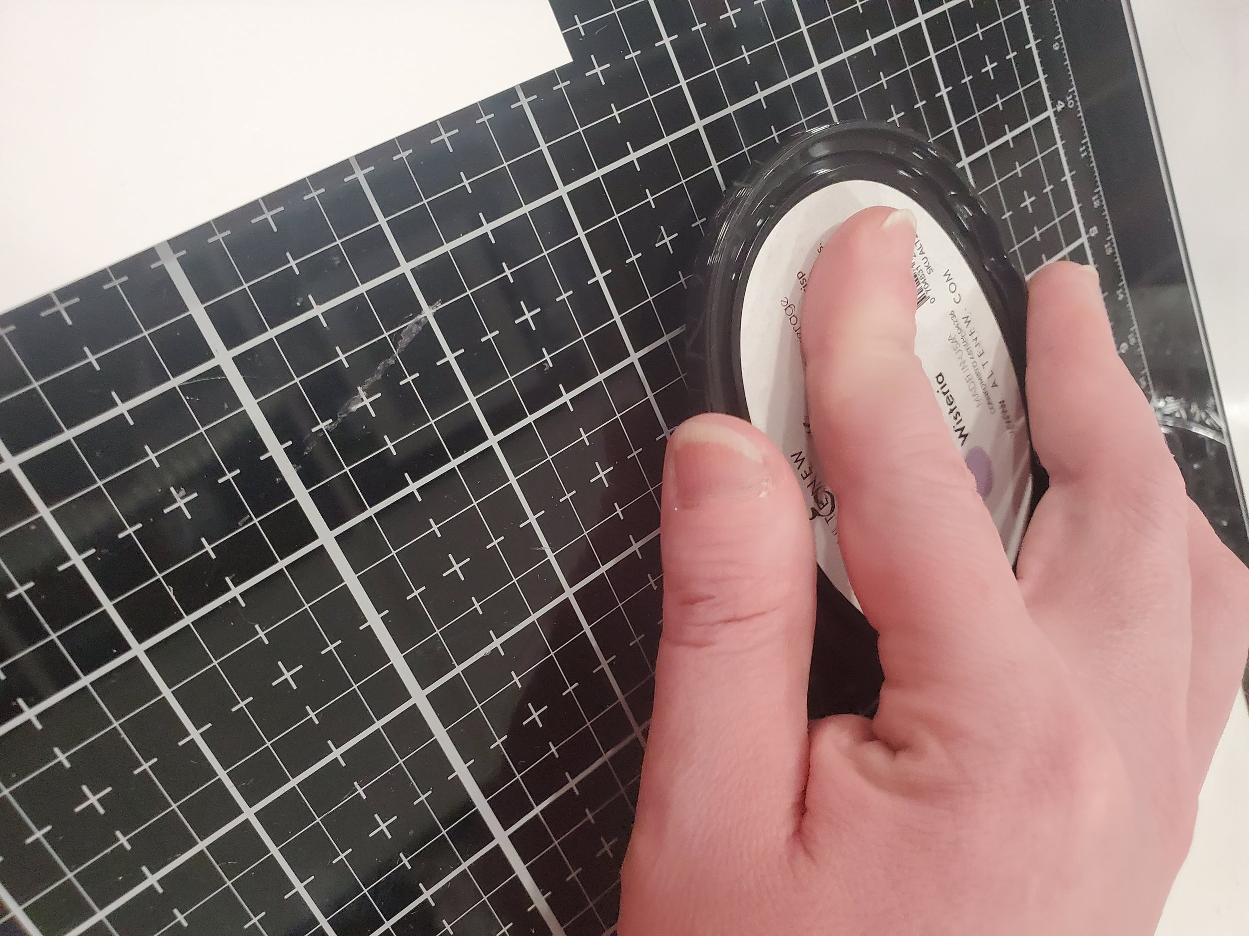
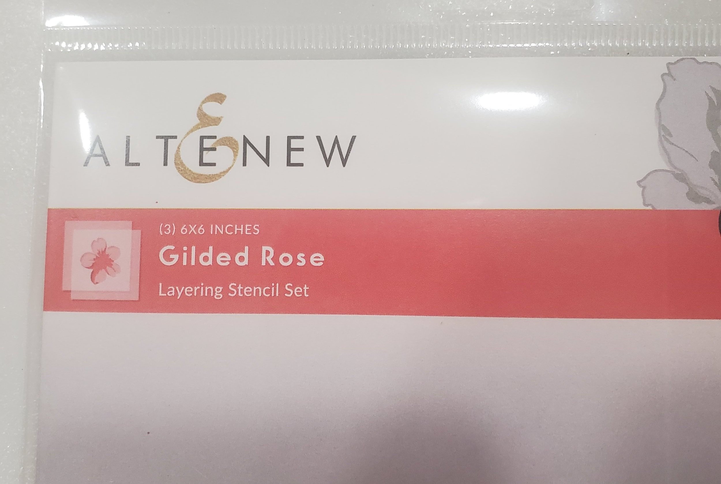
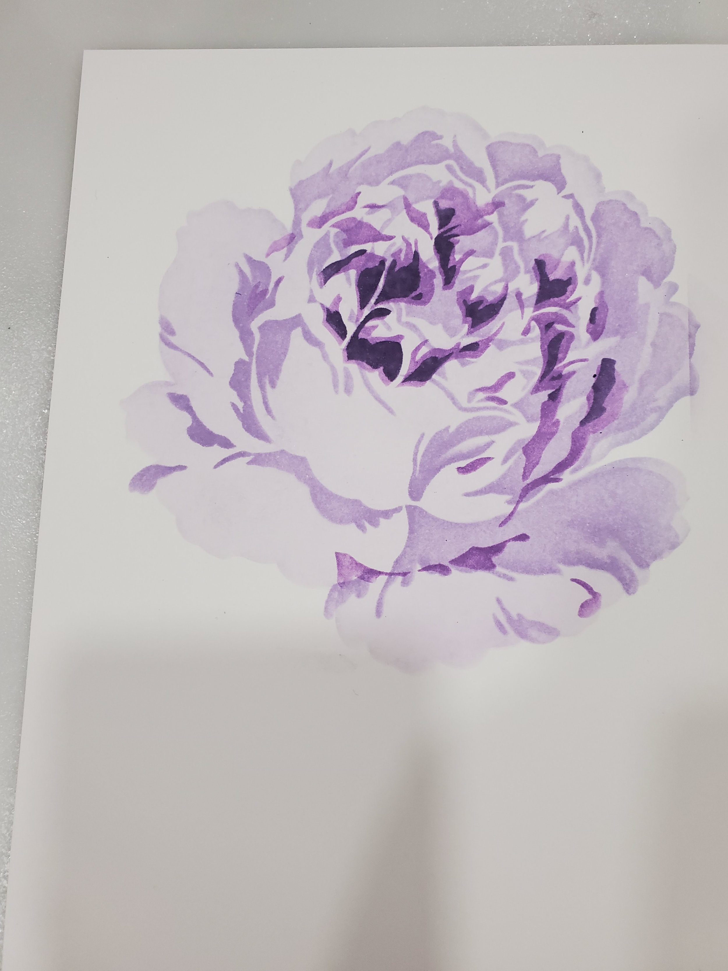
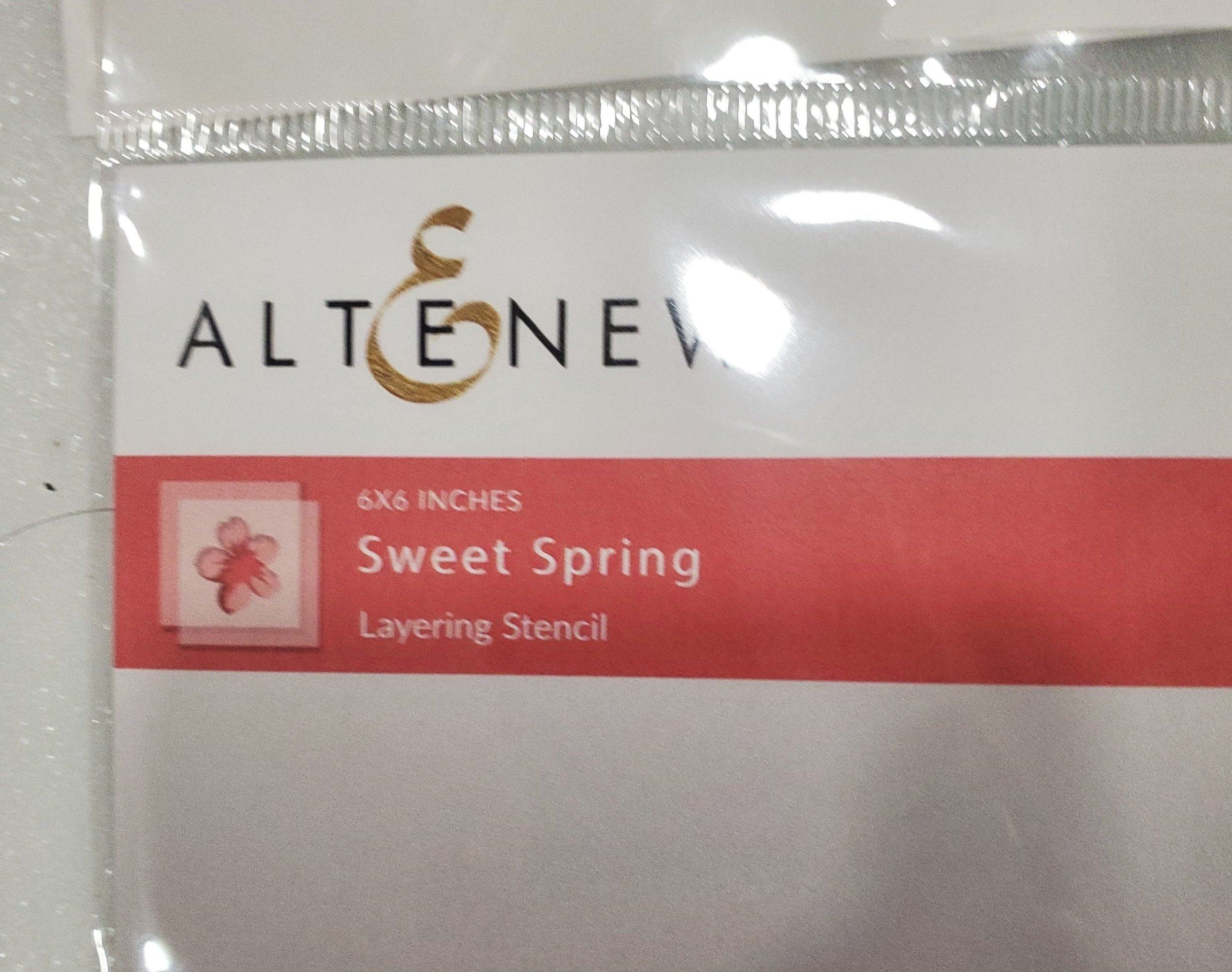
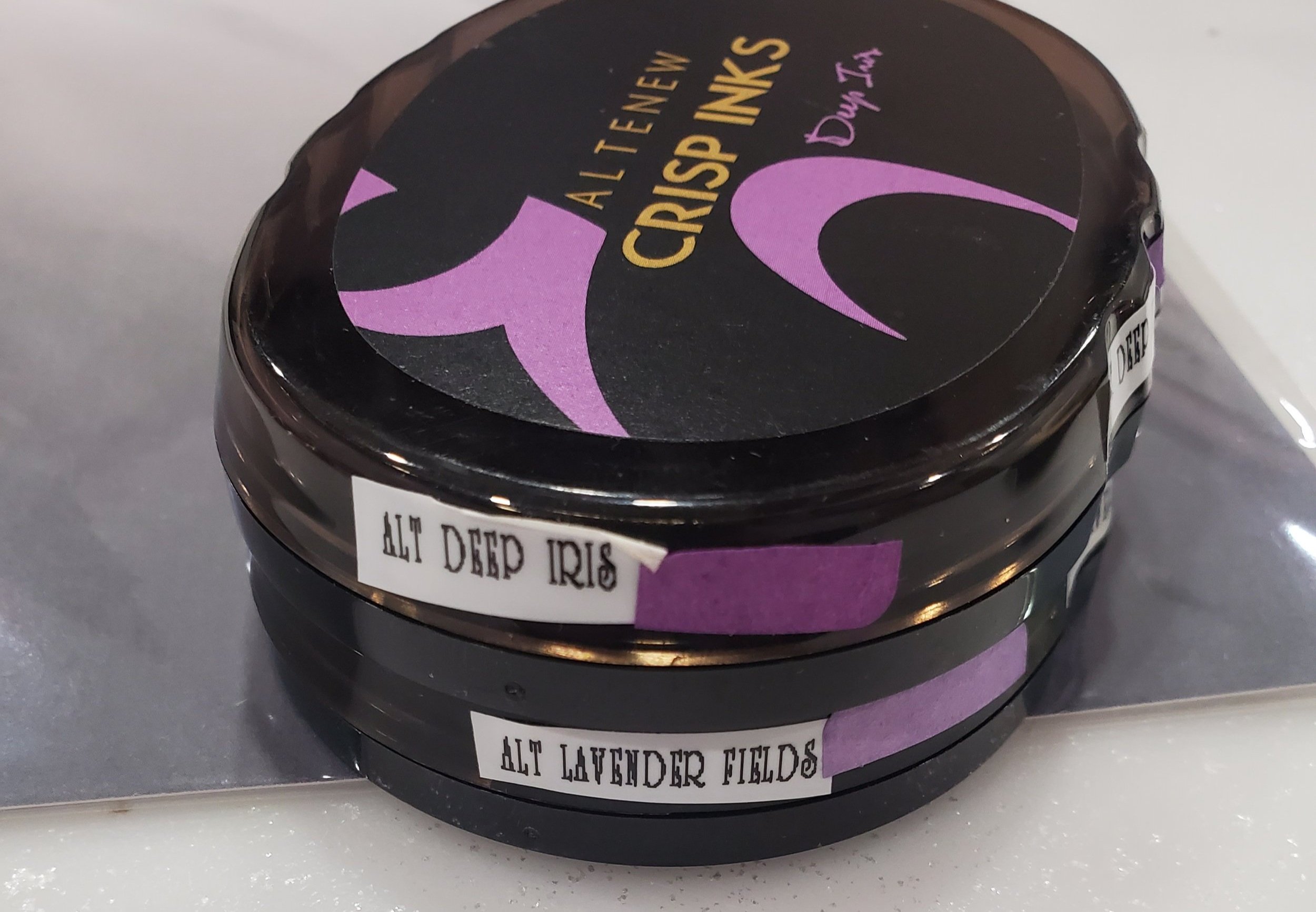
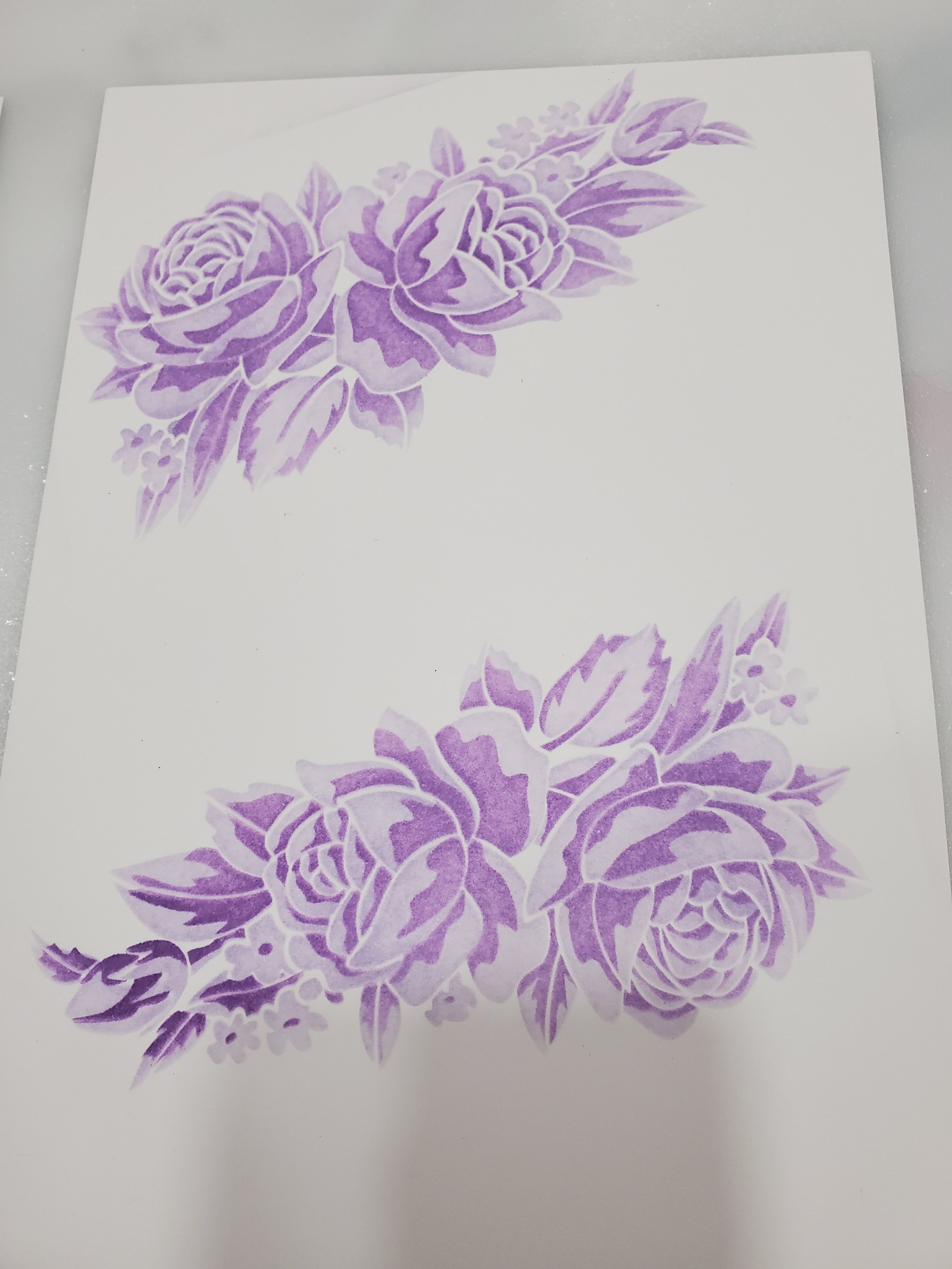
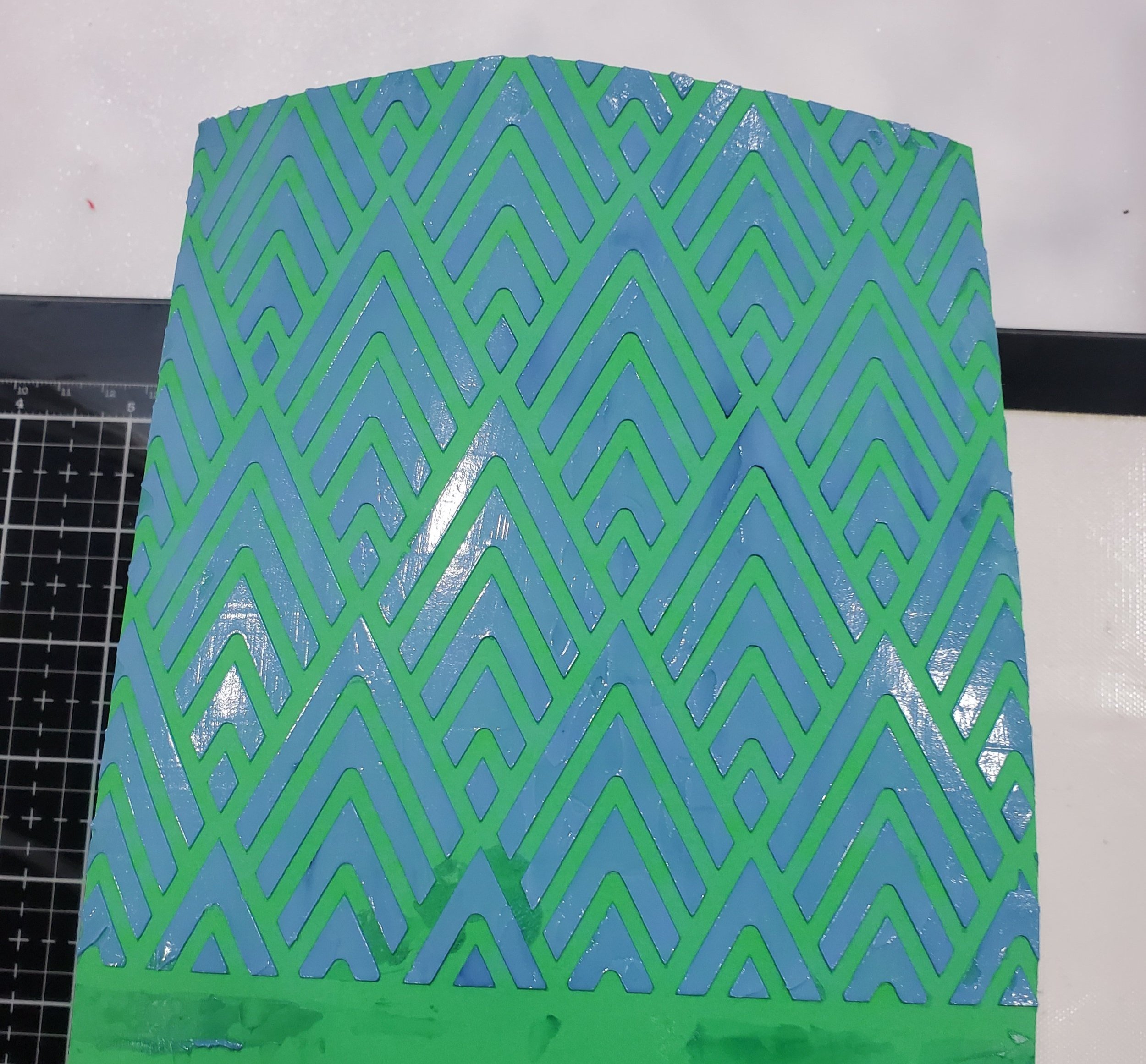
In the gallery below, you'll find the stencils and inks I used for the two "Hers" cards in this assessment. These particular stencils, called layering stencils from Altenew, might seem intimidating if you haven't tried them before, as I hadn't until the Celebration Stenciling module. The reason for their initial complexity, which is actually unfounded, is that depending on the image you're creating, you may have multiple layers to work with. But don't worry, they are actually very easy to align, and some even come with numbered stencils. With a little practice, you'll be able to create stunning works of art in no time at all.
For both of these cards, I ink-blended the colors to my desired hues, allowed them to dry, and then moved to the next stencil, making the process super simple. The result turned out fantastic. The next step involved trimming the backgrounds to their final dimensions, matting them, and adhering them to card bases. As with all of the cards in this set we have to stay true to the overarching theme, so all the feminine cards feature continue to incorporate shades of purple for both the mat and the card base. The sentiment for the F1 card was a double-stacked die cut and surface mounted to the card. As for the F2 card I chose to keep it simple with a stamped sentiment but then give it dimension with a few flat-back pearls.
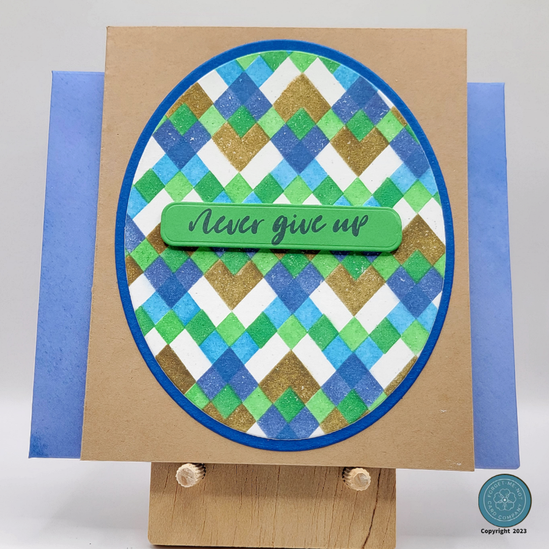
Creating the M1 and M2 Stencil Cards
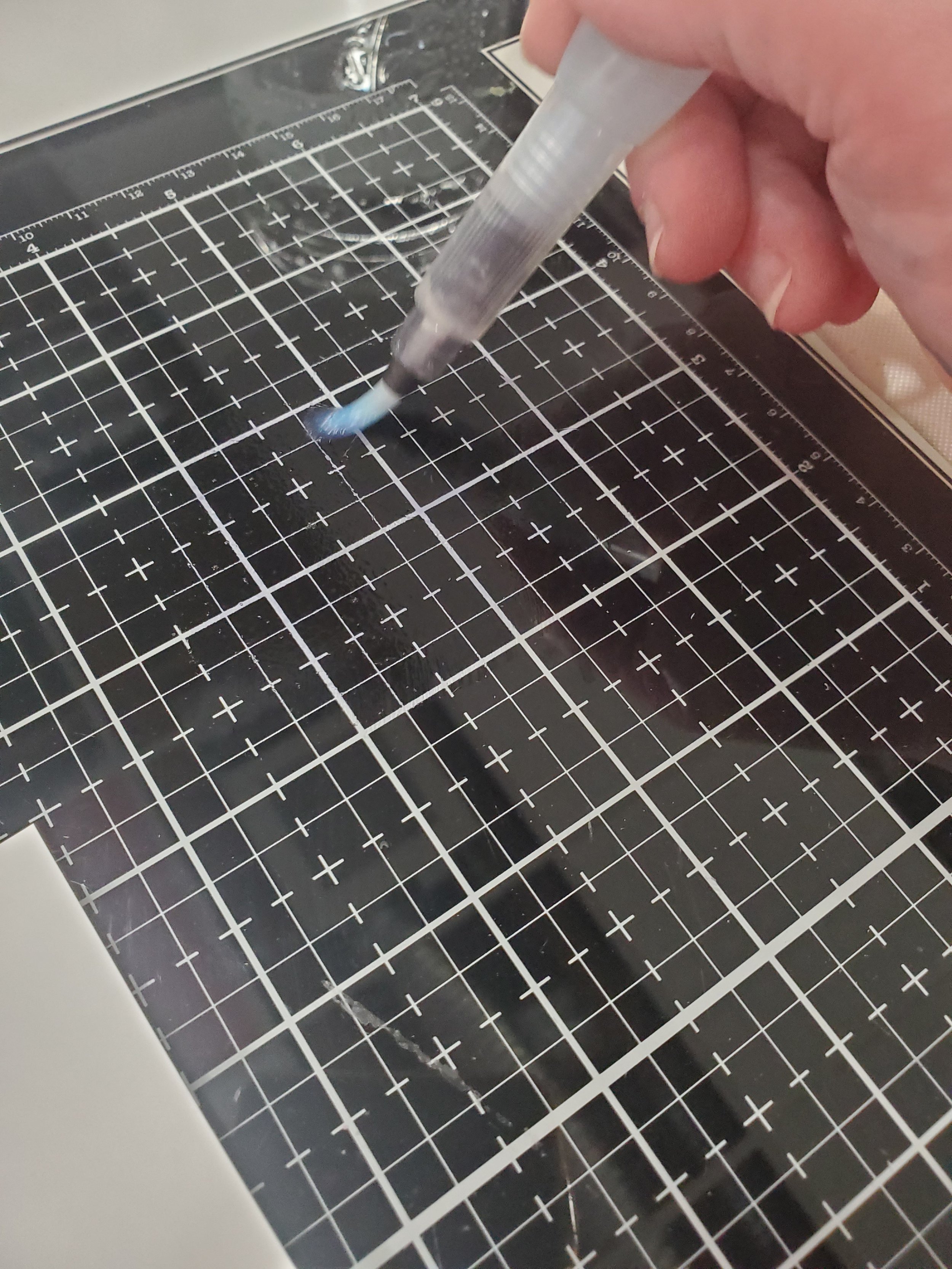
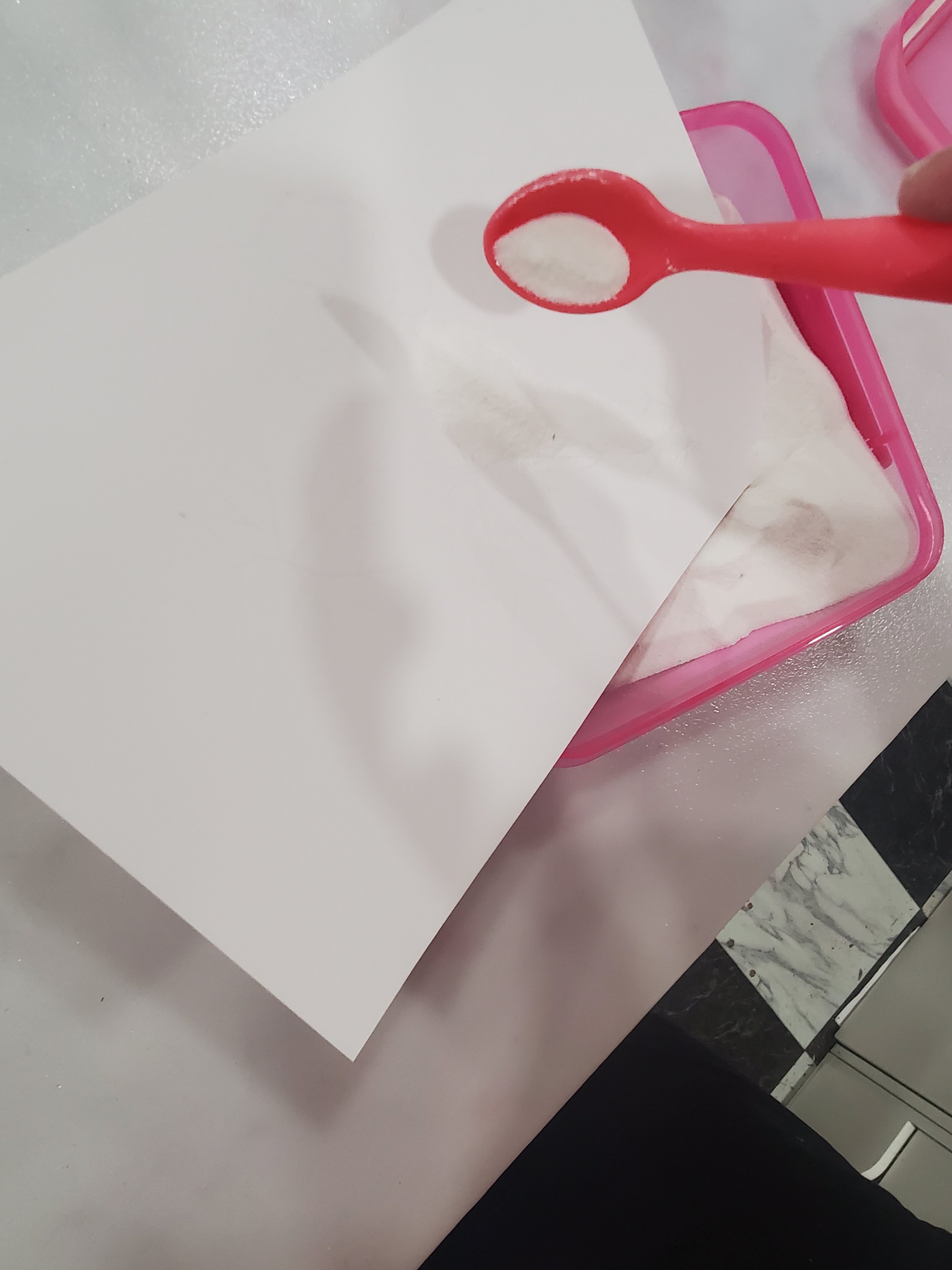
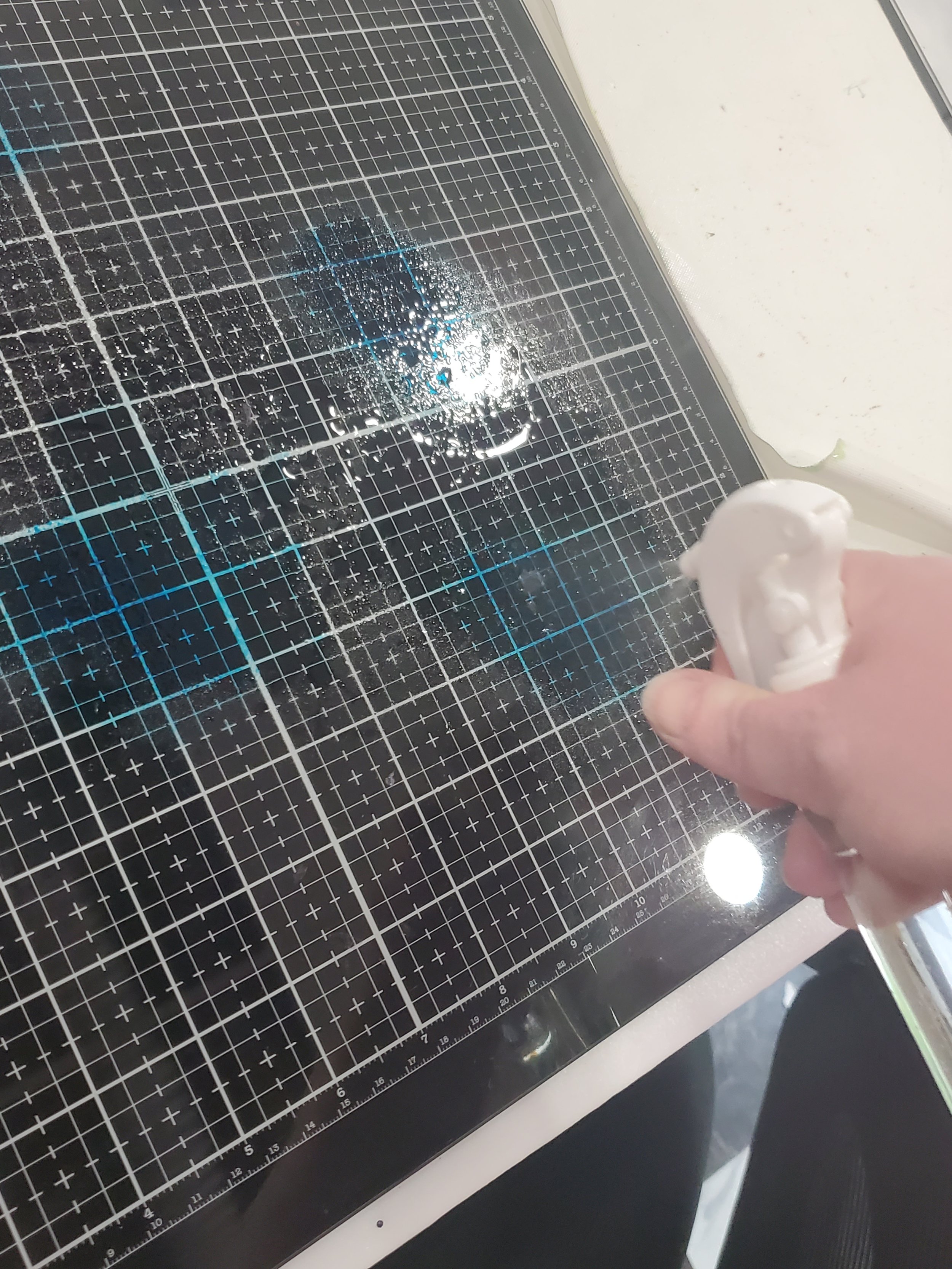
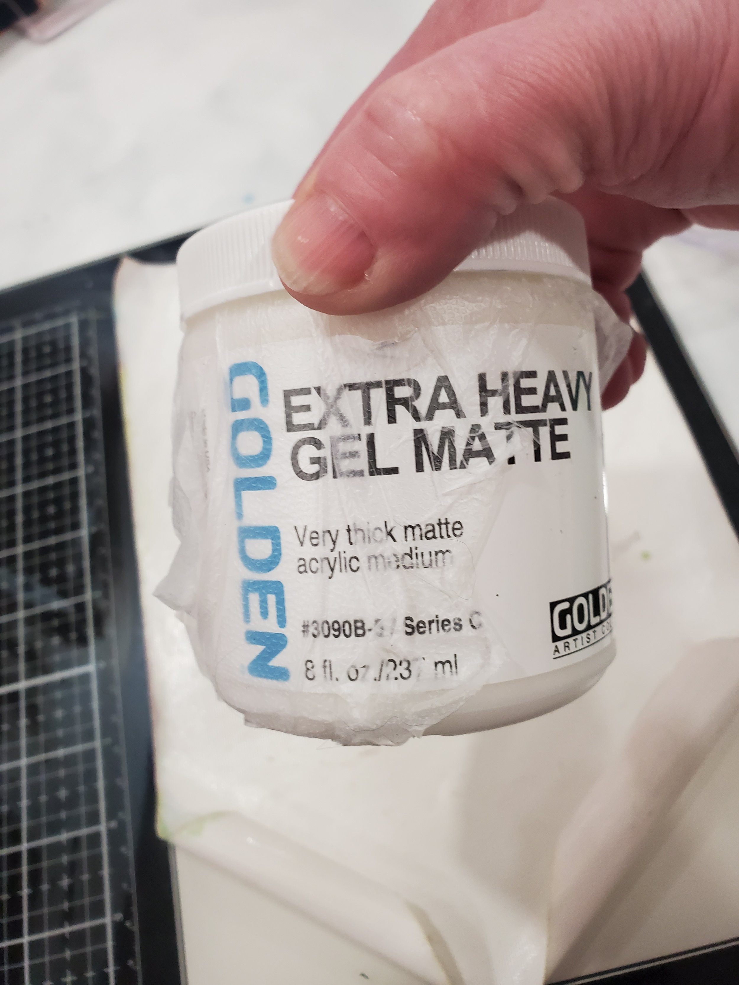
Initially, I had a lukewarm opinion about using Gel Matte for card making, thinking it could only provide some texture. However, my perception completely changed when I stumbled upon a post demonstrating how to color Gel Matte. To my amazement, by simply adding a smudge of ink onto a glass mat and mixing it with the Gel Matte, you can achieve an endless array of colors. I've since used this technique numerous times and highly recommend incorporating it into your creative endeavors. It opens up a whole new world of possibilities and adds a stunning touch to your artwork.
The next step involved trimming the backgrounds to their final dimensions, matting them, and adhering them to card bases. As with all of the cards in this set, we have to stay true to the overarching theme, so the masculine cards continue to showcase various tones of blue for the mat and a complementary kraft-colored card base. The sentiments for both cards were raised off the background with pop-dots which I recommend that you do with cards of this type because the Gel Matte texture makes surface mounting and/or stamping directly on to the card an unattractive option. I also incorporated more of my recycled product for the stripes on the M2 card as well as the mat of the sentiment as the color and material matched the card base perfectly.
Caution: It is advisable to use Gel Matte in a well-ventilated space. The fumes released during the drying process of the gel can be strong, and prolonged exposure to these fumes in an enclosed area may cause discomfort or respiratory irritation. To ensure safety, consider working near an open window or using a fan to promote air circulation. If you experience any adverse reactions, such as difficulty breathing or dizziness, cease the activity and move to a well-ventilated area.
The Packaging
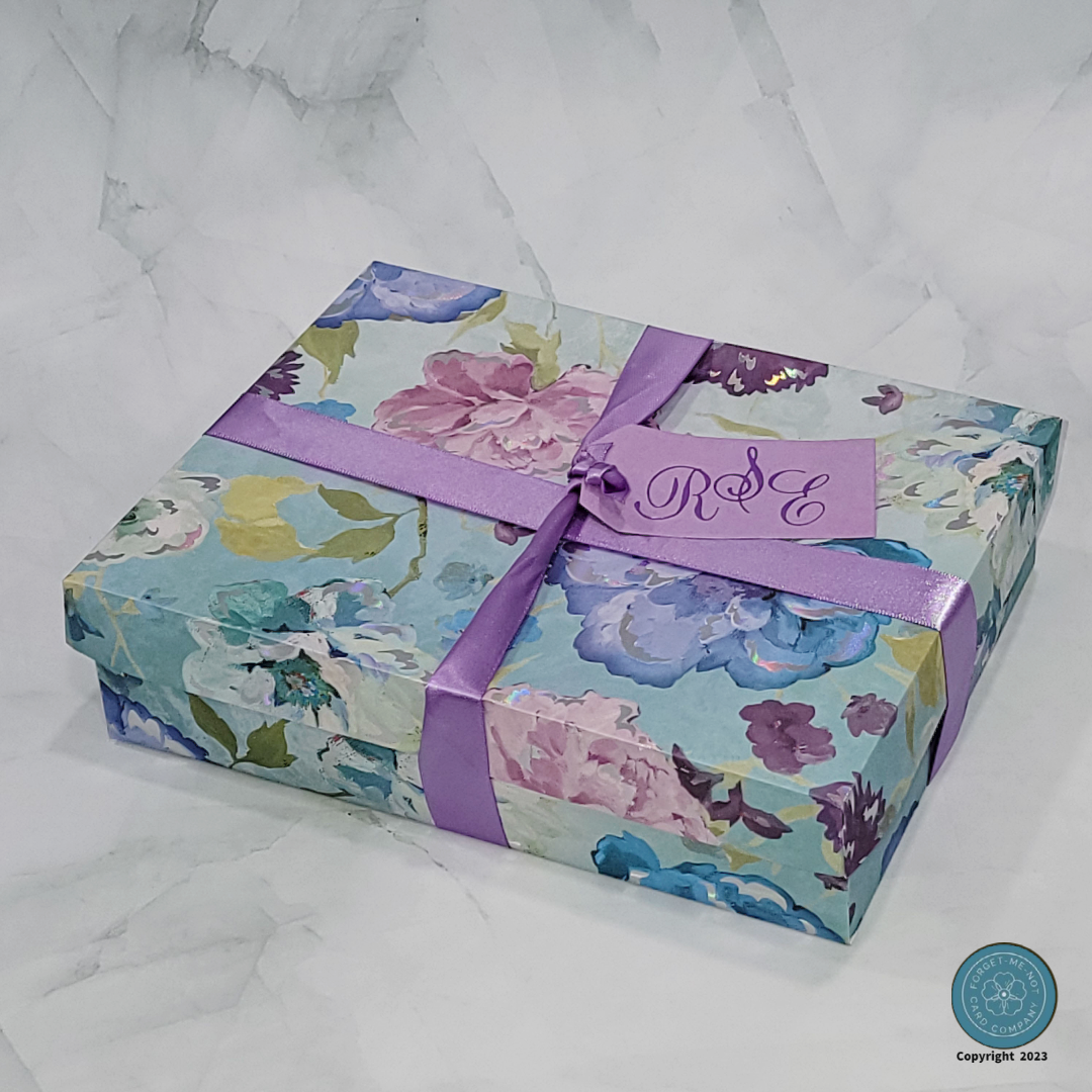
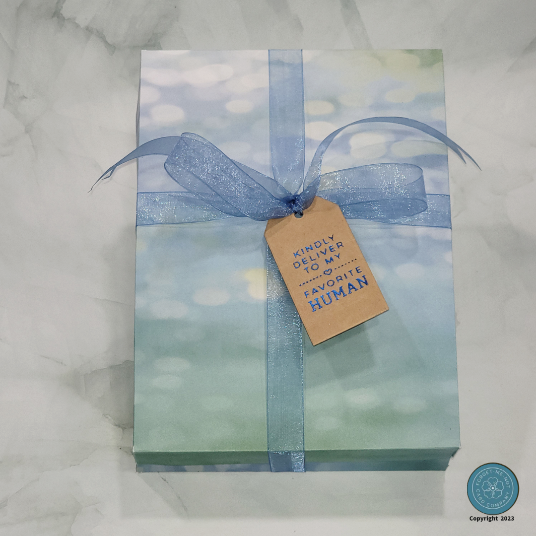
The importance of a remarkable package for any great card set cannot be overstated. With that in mind, my objective was to fashion an extraordinary packaging that not only aligned with the overarching design goal of creating a distinct His and Her set of cards but also seamlessly carried forth the color schemes. The aim was to evoke a sense of sophistication and coherence, establishing a visual harmony with the cards themselves, and by incorporating elements that resonate with the intended recipients, the packaging acts as an enticing gateway to the world of the cards within.
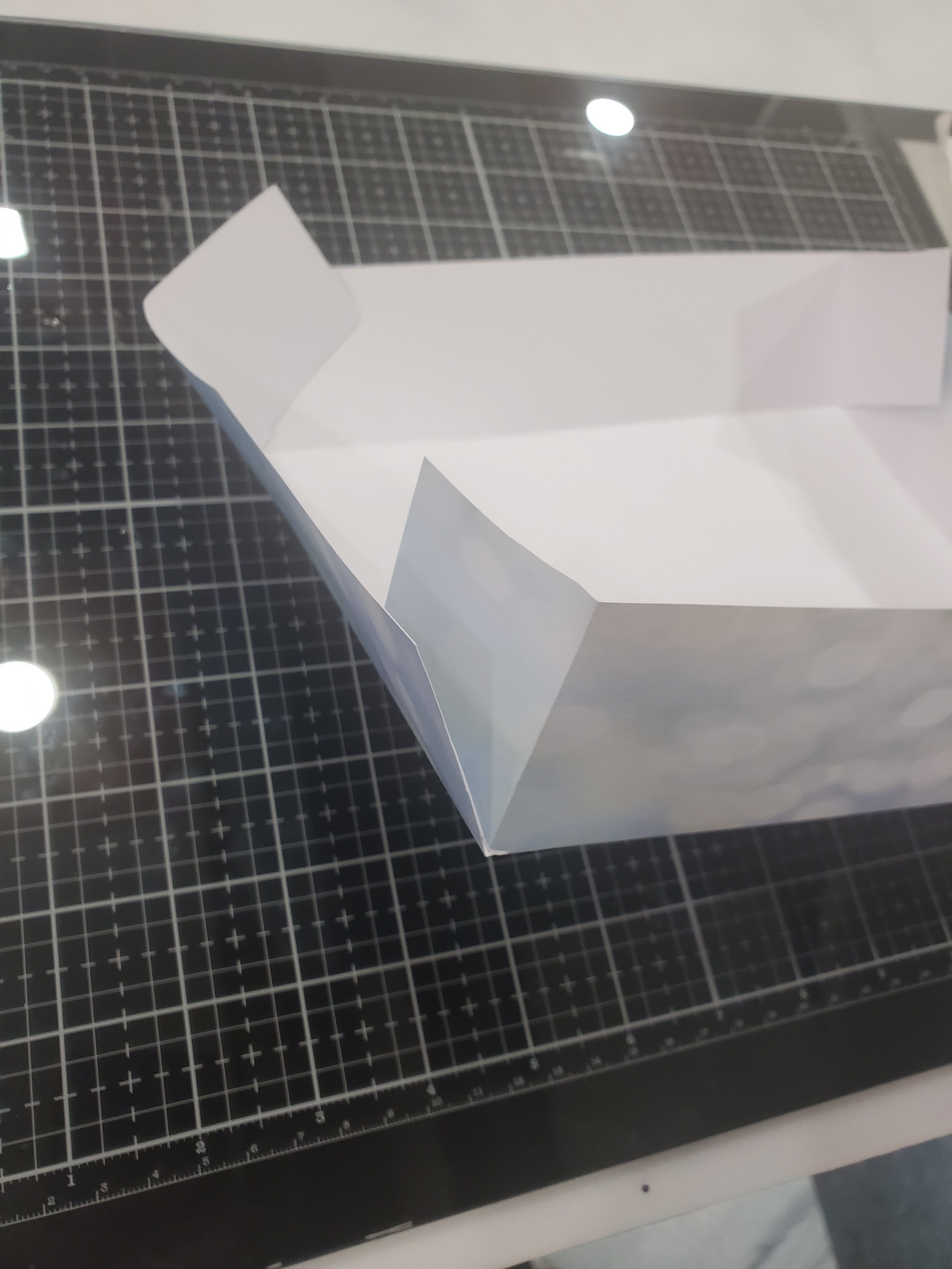
To create these cute boxes, I dipped into my scrapbooking paper supplies and picked out some corresponding paper that I felt went with the set perfectly. The sheet size you start with will determine your finished box size so in order to have a box large enough to accommodate A2-sized cards and leave a little room for internal packaging I chose to go with a 12” x 12” sheet. This provides you with a box that is 8” x 8” if you fold it up with 2” sides the way I created mine.
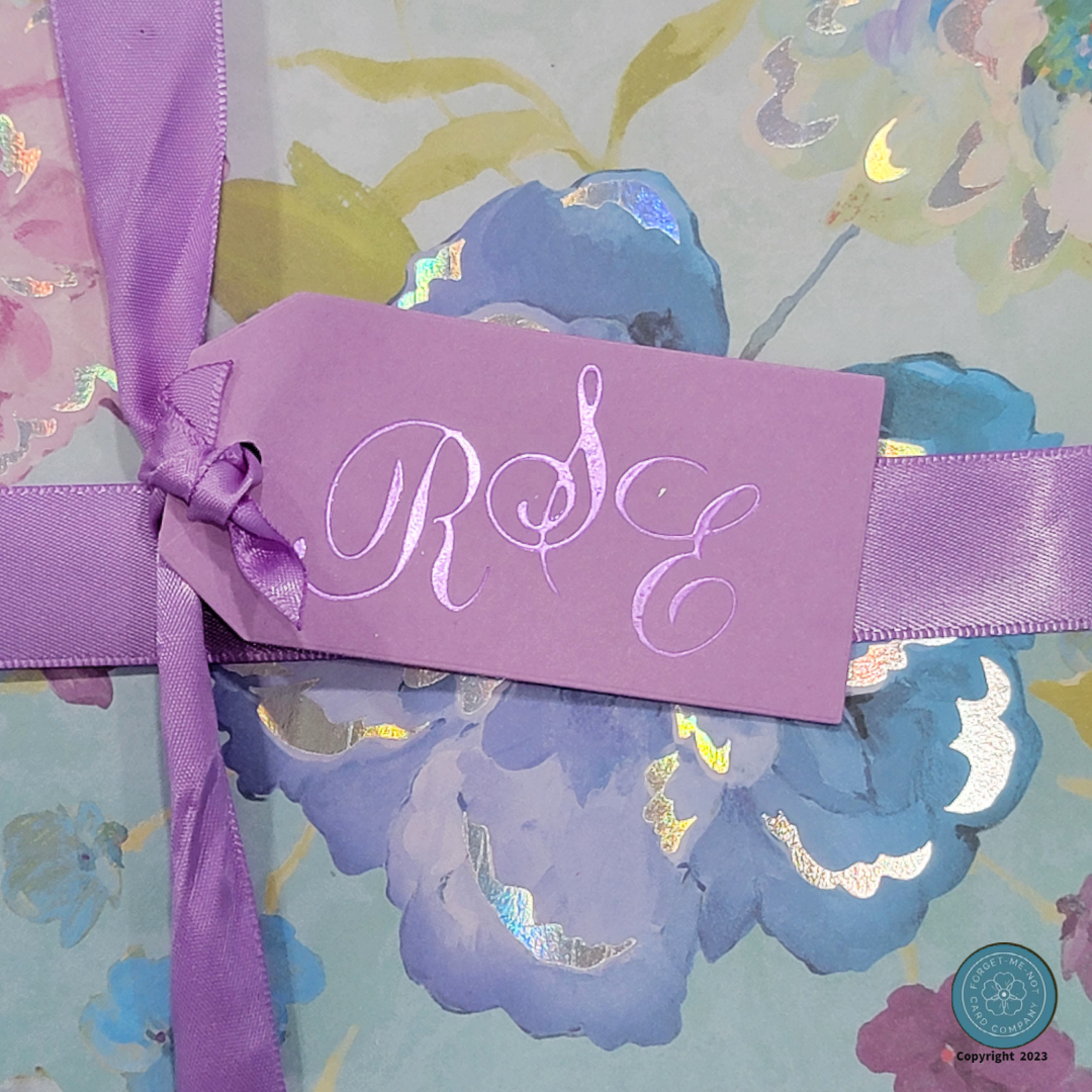
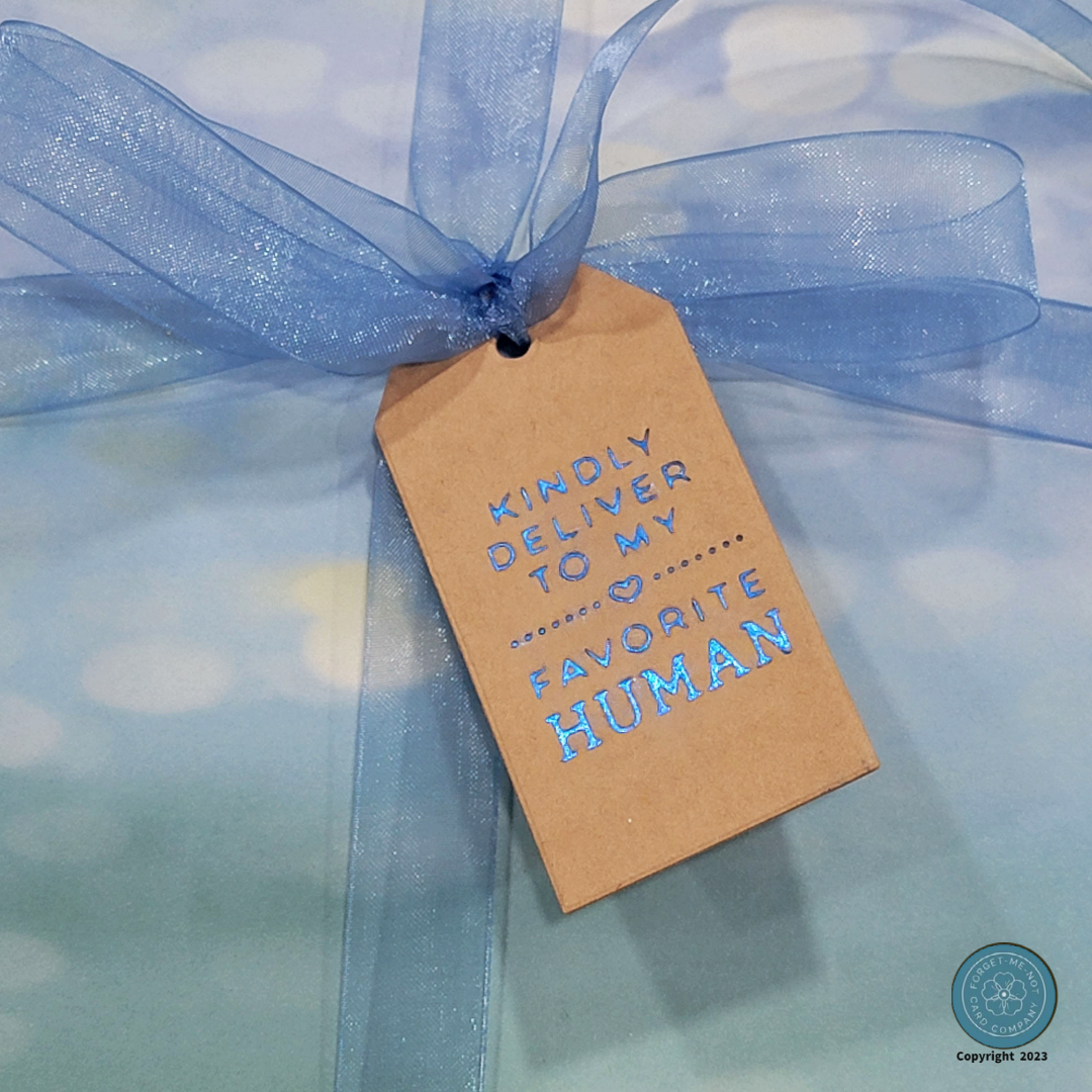
To finish off the boxes I tied them with ribbon that matches the color theme, the “Hers” set got one last piece of recycled product in the form of its ribbon, and created a special gift tag for my intended recipients,

Thank You
I would like to extend my heartfelt gratitude to all my fellow crafters who have taken the time to read through my post and learn about my journey. It is truly a pleasure to share my experiences with you all, and I hope that I have managed to inspire and perhaps introduce you to new skills or tips that you may not have encountered before. Together, we embark on a continuous journey of growth, and I am committed to expanding my craft every day, striving to improve in at least one way.
I would also like to express a special thank you to the Altenew Academy for providing such a wonderful program. The knowledge and expertise shared by your instructors have been nothing short of invaluable in my journey of skill development. The comprehensive resources and guidance offered through the program have played a significant role in expanding my crafting abilities.
Once again, thank you to all fellow crafters for your support and engagement, and a big thank you to the Altenew Academy for their dedication to providing a program that nurtures growth and fosters creativity. Together, we continue to learn, explore, and create beautiful works of art.
