Dance of the Flowers
Good day, fellow crafters. It is with great pleasure that I submit my greeting card design for the Dance of the Flowers contest. As a lifelong fan of art and design, I was immediately drawn to the theme of the contest and the opportunity to showcase my creativity. The challenge of capturing the beauty and movement of a group of flowers in a single design was both exciting and inspiring. My goal was to create a card that not only captures the essence of the theme but also conveys a sense of warmth to the viewer. I believe that my design achieves this goal, and I hope that it brings a smile to the faces of those who receive it.


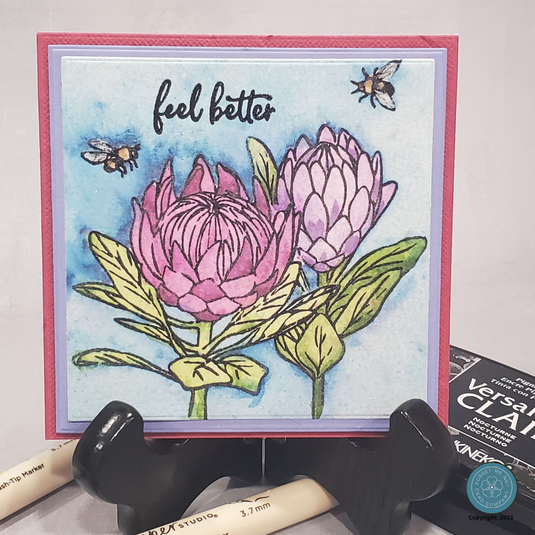

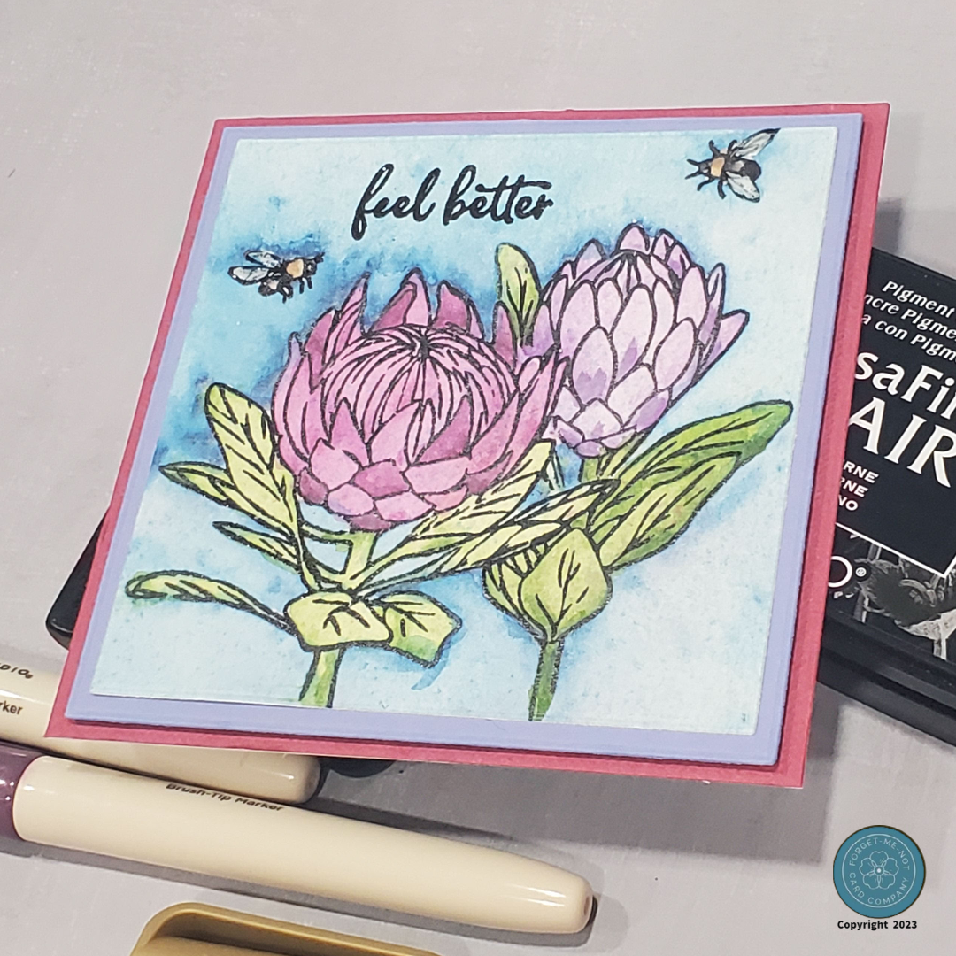
To start the process of crafting this card, I knew I wanted to watercolor my image so I began with a premium watercolor paper to ensure I would get the desired effect for my design. I then proceeded to use my Misti to stamp the Hero Arts Protea Flowers (CM448) onto the paper, carefully placing each image in just the right position.
For the stamping process, I chose to use Versa Mark Clair Nocturne ink to ensure that the flower and bee images were crisp, clear, and well-defined. Once the ink had been applied, I used clear embossing powder and heat-set it. This step is crucial because the powder helps to create a resist effect, which would be vital in ensuring that the water-coloring process was successful.
To add color to my flowers I used a small brush to add just a tiny bit of water to the paper in the areas I wanted to work and then, using my brush tip markers from The Paper Studio, I applied the brush tip marker directly onto the paper, using a light touch to create a base layer of color and then used a damp brush to blend and spread the pigment across the paper. This is a great way to get a watercolor effect because you can control the intensity of the color by adding more water to dilute the pigment or by adding more layers of color. You can also experiment with different brush strokes and techniques to create a variety of textures and effects.
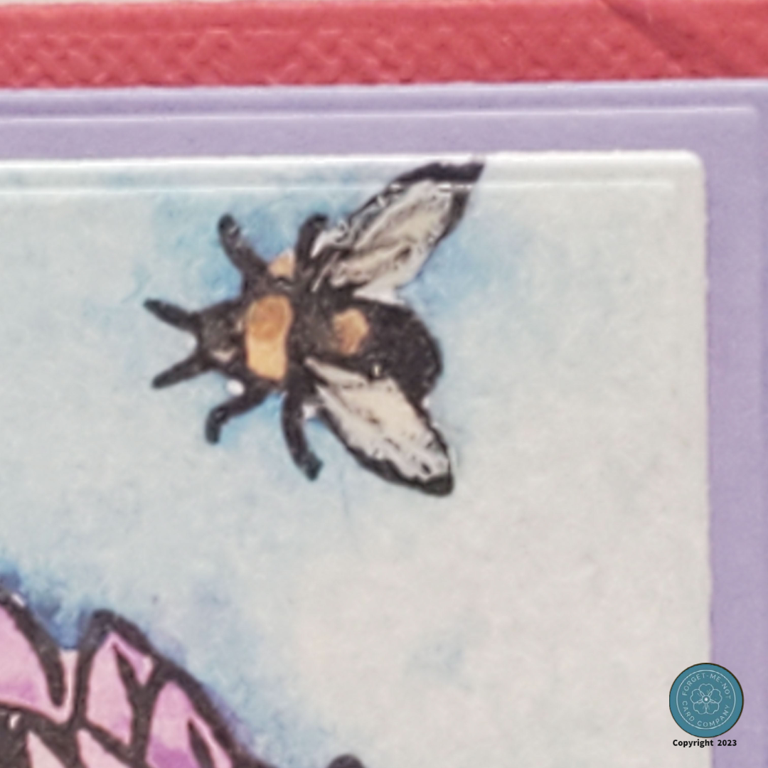
The coloring for the bees was done similarly but with Arteza’s Metallic markers to give the bees a punch of color. I also used some Wink of Stella on the wings and once that was dry used a bit of Glossy Accent on top of that. This step really made my card pop, as from a distance the Bees seem to be actually crawling on my card instead of being part of the image itself.
For the card base, I chose a pre-cut A2 size, in Burgundy. I decided on Burgundy because I wanted to complement my flowers with the Lavender mat and since all Purples are made of Red and Blue they went together nicely. I then assembled my card, stamped the sentiment in the Nocturne ink, and called the card complete.