Simon Says Stamp Wednesday Challenge
Flowers
Good day, fellow crafters. Below you will find this week’s entry into the Simon Says Stamp Wednesday Challenge. Although it may seem like a recurring theme during this time of year, it never loses its charm. As I gaze through the window of my studio, I'm greeted with a breathtaking view filled with abundant inspiration. Being the one who planted these flowers, I can confidently say that their beauty never fails to bring a smile to my lips. Don't hesitate to participate in this challenge or any other that catches your eye among the submissions I share. Remember to tag me when you do, so I can admire your wonderful creations as well.
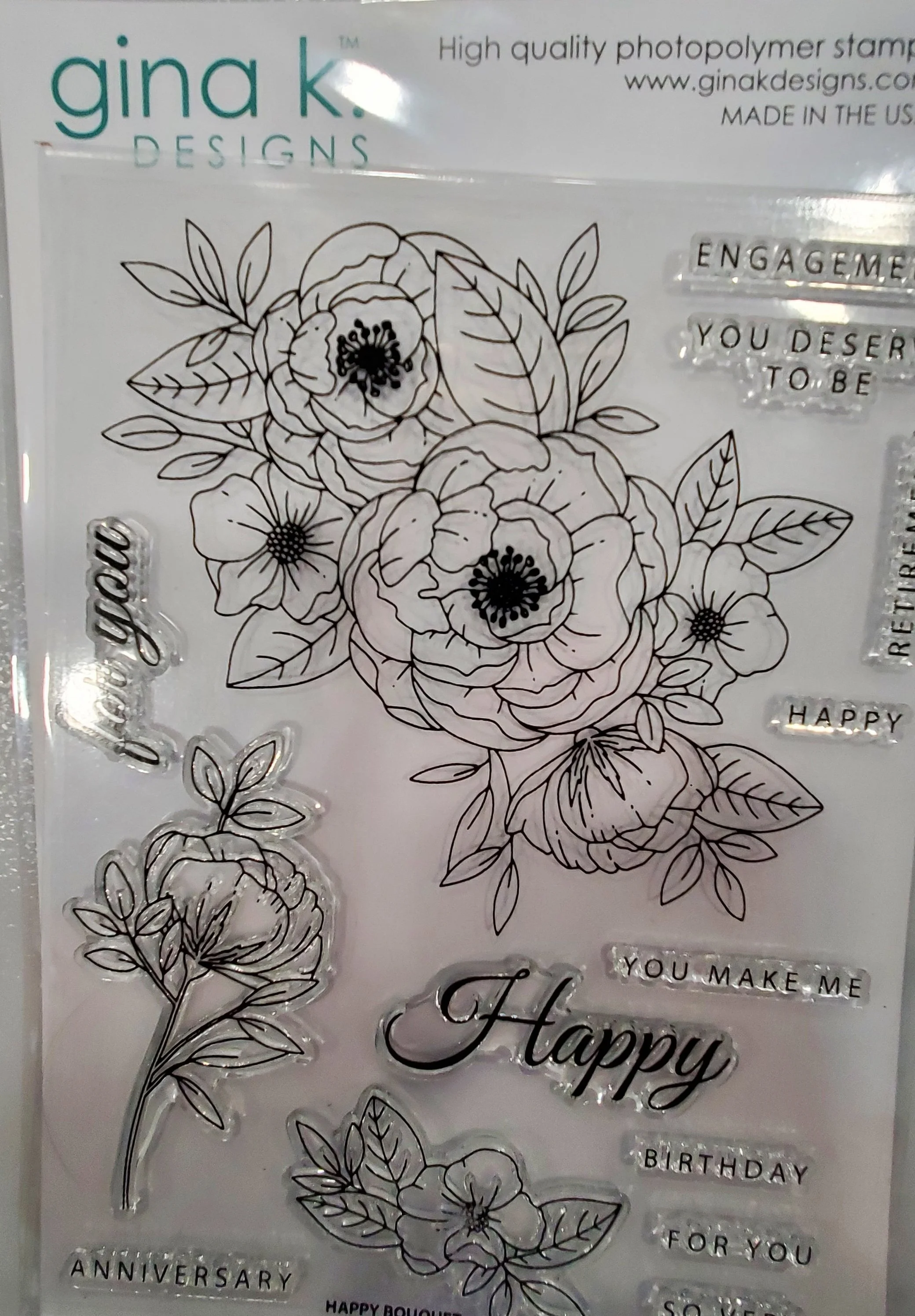
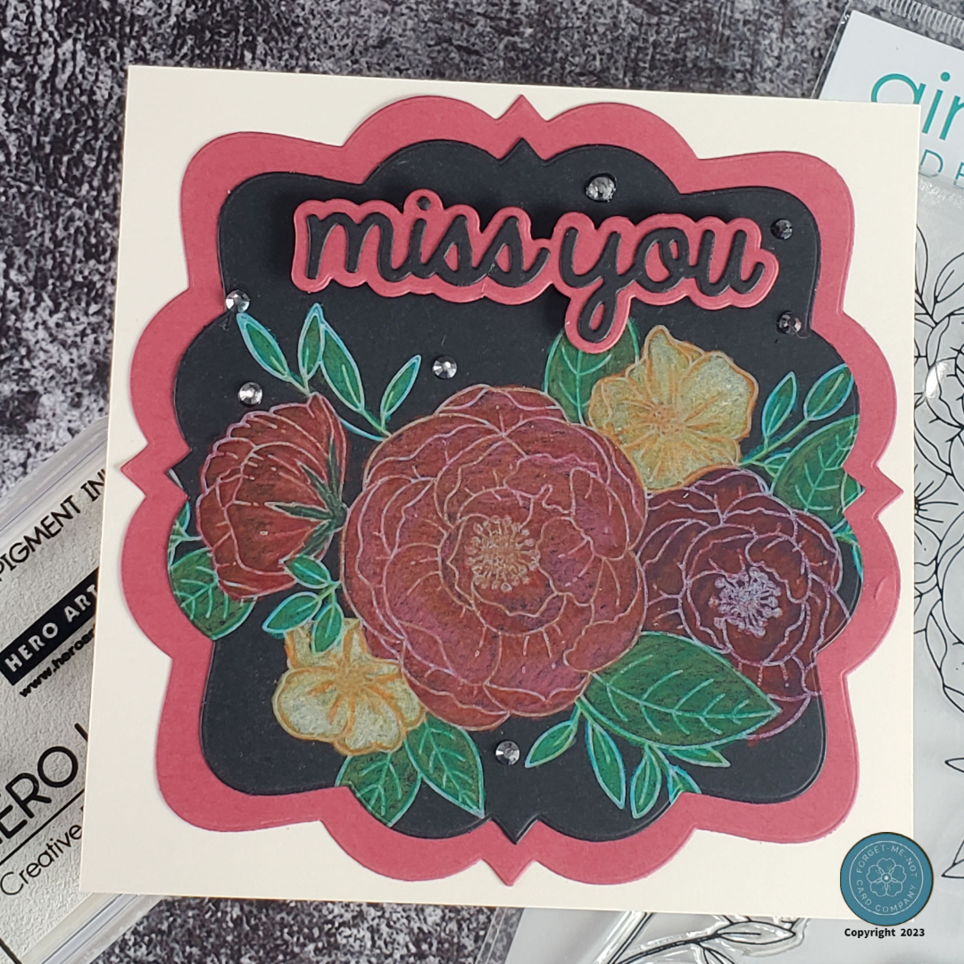
This card draws its inspiration from the beautiful Gina K stamp set, showcased on the left side, as well as the breathtaking sight of a large rose bush that greets me outside my studio window. During this time of year, the bush bursts with fist-sized blooms, filling the air with an irresistible fragrance. My goal was to create a card design that captures the scene so effectively that you could almost smell the roses as you admire the card.
To begin I chose some of my white cardstock that works well with the color medium of choice for this project, my PrismaColor colored pencils, the Gina K stamp set, and Hero Arts pigment ink in the color of Unicorn White. Next, I inserted the white cardstock into my Misti stamping tool and aligned the flower stamp. I applied the white ink to the stamp, making sure to coat it thoroughly, and then pressed it firmly onto the cardstock. To ensure complete coverage, I double-checked the stamped image and then reapplied ink and restamped it so that the transfer was perfect. The choice of using white ink instead of black was a design choice that came from the idea of recreating the sunlight upon the flower's edges and folds which is an effect that black ink simply couldn't capture. With stamping complete, I then used my trusty colored pencils to shade each petal to its final hue and detail. The colors blended seamlessly, creating a visually appealing and lifelike representation of the blossoms.
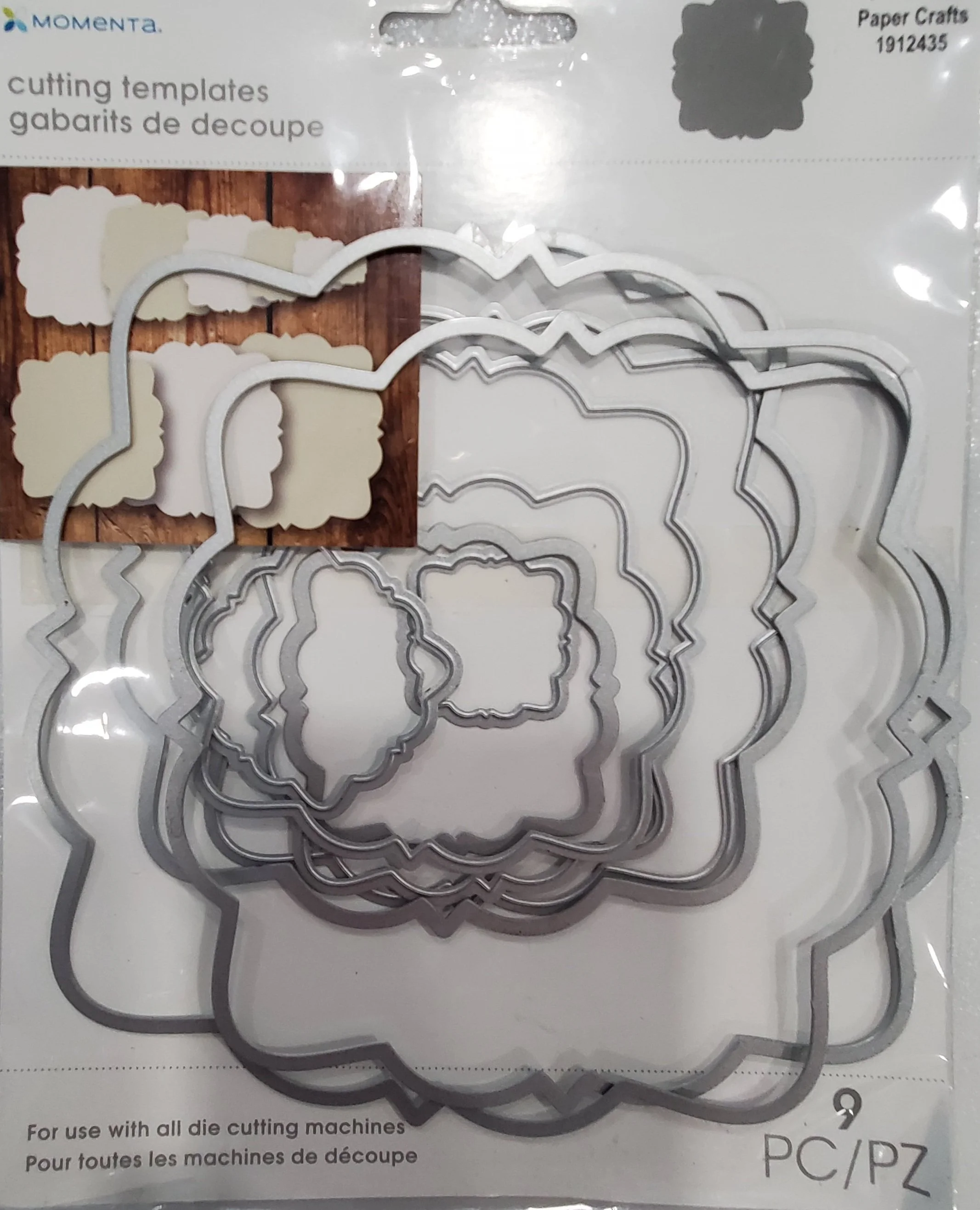
The next part of the construction process was to use the dies featured in the image on the right to cut out the background and mat. I know I have mentioned it several times in the past but in case you didn’t know it, I really like red and black as a complementing pair. To me they give off a sense of class so I like using them when I am feeling a little fancy. Once they were cut out I adhered them together and then mounted that to a precut square, cream-colored card base. I then cut out the flower image and adhered it to the card base as well.
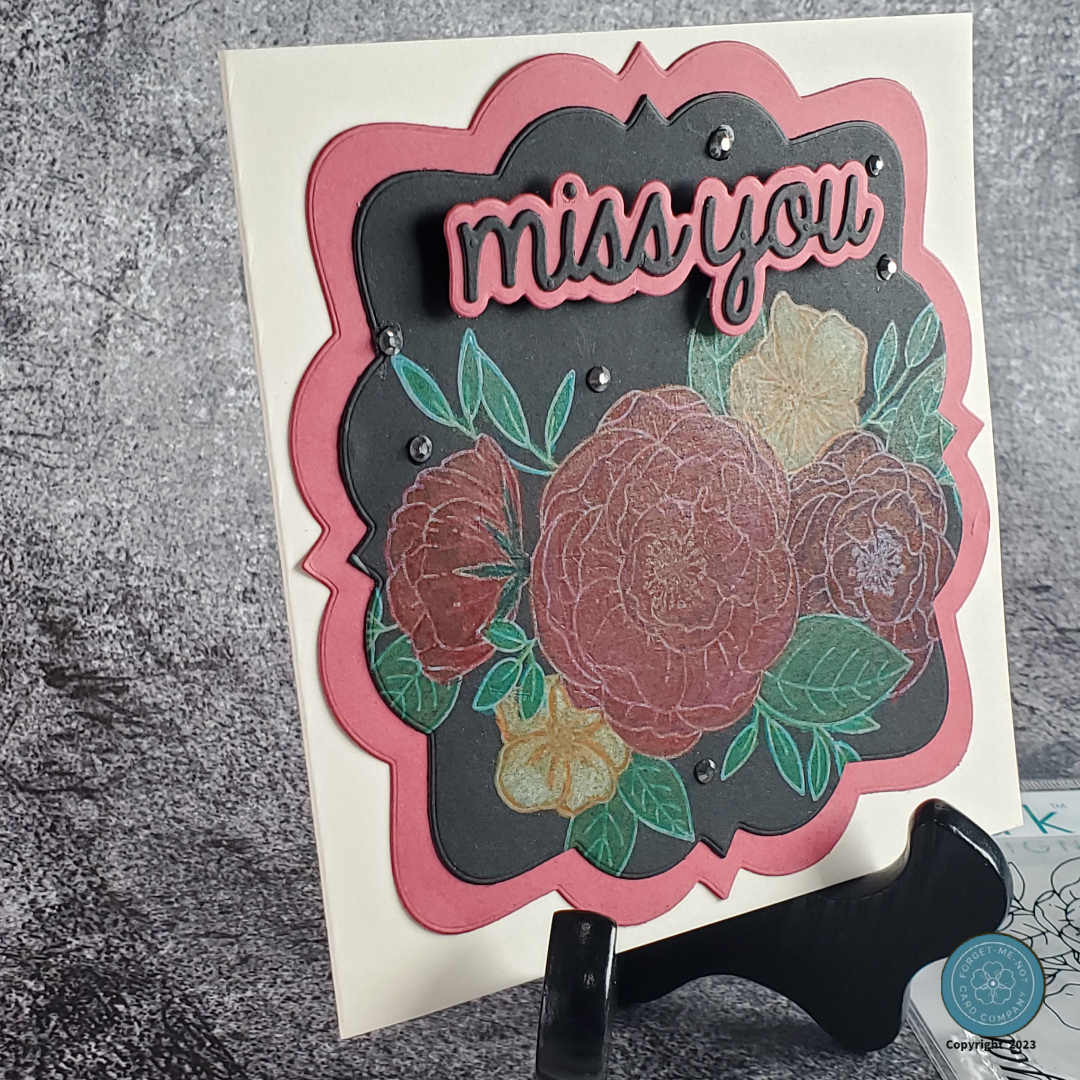
For the sentiment, I used the “Miss You” die set from Heffy Doodle and its corresponding background die. I cut these out of the same red and black cardstock but to add dimension I mounted them to the card base using some pop dots. Image number two in the gallery below gives you a good idea of how much it is raised from the surface.
To finalize this card and give it some additional appeal, I incorporated some Granite colored flat-backed jewels from Little Things. I made sure to use the odd number theory so that the viewer would take in the entire card. If you have never heard of the idea it can be best explained that by introducing slight asymmetry, odd numbers bring a sense of harmony and prevent monotony. They capture attention, create energy, and leave a memorable impression.
I hope this card has left a favorable impression in your mind and that you are inspired to journey along with me in the world of papercrafting.
