Magical Markers
Good day, fellow crafters. Today is about the use of alcohol markers. I had a lot of fun with this one as I enjoy pushing some of more of my creative ideas into fruition. Exploration of materials can sometimes lead to exciting new ways to do things after all. I hope you enjoy.
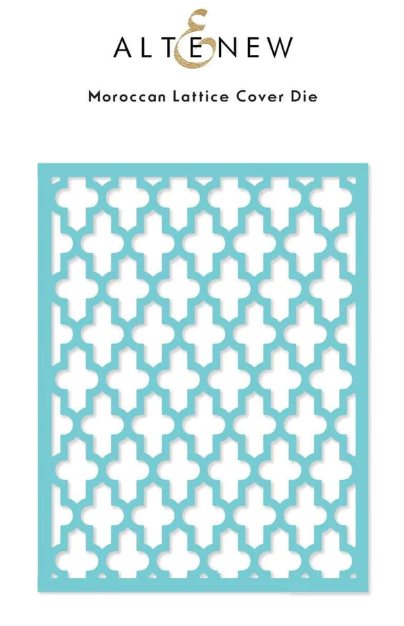
To create the background for this card, I first began with a sheet of holographic cardstock to which I colored in order, the colors of the rainbow. I allowed for the markers to dry and then spritzed the card with some 91% rubbing alcohol. I then used a paper towel to dab at the colors and lift some of the color away. Using this method on the holographic card gives it a weathered metallic look that I found quite interesting. I next used the Altenew Moroccan Lattice Cover Die to cut out the background and then to increase its visual appeal placed it over black cardstock to make it visually pop. Both pieces were then mounted to a pre-cut A2 vanilla colored card base.
The creation of the flowers was an interesting experience. From the picture, and if you follow my work, would likely surmise that the flowers were stamped onto watercolor paper and then painted with watercolors. However you would be entirely incorrect. These flowers, from the Altenew Castle Garden stamp set, were stamped onto Acetate with black StazOn ink, which I allowed to dry. I then flipped them over and added color by using my alcohol markers. Once dried these do look like they were water colored which still makes my heart happy. Flipping them back over, so the color was back on the bottom I used the corresponding die to cut them out.
However, an interesting challenge arose during this process. The flowers had a striking resemblance to stained glass or perhaps even a sun catcher, rather than the look I had in mind. To address this, I came up with a clever solution. Using white cardstock and micro dots, I proceeded to cut out the flower shapes once again. Finally, I mounted the acetate layer on top of the white cardstock, seamlessly combining the elements to achieve the desired effect. This additional step allowed the flowers to embody their intended appearance, ensuring they became a captivating focal point of the overall design.
Continuing the harmonious theme of the card, the sentiment from Altenew's Strength Blooms set was used. I stamped it onto the same black cardstock as the background clear embossing ink and then to add a touch of refinement, fine white embossing powder was delicately sprinkled over the ink and heat set. This process ensured that the sentiment seamlessly blended with the overall design, completing the card with a heartfelt message.


