Altenew May 2023 Color Challenge
Good day, fellow crafters! Today, I am thrilled to share with you my entry to the May 2023 Altenew color challenge. This month's challenge features a vibrant and playful color palette that inspired me to get creative and experiment with bold, eye-catching hues. As a passionate crafter and card maker, I always look forward to participating in Altenew's monthly challenges, as they provide me with a wonderful opportunity to explore new color combinations, try out different techniques, and push my creative boundaries. In this blog post, I'll take you through my creative process for this challenge, from selecting the right colors and supplies to designing and crafting my card. I hope my entry to the May 2023 Altenew color challenge will inspire you to try out new colors, techniques, and designs in your own crafting projects. So, join me on this exciting journey of creativity and color, and let's get started!


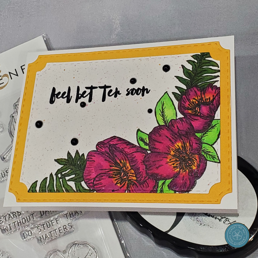
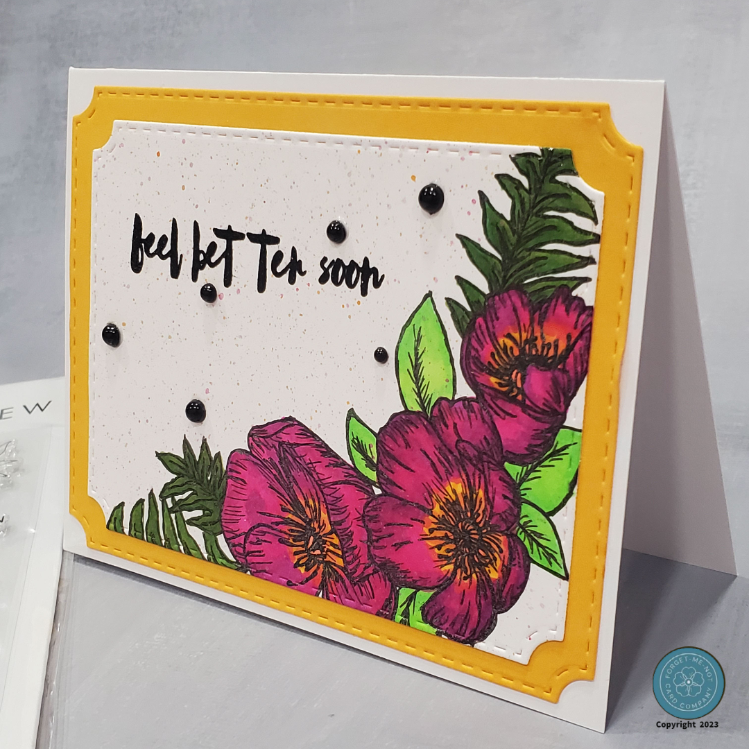
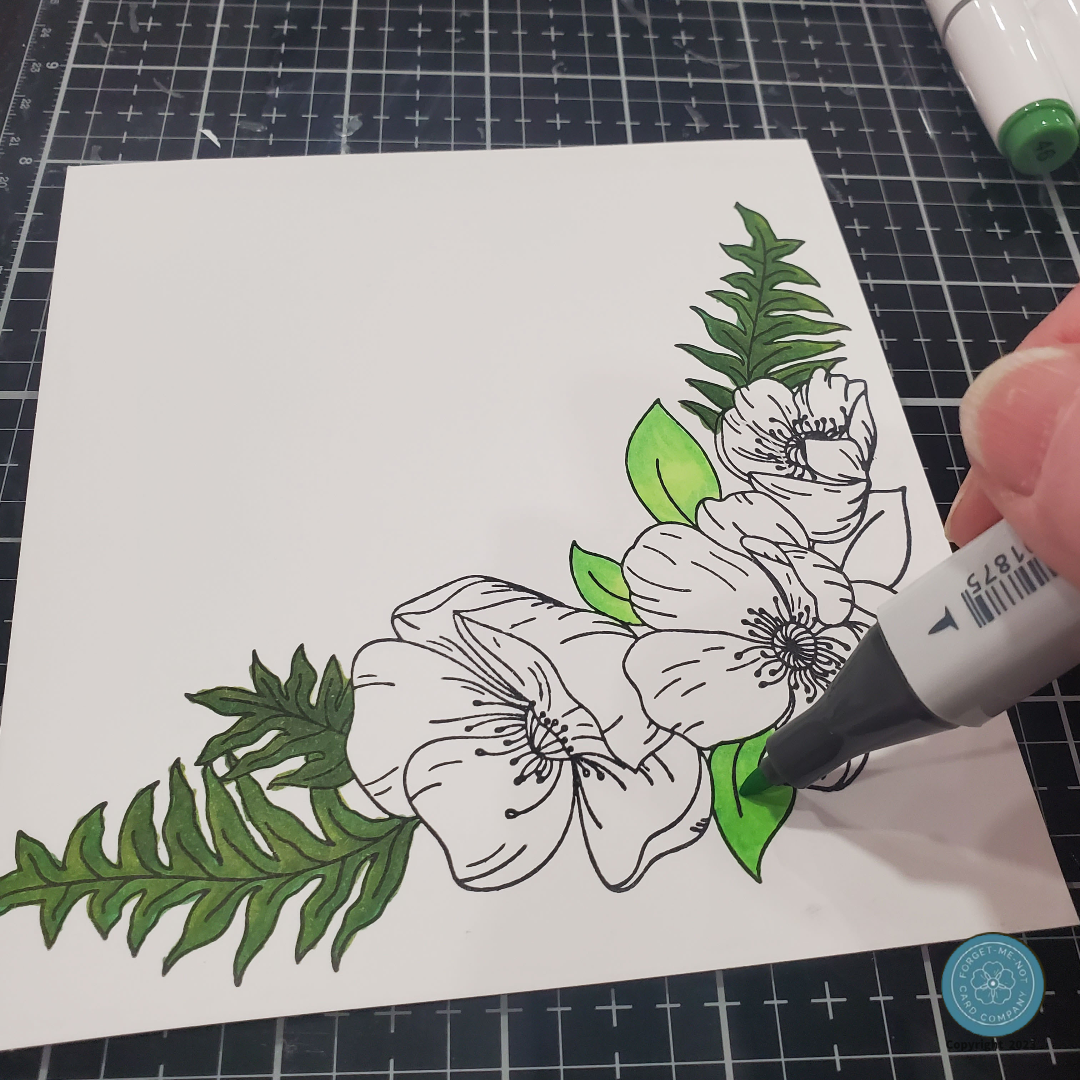
To begin this challenge, since it was for Altenew, I immediately reached for their specific crafting supplies. After browsing through my spring and floral stamp sets, I decided to go with the Altenew Poppy Arrangement stamp set, which I thought would be perfect for this challenge. For my base cardstock, I opted for high-quality white paper to prevent any chance of ink bleed during the coloring phase. To stamp the image, I used Altenew's Crisp Ink in Permanent Black, which provided a sharp and clear outline for my coloring work.
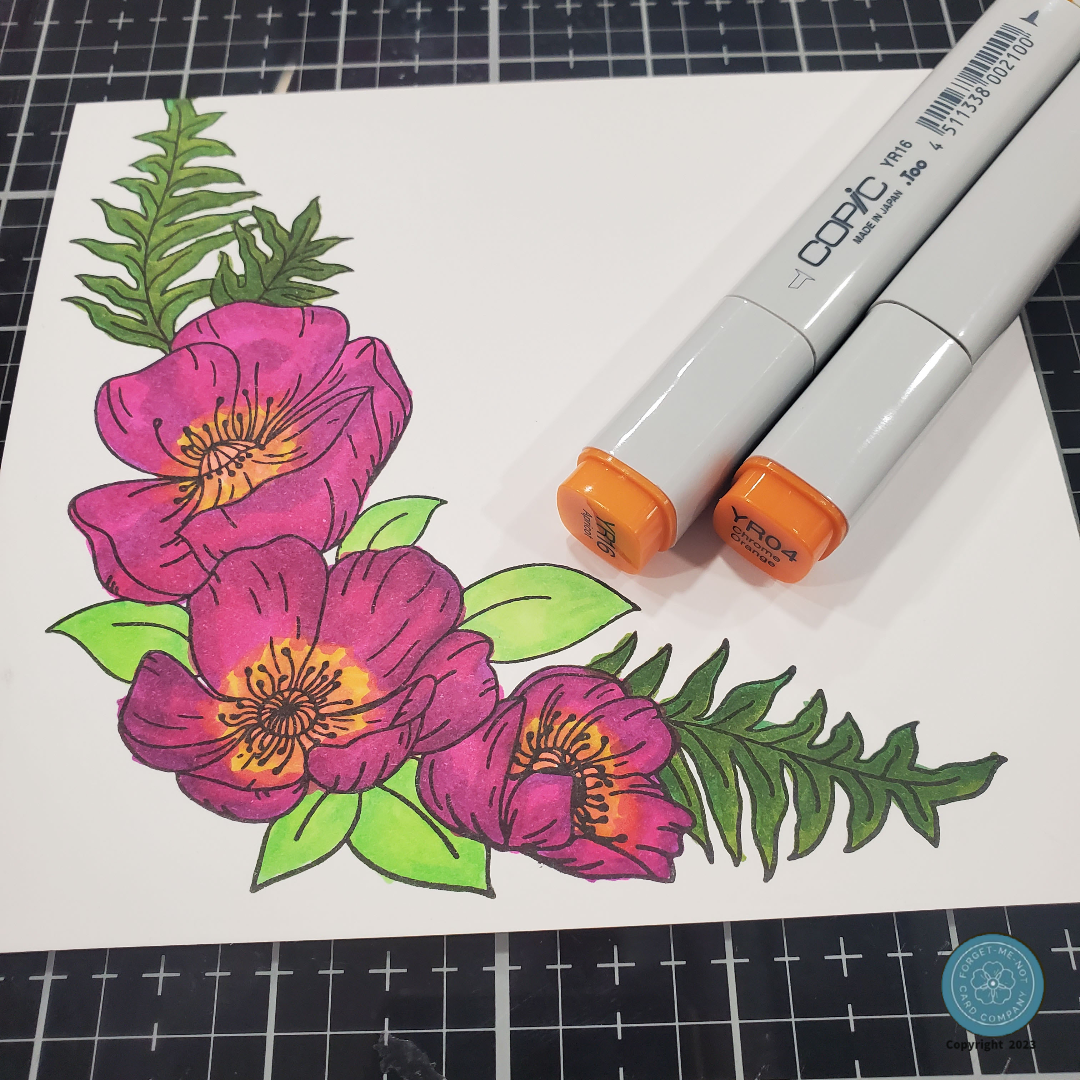
The next step in my card-making process was to add color to the stamped image of the poppies. After considering different coloring options, I decided to use alcohol ink markers for the majority of the coloring (1). These markers are known for their ability to blend and layer colors seamlessly, which would be perfect for achieving the specific shades and hues I wanted for my poppies. I was careful with my coloring, making sure to stay within the lines and avoid over-saturating the cardstock to prevent any bleeding. Using high-quality cardstock also helped to ensure a smooth coloring process without any unwanted smudging or bleeding.
Once I completed the initial coloring, I used orange Copic markers to add depth and dimension to the flower centers (2). The orange color contrasted well with the other colors used in the image and made the centers pop. The final step in coloring the image was to use an Arteza Black gel pen to outline and highlight the poppy image(3). This added crispness and definition to the stamped lines and helped the image stand out even more. The Arteza Black gel pen also gave the image a subtle shine, which added a touch of elegance to the overall design.
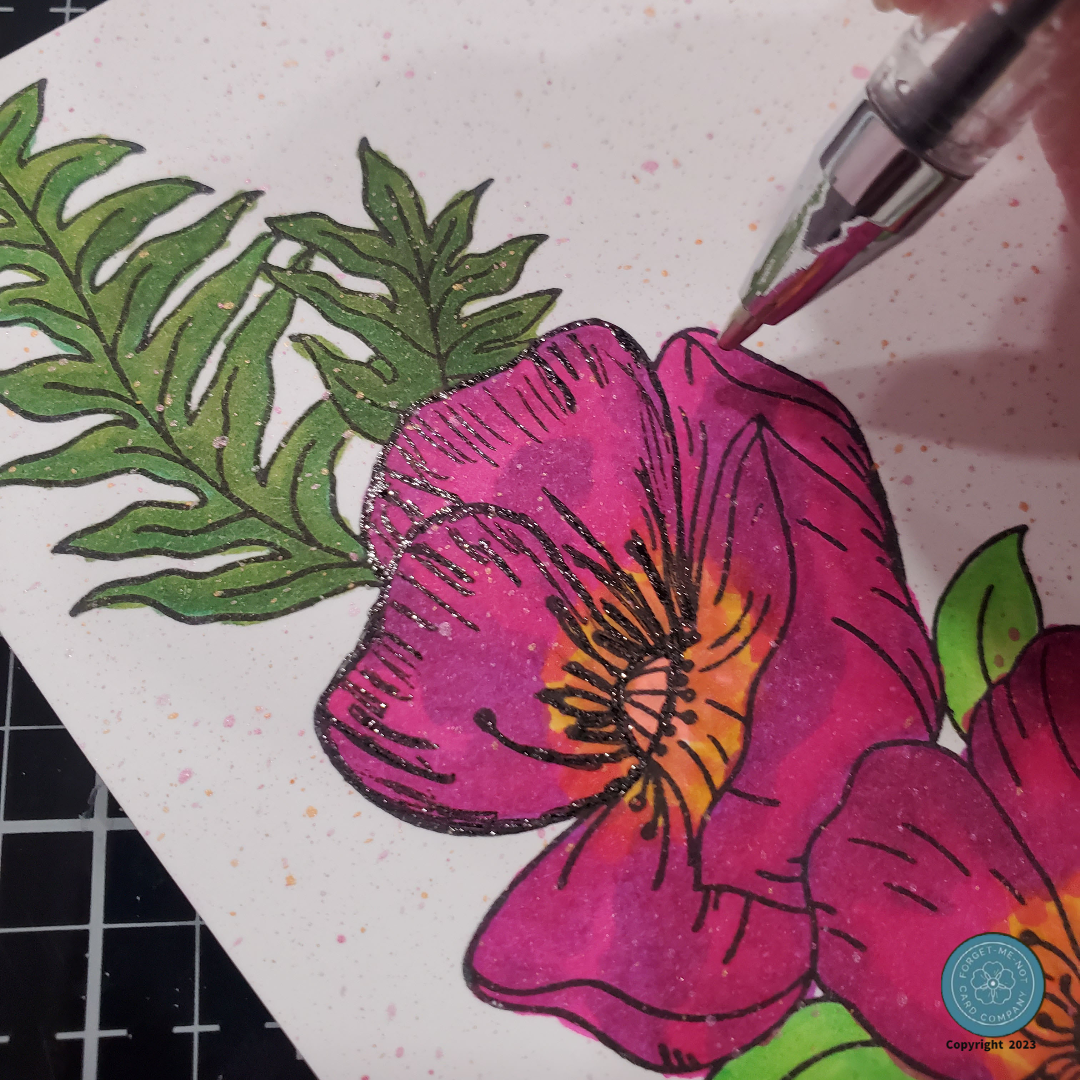
For the final step of the base image, I lightly speckled the white background by flicking ink from a brush in the same colors I used to color the poppy image. This technique helped to break up the plainness of the white space and added a subtle visual interest to the background without overpowering the main image. The speckling also helped to tie the colors of the background in with the poppies and gave the card a cohesive look. I set the base image aside to fully dry.
While that was happening, I worked on the card base and mat. I always go for my trusty A2 White card base, pre-cut and folded for convenience. Why, you ask? Well, not only do I love creating cards for challenges and just for fun, but I also like to keep in touch with friends and family by mailing them handmade cards. And let's face it, nobody wants to pay an arm and a leg for postage. Believe me, I learned that lesson the hard way when I got too fancy with my card designs and ended up paying more than I would for a gourmet meal! To the card base, I adhered the mat that I had cut with my Pink and Main Notched corner die set (PNM399). I love stitch dies as the look of the faux stitching seems to say handmade and made with love to me, could be just me though.
I next cut the background with the same die set and adhered it to the mat as well. I loved the look and was ready for the sentiment. For this, I chose a sentiment from the Altenew Bamboo Rose stamp set and the same Crisp Ink in Permanent Black I used for the image stamping. Finally, to wrap it up I felt it need a bit more dimension so I added some flat-back Onxys Pearls from Kat Scrappiness.
And with that, my beautiful, handmade card is ready to be sent off to my loved ones. I know they will appreciate the time and effort I put into making it, and I can't wait to see their reactions. There's just something special about receiving a handmade card in the mail, isn't there?